

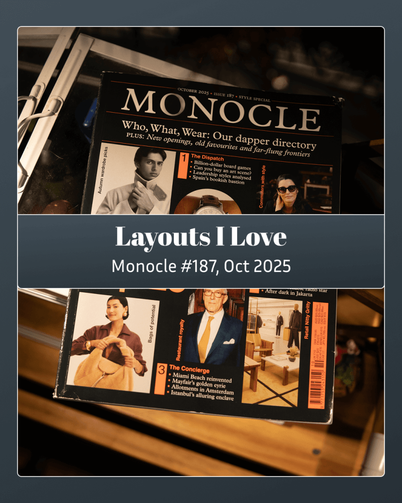
Monocle is a good enough magazine to be worthy of criticism. I think I’ll still just fawn for now.
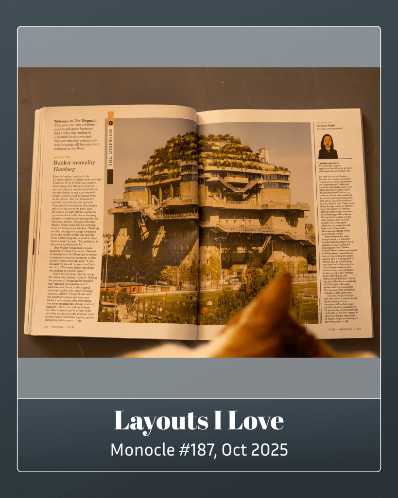
The spread showing the reclamation of a former labor building in Hamburg into a public garden caught the attention of my cat. It’s a wonderful use of a full spread.
Monocle’s typography is sharp and precise; I’ll be talking about it a lot in this series. On this page alone, you can spot at least seven different paragraph styles. It sounds like a lot, but it never feels cluttered. The hierarchy makes sense right away.
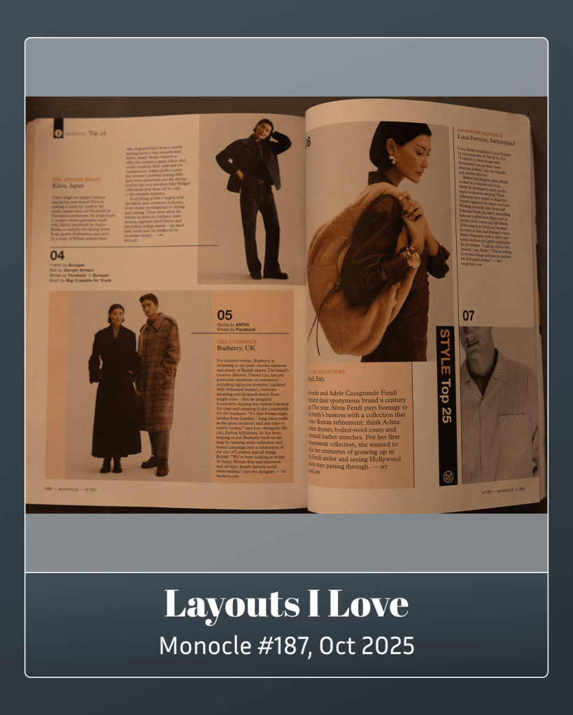
The “Style Top 25” is lovely multi-page feature. There’s a sense of progression in the photography, as if you’re watching decisions being made by the models. Unlike many style features, you’re never confused about what’s actually on offer. The product is always the focus.
See you next month.

Leave a comment