
-
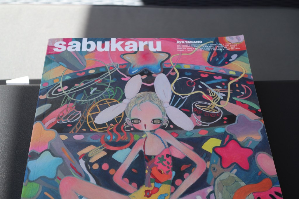
If you learn anything from these posts, that’s great, but really I just like sharing cool shit. That’s also the vibe I get from Adrian Bianco’s Sabukaru, a giant, expensive magazine filled with interviews and sub culture treasures. Printed on heavily glossy paper with metallic, shimmering inks makes this magazine feel expensive and otherworldly, but…
-
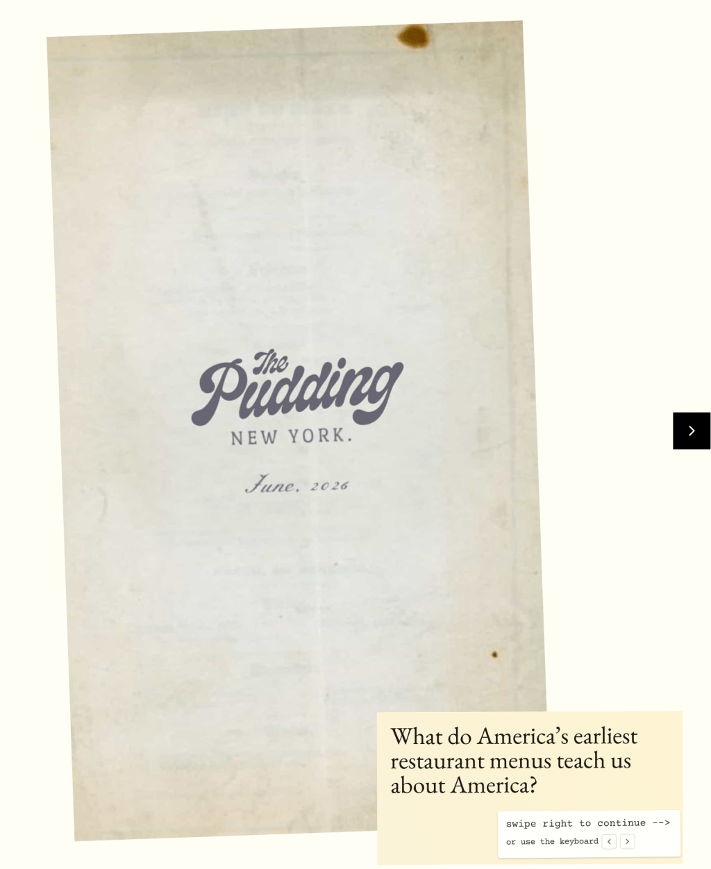
The pudding is a website with a ton of fun graphic design posts. They use colour, hierarchy, and maps to make fascinating posts about modern culture. It’s been one of my favourite blogs for a long time. Back in the summer, they posted “Menu Story,” an essay about the New York Public Library’s Buttolph Collection…
-
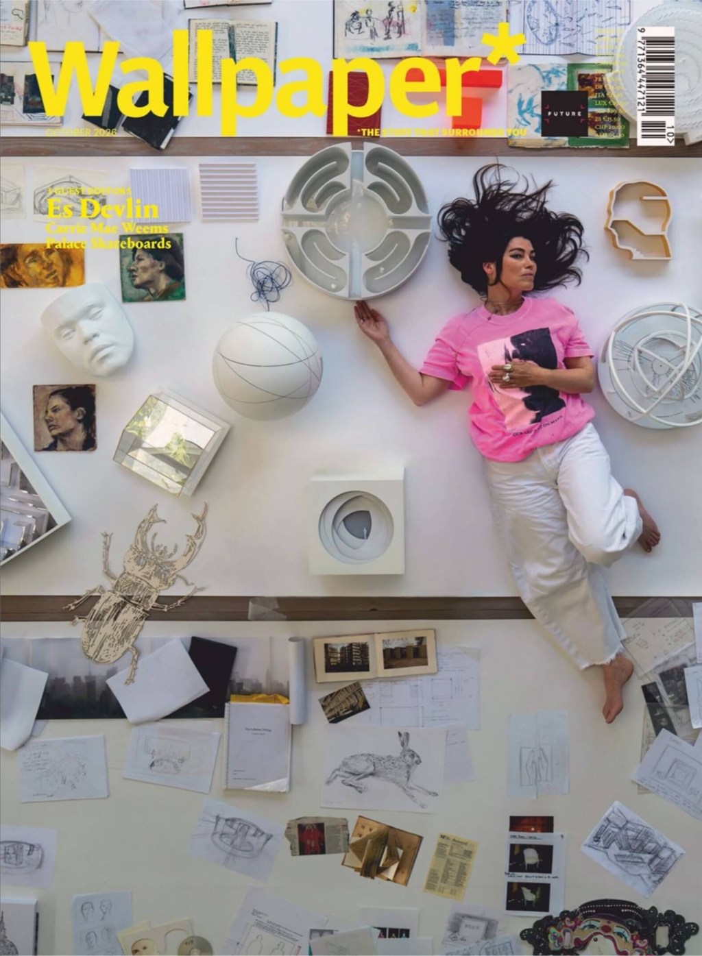
Layouts I Love • Wallpaper, Oct 2026 The massive October issue of Wallpaper* is anchored by its impeccable typography. Stark black, oversized serif typography is standard with Wallpaper. Color-coding the features (Yellow for Es Devlin, red for Palace Skateboards, and blue for Carrie Mae Weems) creates a smart navigation system. You should always know where…
-
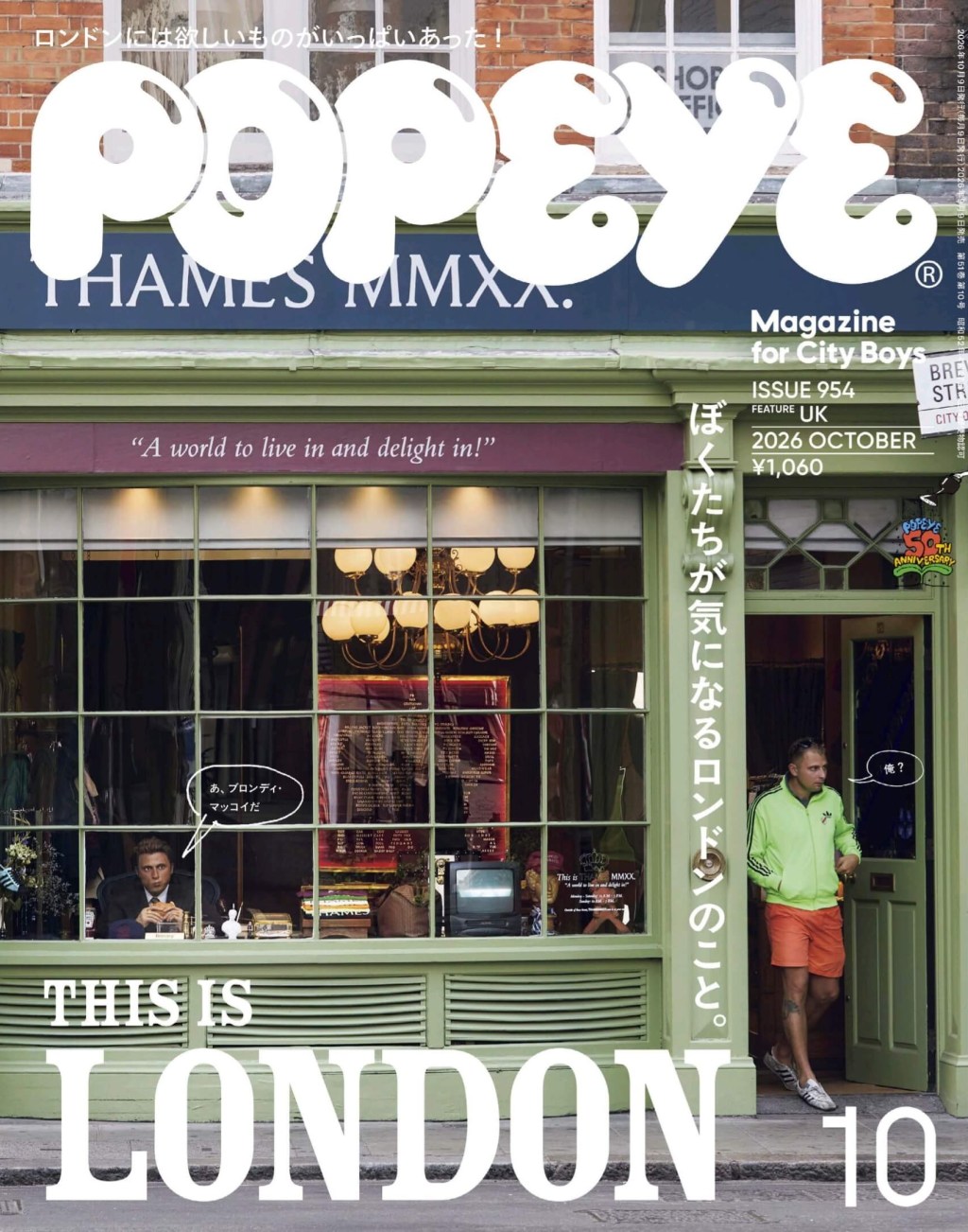
There’s a bilingual note in the October issue of Popeye: an explanation for this trip to London to look at the fashion scene. It shows a zeal for travel, regardless of its high cost. Seeing things in person is worth it, they argue. But they also give an anecdote, that Popeye was almost focused on…
-
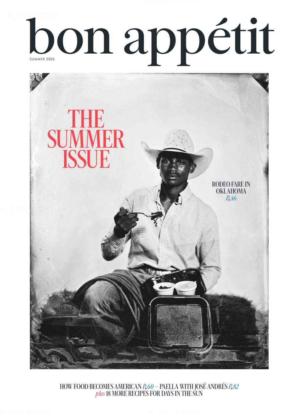
How hard is it to photograph food? At first, I thought okay, they cut out the plate and then decided what background fill to use. But then I looked a little closer. These backgrounds are tablecloths. The photographers chose this colour before shooting. The whole page is the photograph. All of this is real. The…
-
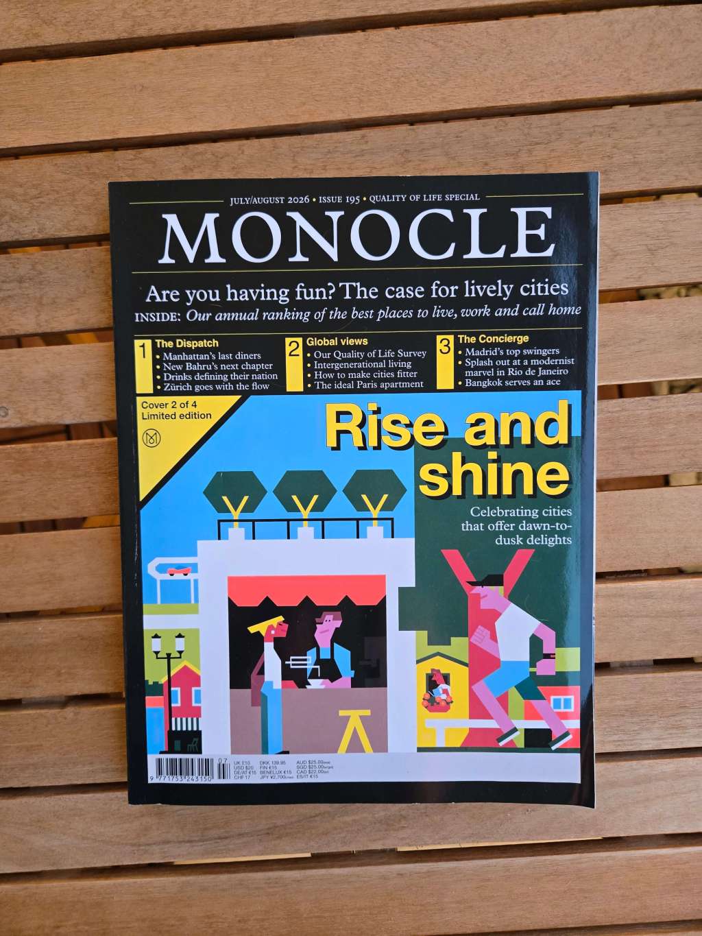
Monocle magazine features engaging layouts that capture attention both from a distance and up close, combining visual appeal with informative content. Highlights include a charming grid graphic for rail travel, stunning two-page photo spreads like a Tokyo vista, and a delightful collection of old postcards with intriguing tourist writings.
-
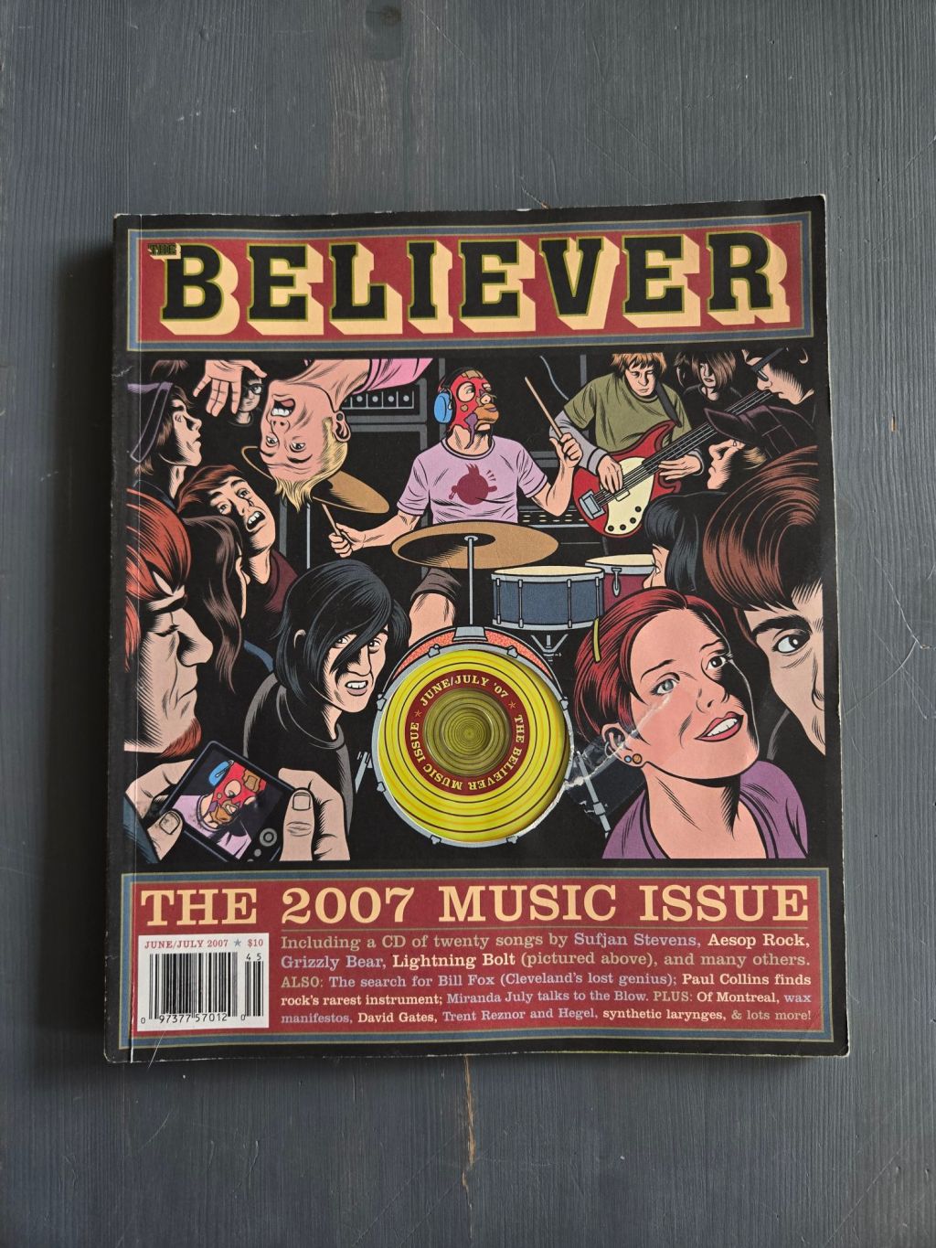
It came with a CD. This was a magazine that came with a CD. It came with a CD. This was a magazine that came with a CD. Things used to come with a CD. You’d buy something, and then there would also be a CD. They wanted you to have the CD too, so…
-
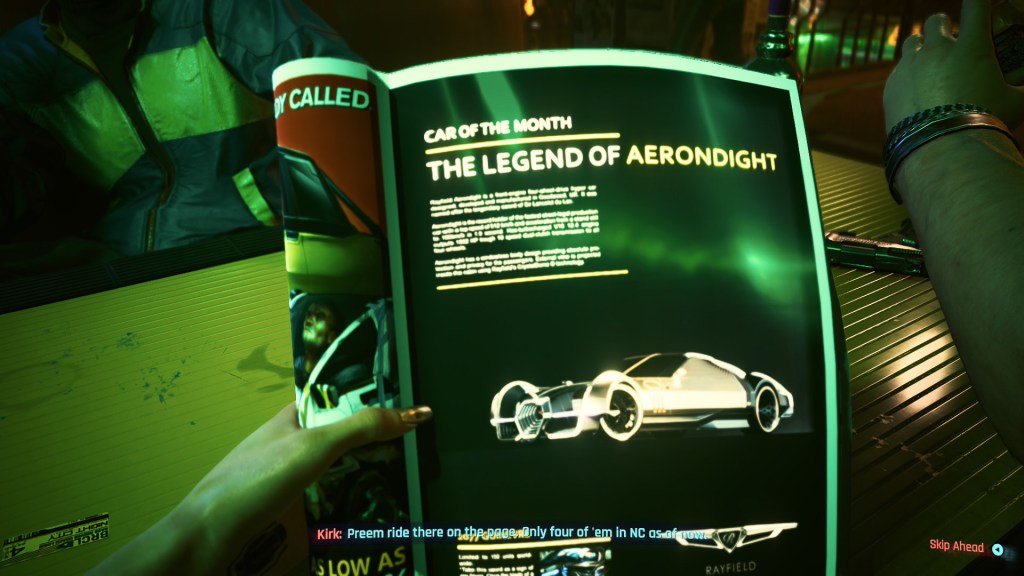
Cyberpunk 2077 effectively establishes its dystopian tone through pervasive print media, with magazines scattered throughout Night City that reflect a nostalgic early 90s aesthetic. While some content is adult-oriented, the game’s modding community enhances the experience, offering features that allow characters to interact with various publications and minimize magazine duplicates.
-
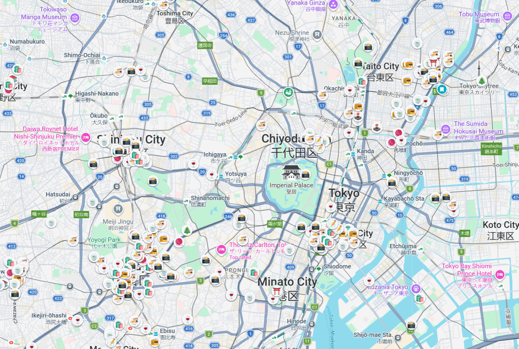
I’m visiting Japan later this year, but I was there two years ago. I’ve had several friends go to Japan this year and a few are there right now (this might be true any time you’re reading this). If you’re a friend of mine and want to use any of my google maps, click on…
-
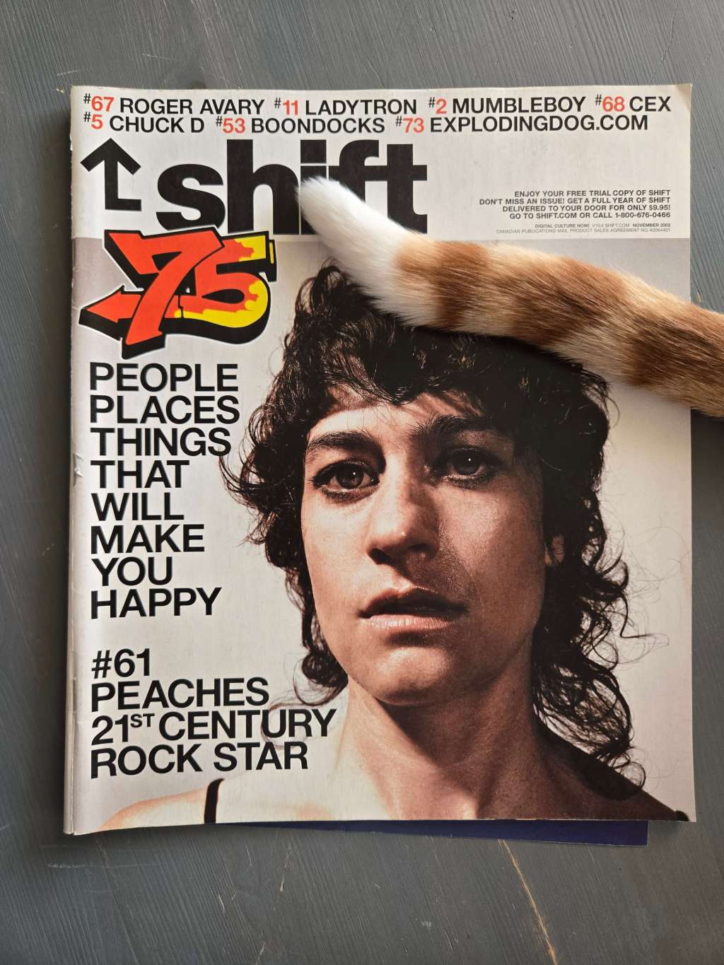
Shift was a Canadian music and culture magazine featuring a 2002 issue characterized by a comprehensive list format. Each item, ranging from people to art, is numbered and presented with varying lengths of description. This nostalgic layout inspires the creator to initiate a new series, reflecting on a beloved style of presentation.
Blog Posts
- Blogging (14)
- Designs (13)
- Scripts (2)
- Favourites Logs (30)
- Hyperlinks Logs (13)
- Layouts I Love (91)
- links (2)
- Photos (13)
- Podcasts (38)
- Tech Blog (58)
- Uncategorized (4)
- Writing (3)
3DS (6) anime (5) Anime North (4) apple (4) apple music (4) Apple Watch (3) bookmarks (4) Canon M50 (5) coffee (3) Comic Books (3) delta (7) design (5) fashion (3) game log (6) indesign (4) ipad (3) iphone (14) itunes (3) Japan (22) links (4) magazines (55) monocle (7) movie log (5) movies (6) music (19) nintendo (4) nintendo-switch (6) Popeye (3) print (21) ratings (3) retro magazines (8) spotify (4) Steam (4) technology (7) Toronto (11) tv (3) TV Log (5) typography (6) video games (26) Websites (6) windows phone (3) wrestling (3) you chose poorly (39) youtube (4) zines (11)
