

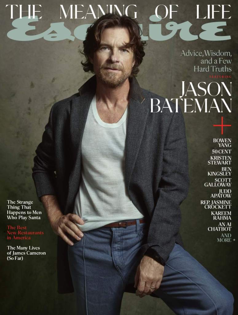
Esquire’s layout game is professional and clean, but there’s delightful details to keep the eye engaged.
The masthead for December isn’t just a colophon, but an added layer of context centered around the issues’ theme.
Five columns, four items. How do you make this interesting? Cascading. Draw the eye down and through. I thought it was an accident, but they do it again.
In layout work—especially if you’re working at a high level—there should be no accidents.

Leave a comment