
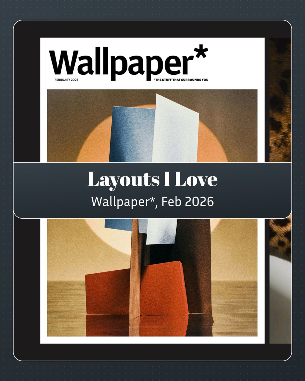
I like Wallpaper* a lot. I’ll have more to say about the magazine in future issues. For this one, I want to just focus on Header hierarchy.
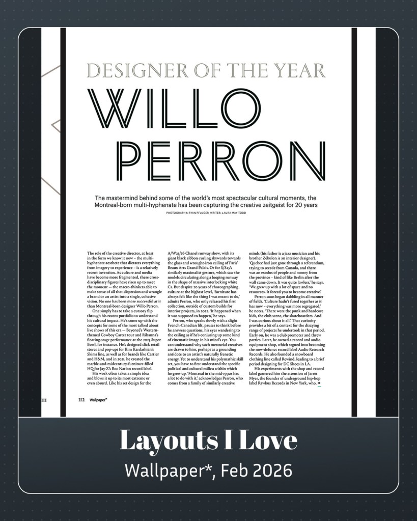
Designer of the year is in gray, Willo Perron in black. Subhead, space, three unjustified columns, a clean start.
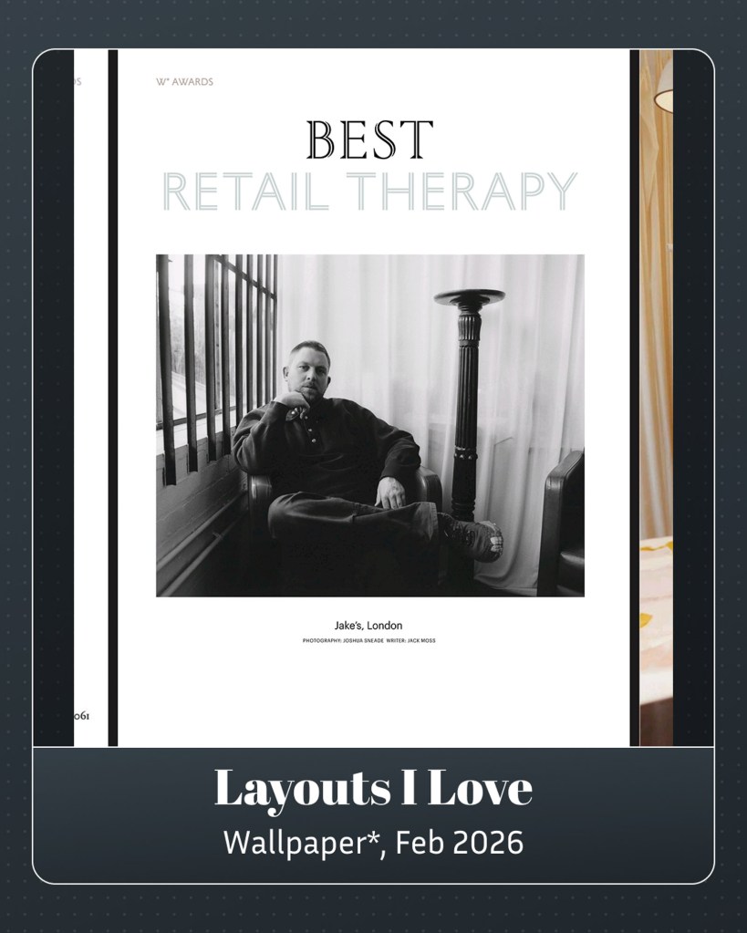
Next one: best in black. Retail therapy in grey. It’s a little chromatic change. Keeps things fresh.
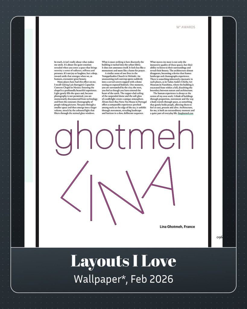
Change it up some more. Rotate some type. Add some colour. But write the name twice for clarity.
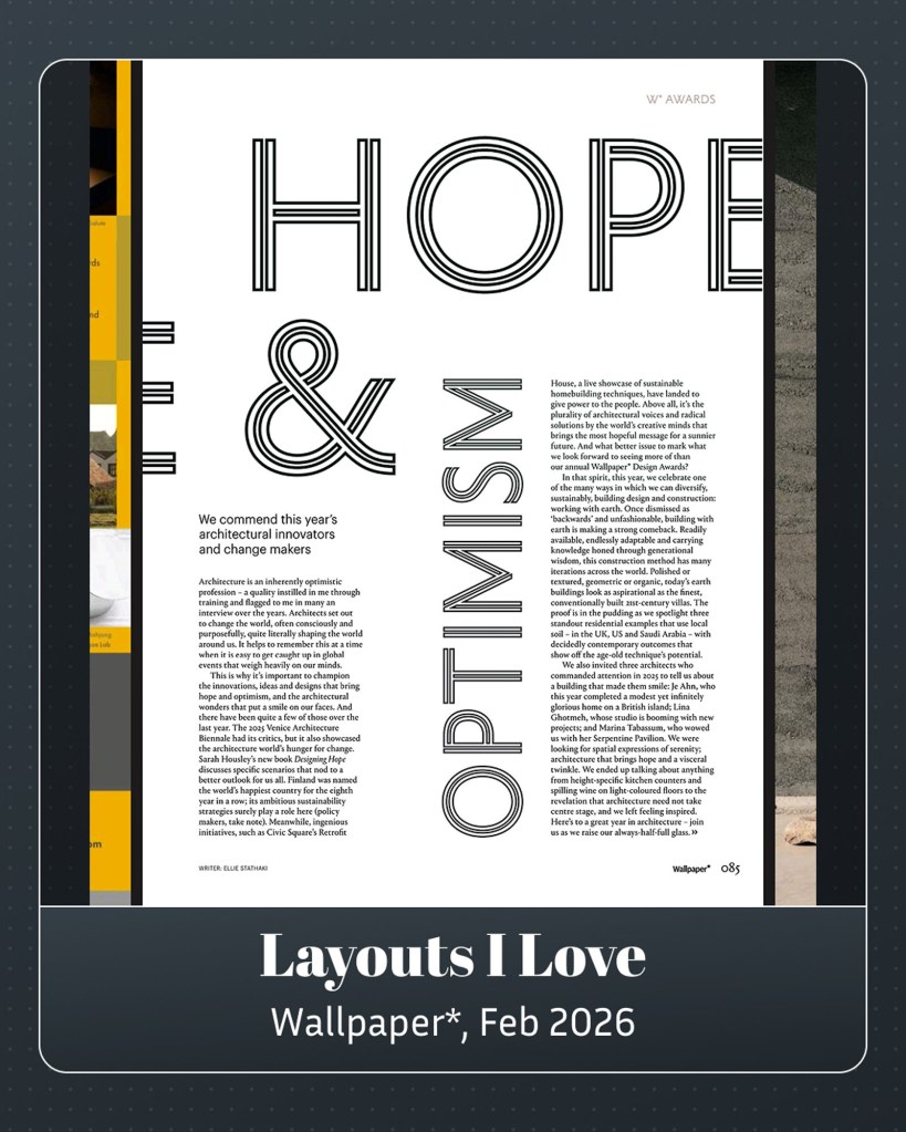
Finally, type Hope so big it bleeds over, looping back over, letting the title take over a whole middle column. Good. We need all the large-typed hope and optimism we can get.


Leave a comment