
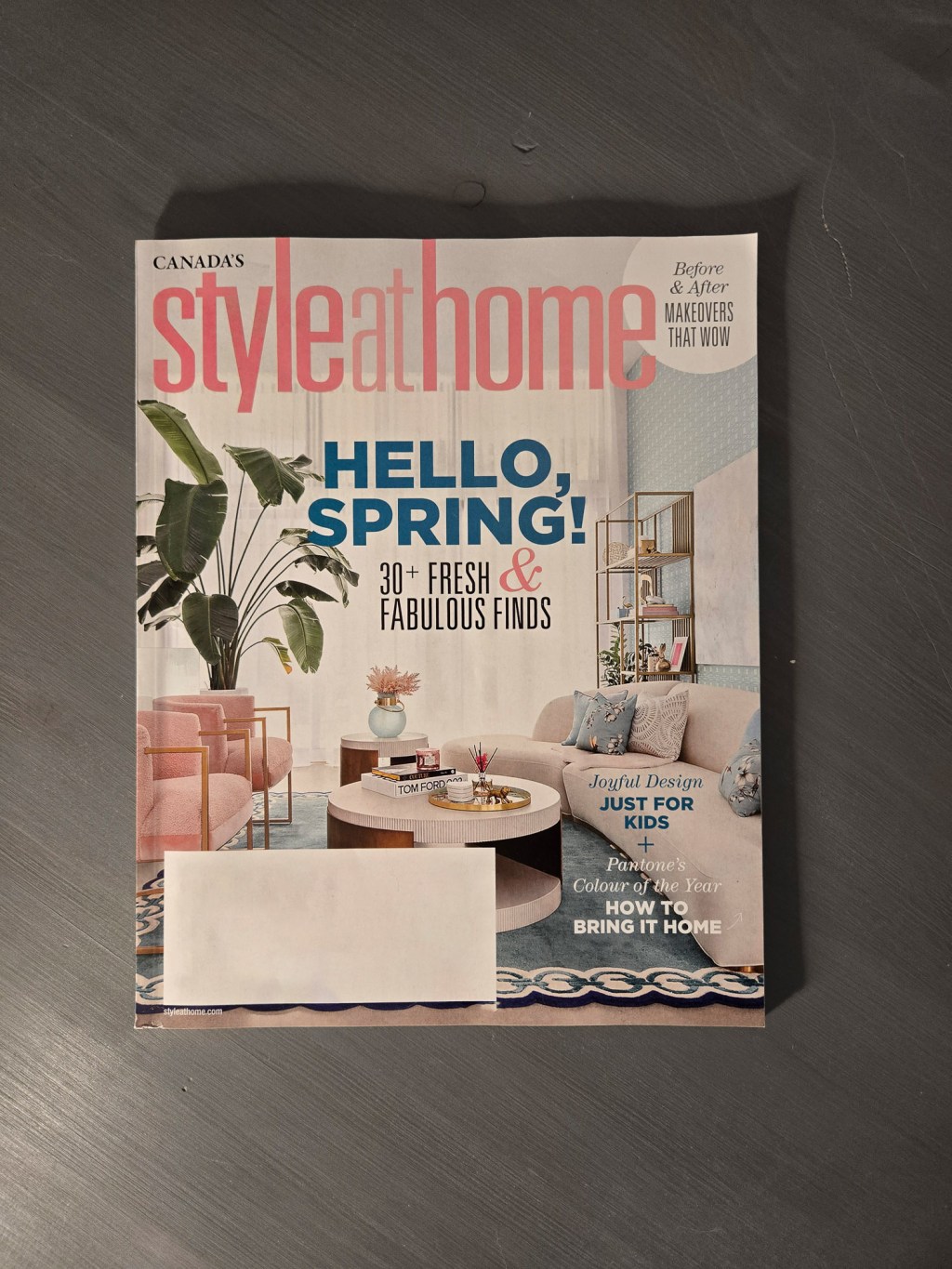
Style At Home is a long-running Canadian interior design mag. You have seen it everywhere.
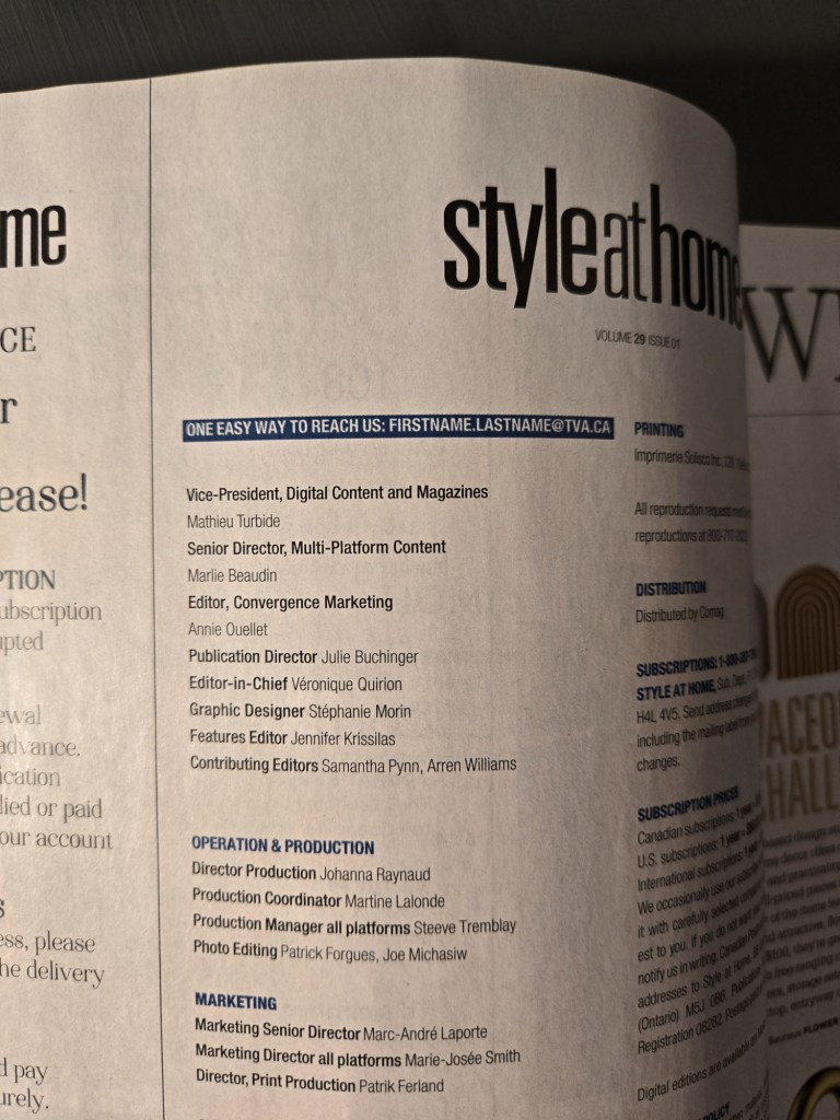
I’ve seen this on personal websites, but this is a first in a magazine masthead for me: an instruction for contacting via email without printing the email. You’re an adult. You can figure it out.
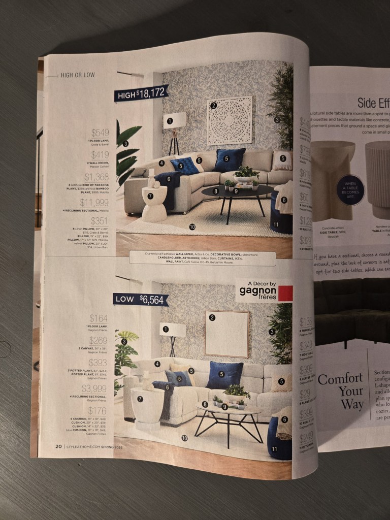
The high price vs low price page is good parallel compositioning. The same layout with two identically arranged but different photos. It’s cool to look at. But I might have put a circle around the numbers on the edges to help the eye match the items.
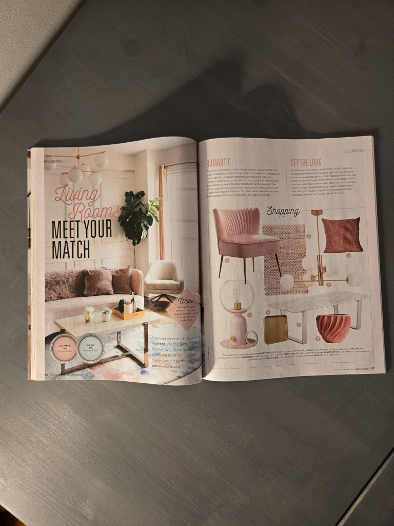
This idea is better when it gets more space to breathe, like this spread on page 58. You can see the items clearly on the right “in-situ”, and then see them in a real space on the left. The dream on one side, and the shopping list on the other.


Leave a comment