
I wanted to pick one wrestling title for this series. They are an interesting, expansive work of loud physical design meant to be seen from kilometers away. Clarity is the most important thing in that art form, and you need to know what an international object like this means right away. I would argue that this clarity is what kept this prop on TV for almost 30 years as it kept changing hands.
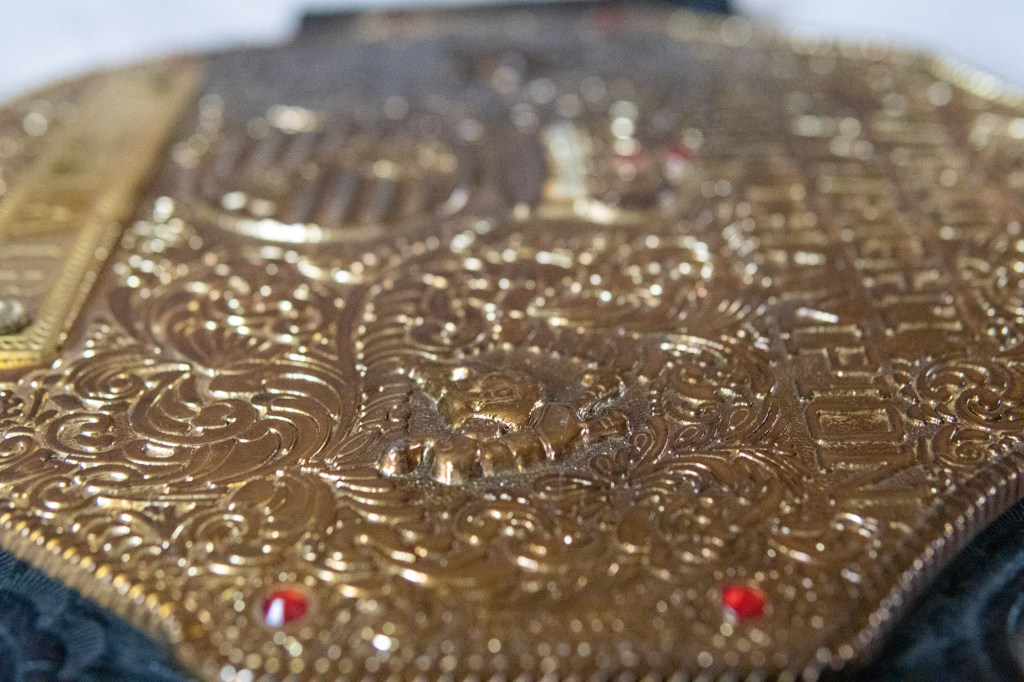
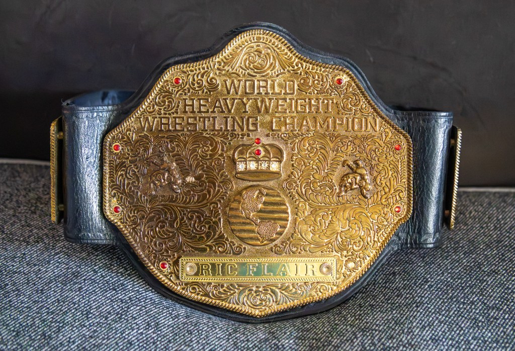
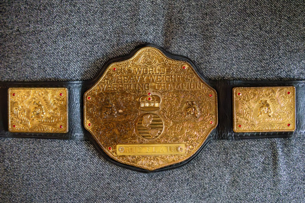
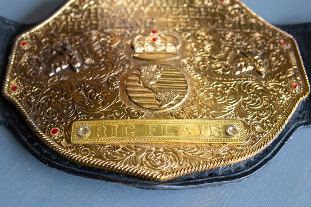
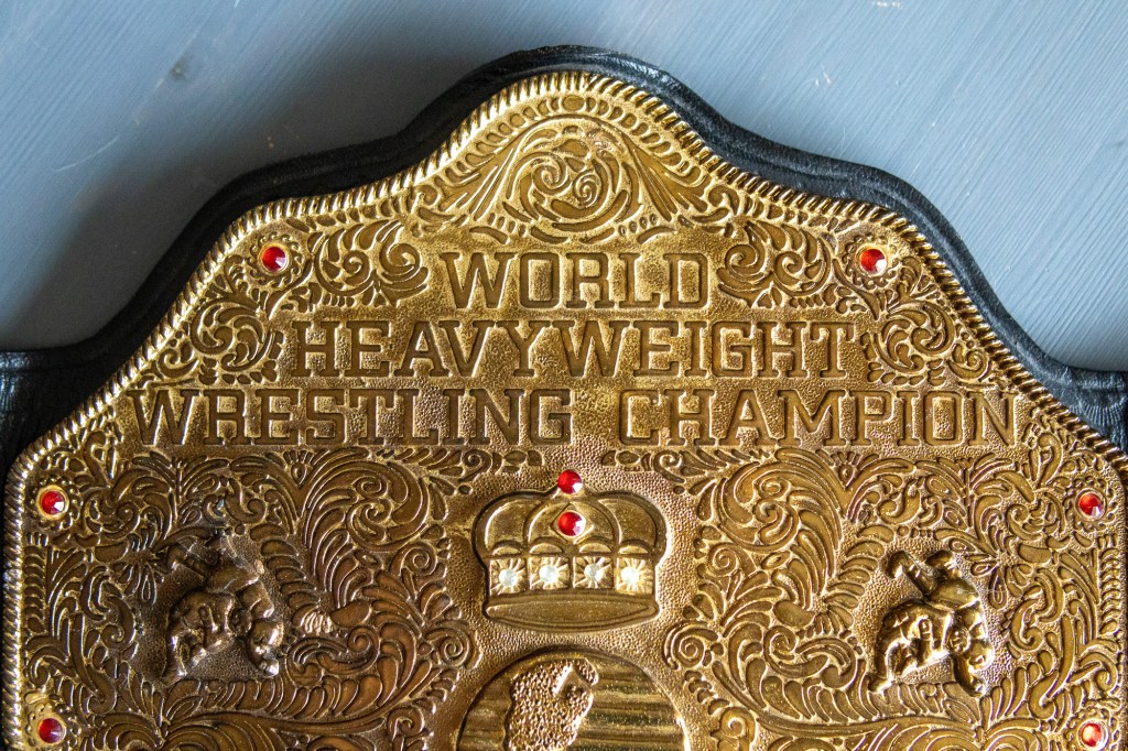
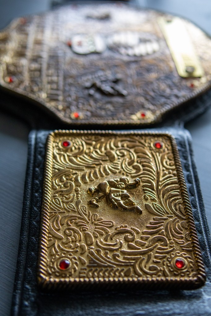
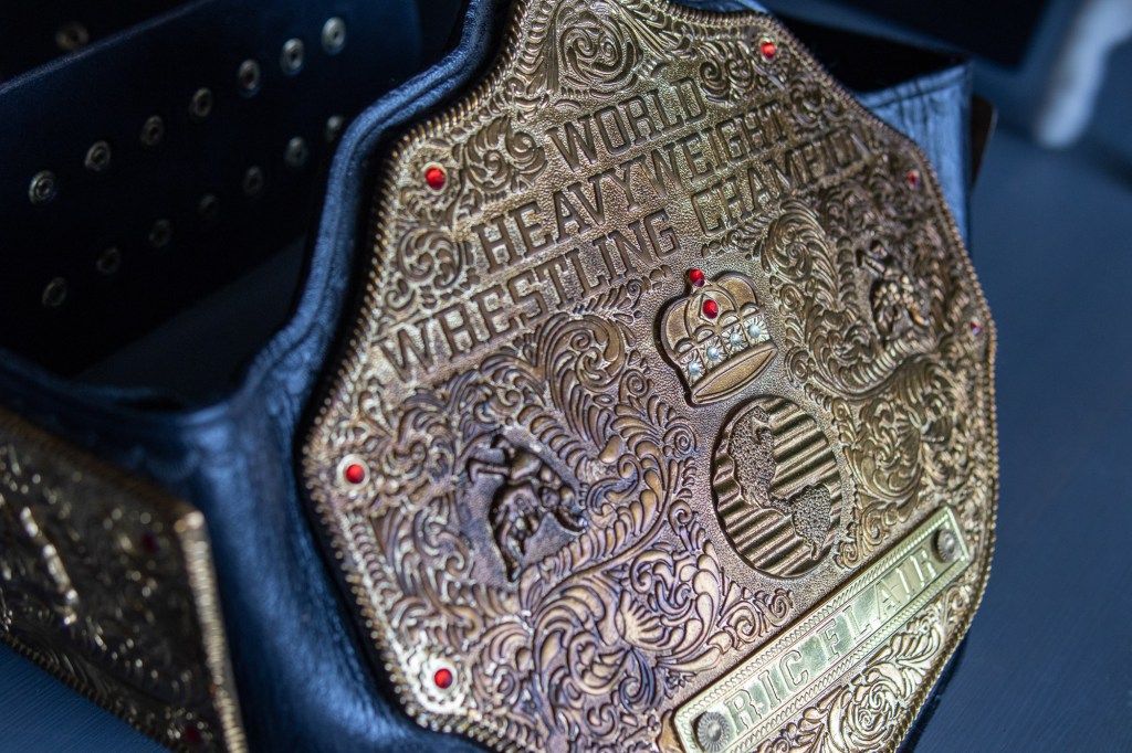
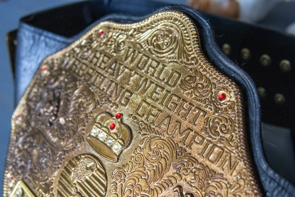
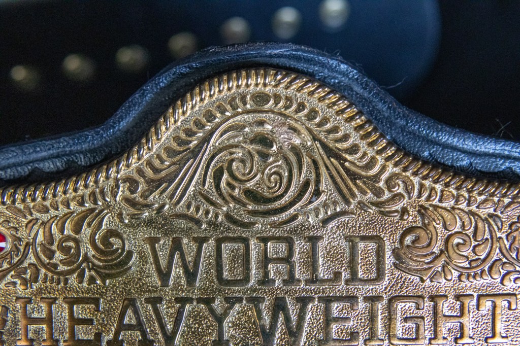
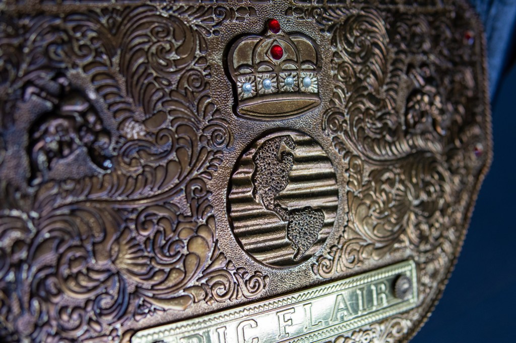
Here’s the layout. Block capitalized letters saying World Heavyweight Wrestling Champion. Below, a prominent crown above a globe, flanked by wrestling figures mid-suplex. All white space is taken up by western-style floral scrollwork, reminiscent of Spanish and southern American leather belt designs. The details are all contained within a visible rope line, the same thing that surrounds a wrestling ring. It carries that craft forward into a drag performance of a belt buckle. It’s bigger and heavier than any normal person would ever ask for.
Last thing. There is no corporate logo on this title. It doesn’t say NWA, WCW, New Japan, or WWE on it anywhere, despite it being a trophy in all of those places. This allowed it to be used as a true international world’s title that connected and undermined its corporate owners. To this day, wrestling fans, regardless of insider knowledge or loyalty to a brand, see someone holding this title and think “that’s the real world’s champion.”
Thank you to my friend Patrick for letting me borrow this for this project.
Additional reading: The Big Gold Belt on Wikipedia, The Real World’s Championship Part 1, 1991–92, The Real World’s Championship Part 2, 1993–94

Leave a Reply