

If you’re ever bored by the look and feel of some magazines, I beg you to just look around at other parts of the world. They’re still having fun out there.
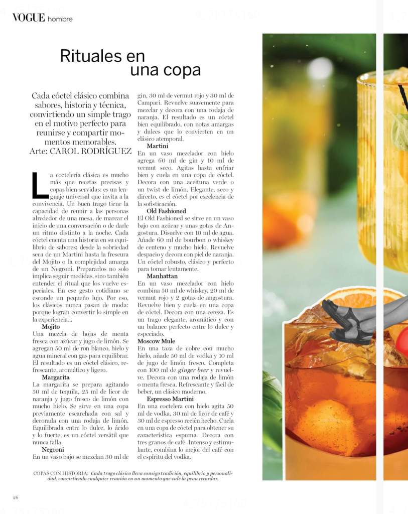
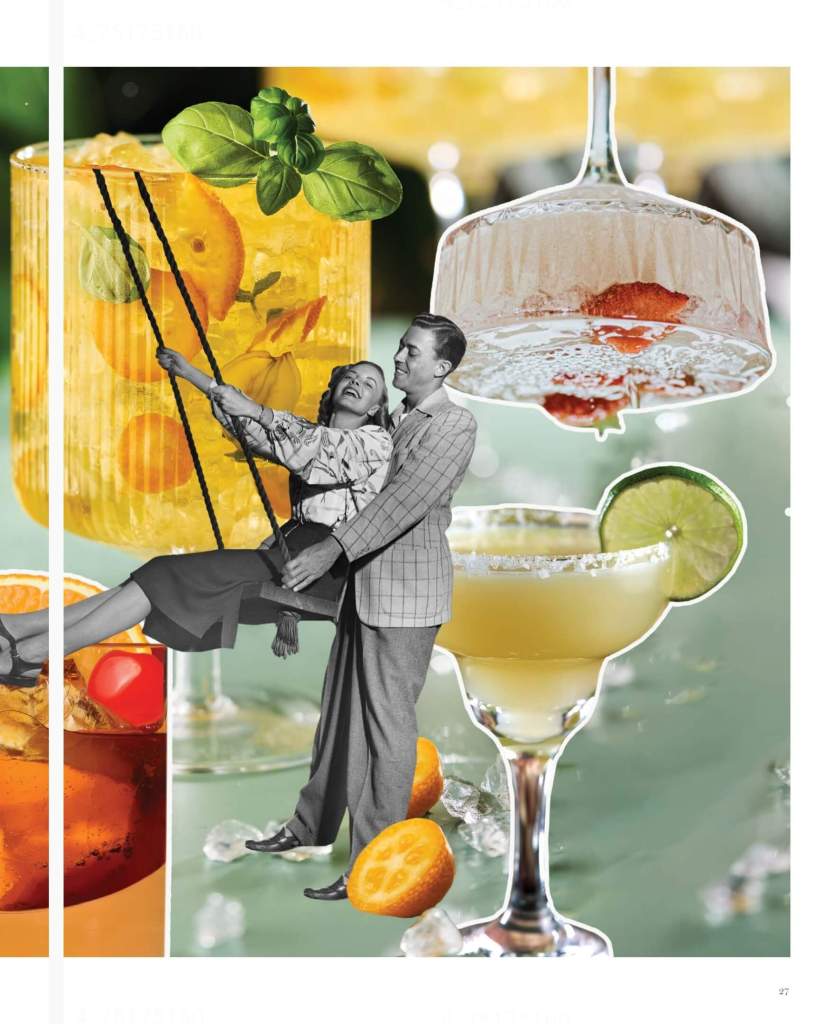
Take this layout for a list of cocktails. We’ve got a tight two-column, four font sizes on one page, a drop-cap L for stature, and manually indented subheaders. Big white strokes on all the images, as if paste-boarded. Human. Lovely.
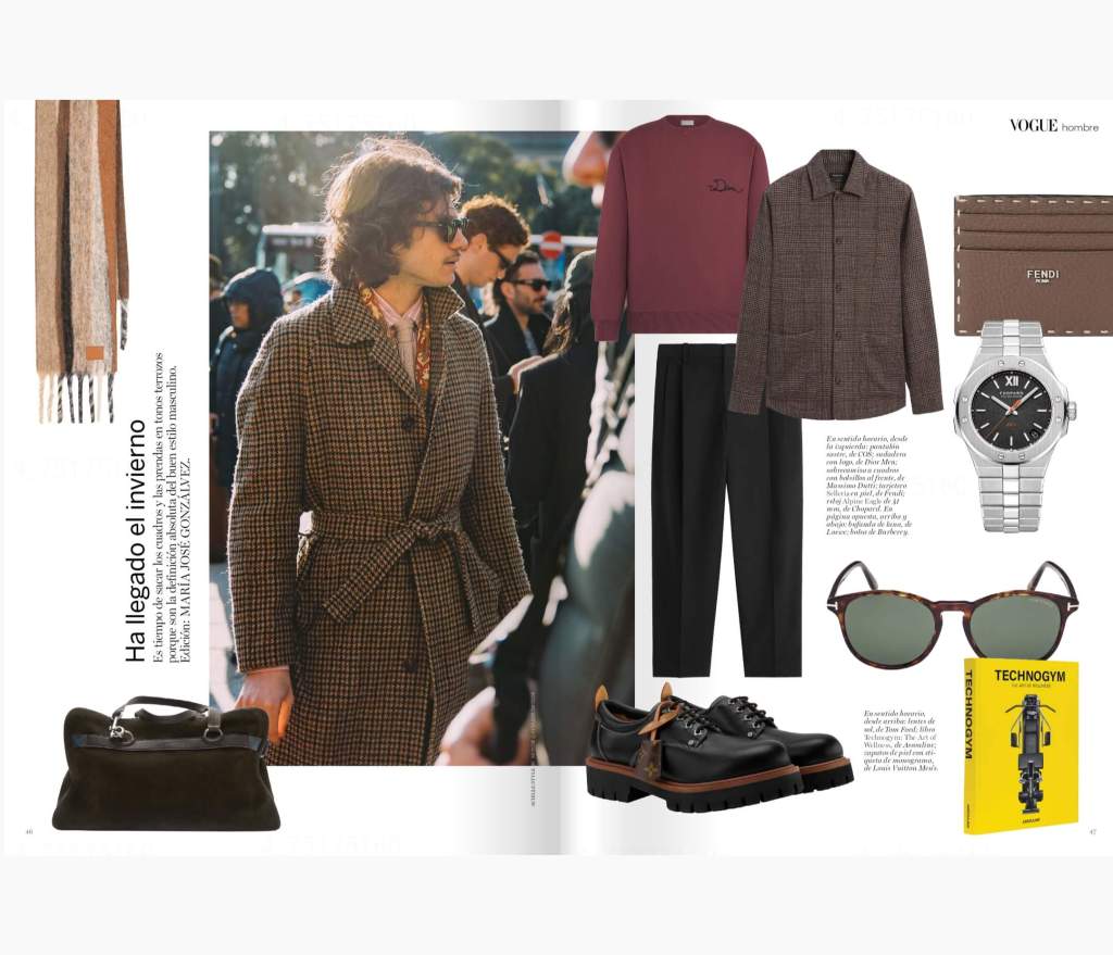
I also love the fashion spread later on, which actually does something rare: puts clothes for men in order of head to toe. Look around at other layouts: they almost never do this.

Leave a comment