
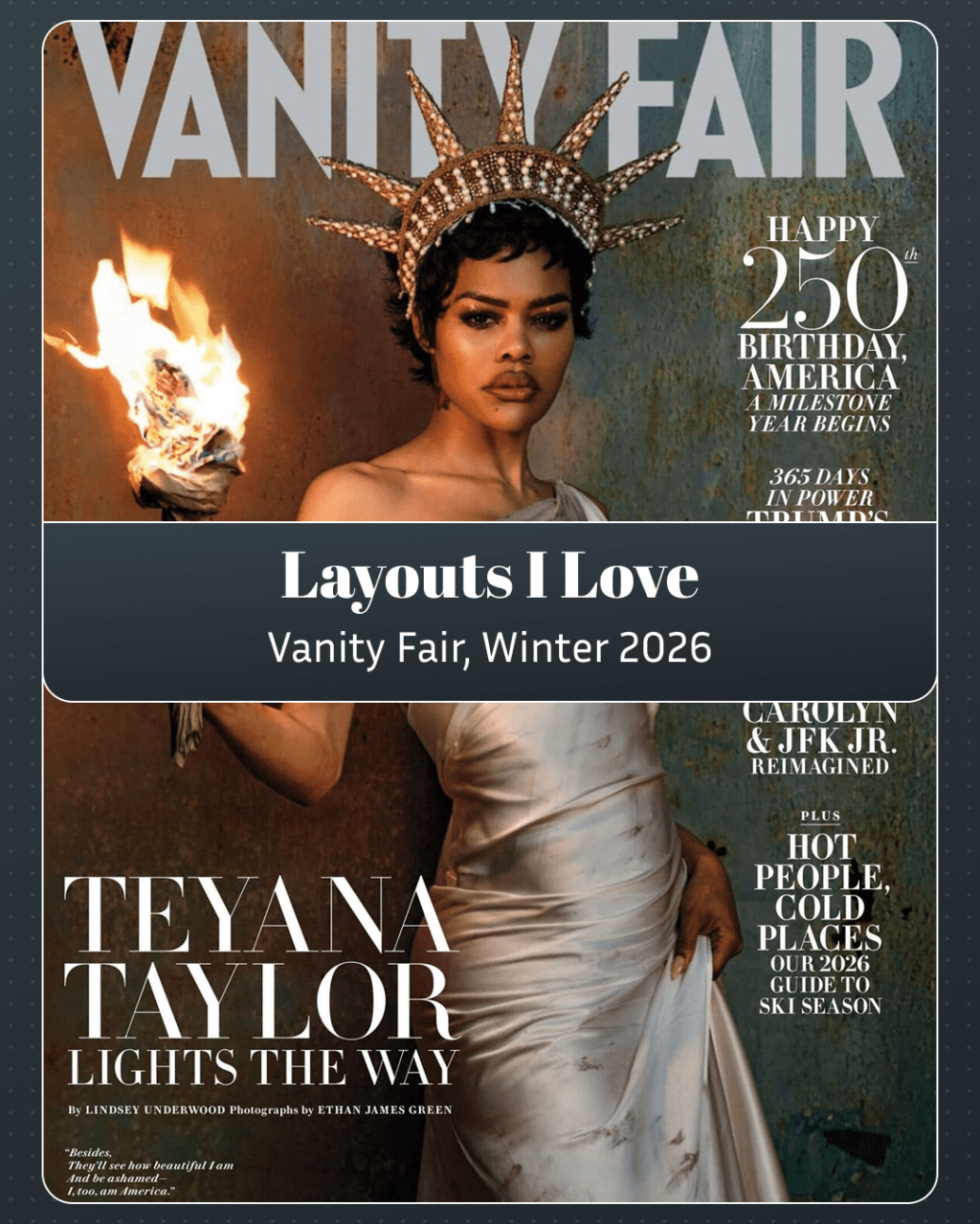
Vanity Fair garnered a lot of attention for the White House feature in this issue. Everyone has seen the photography and some may have even read the story; I’m fascinated by the spatial logic.
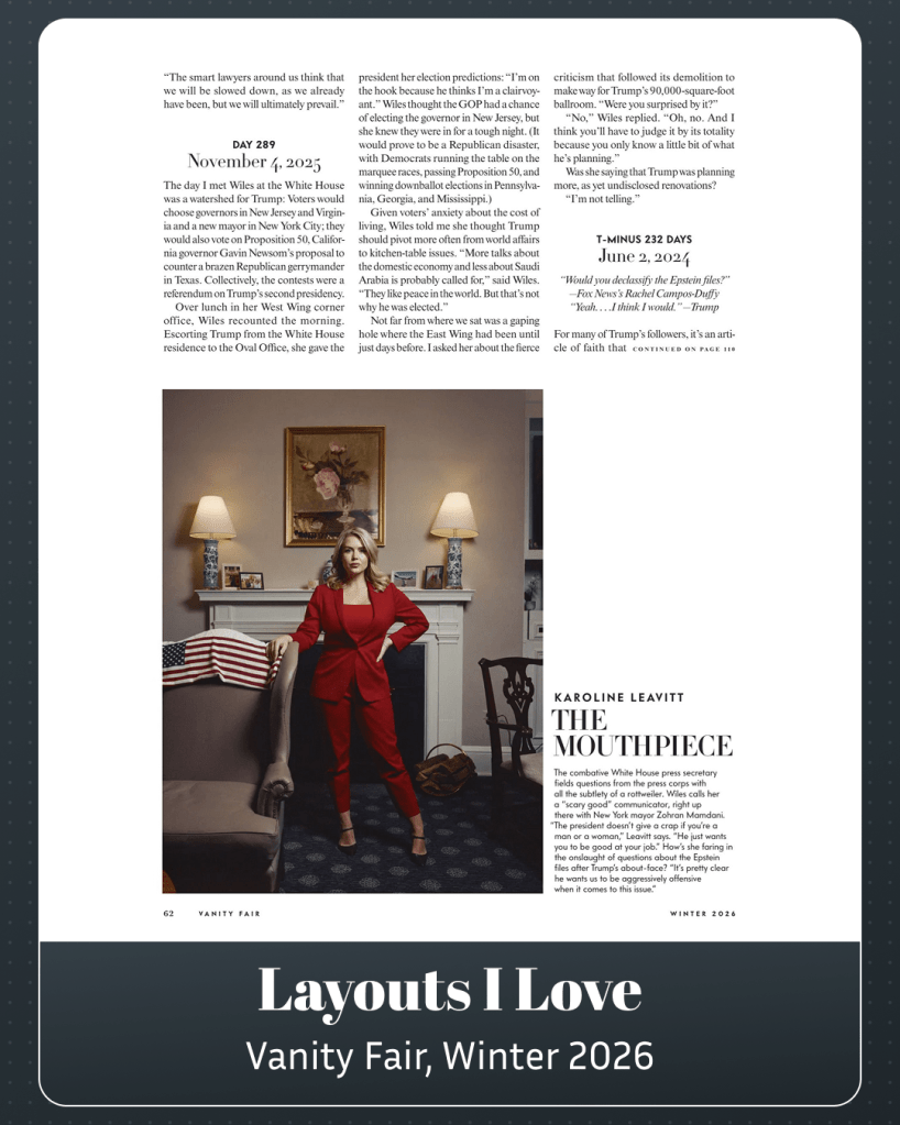
Most of the images take up 100% of the page, but not all. Take this one. The Leavitt photo takes up near two thirds of the height and two columns of width. It’s a deliberate moment of compositional breathing room. The article “continues” at the end of the issue—a mid-sentence cutoff, too. I think these are all interesting layout decisions.
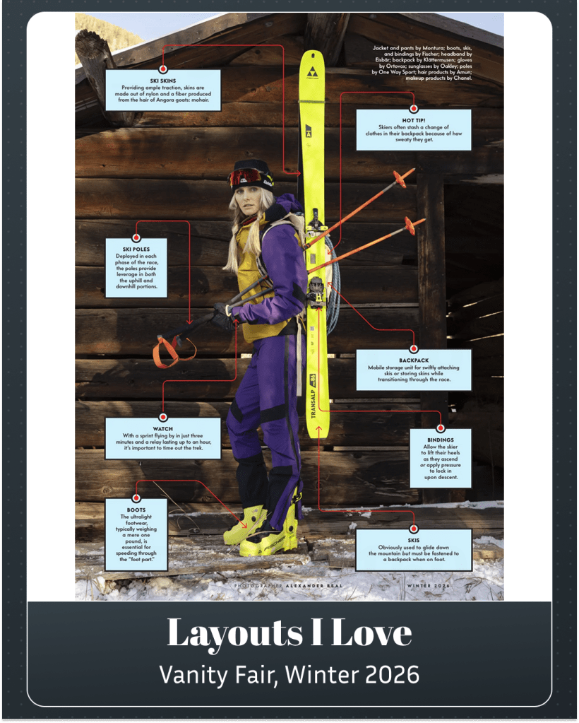
Elsewhere, I’m digging the “Ski Legend” page. The way the items hug the outer edges creates a natural frame, and the red directional arrows provide a perfect visual anchor.
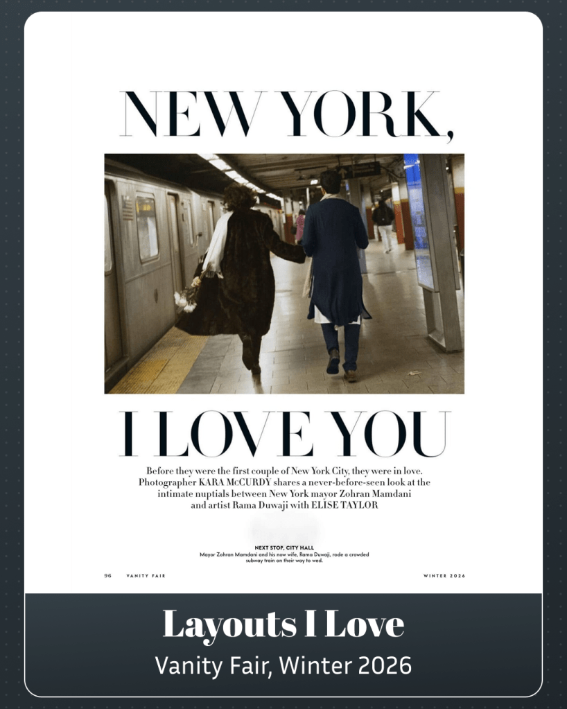
My favourite bit of the issue, though, were the photos of Zohran and Rama on the subway, on their way to get married. A great reason to break out the big display type.


Leave a comment