
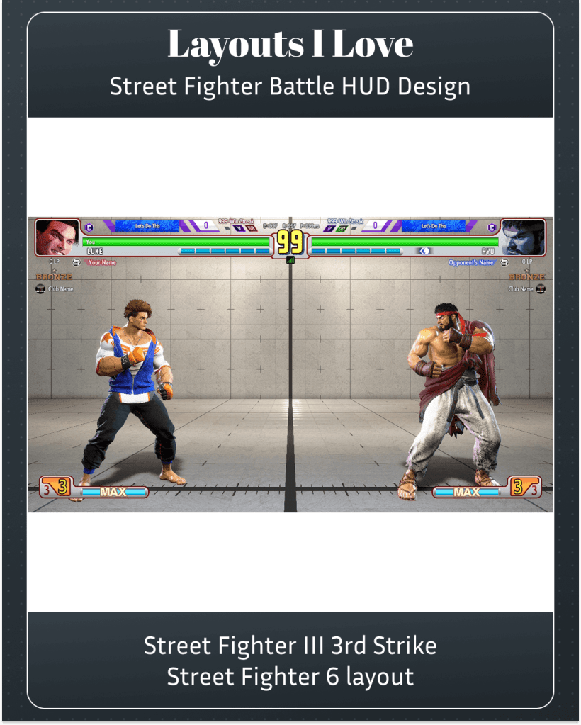
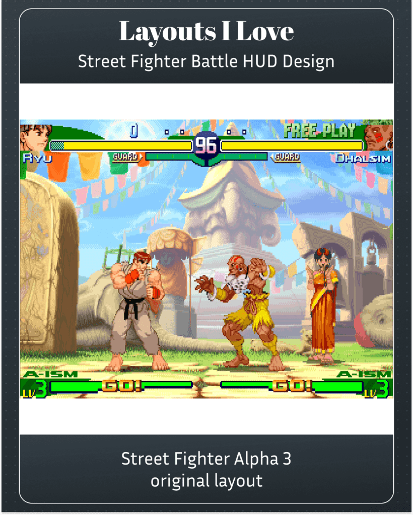
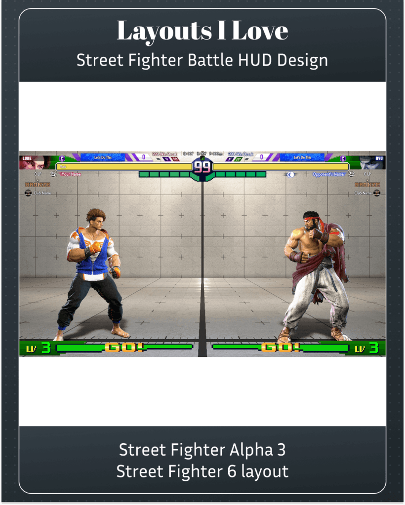
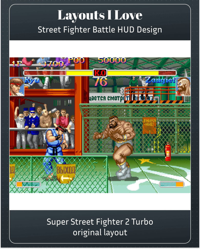
In January 2026, Capcom released a set of six battle HUD (Heads up Display) designs, five of which were based off the look and feel of older entries in the franchise. I did not buy the Street Fighter 4 or 5 HUD designs, because I have no nostalgia for Street Fighter 4 or 5.
I’ve interspersed screenshots and videos of the original HUD designs so you can go back and forth and compare. I think they did a great job of retrofitting these designs for Street Fighter 6.
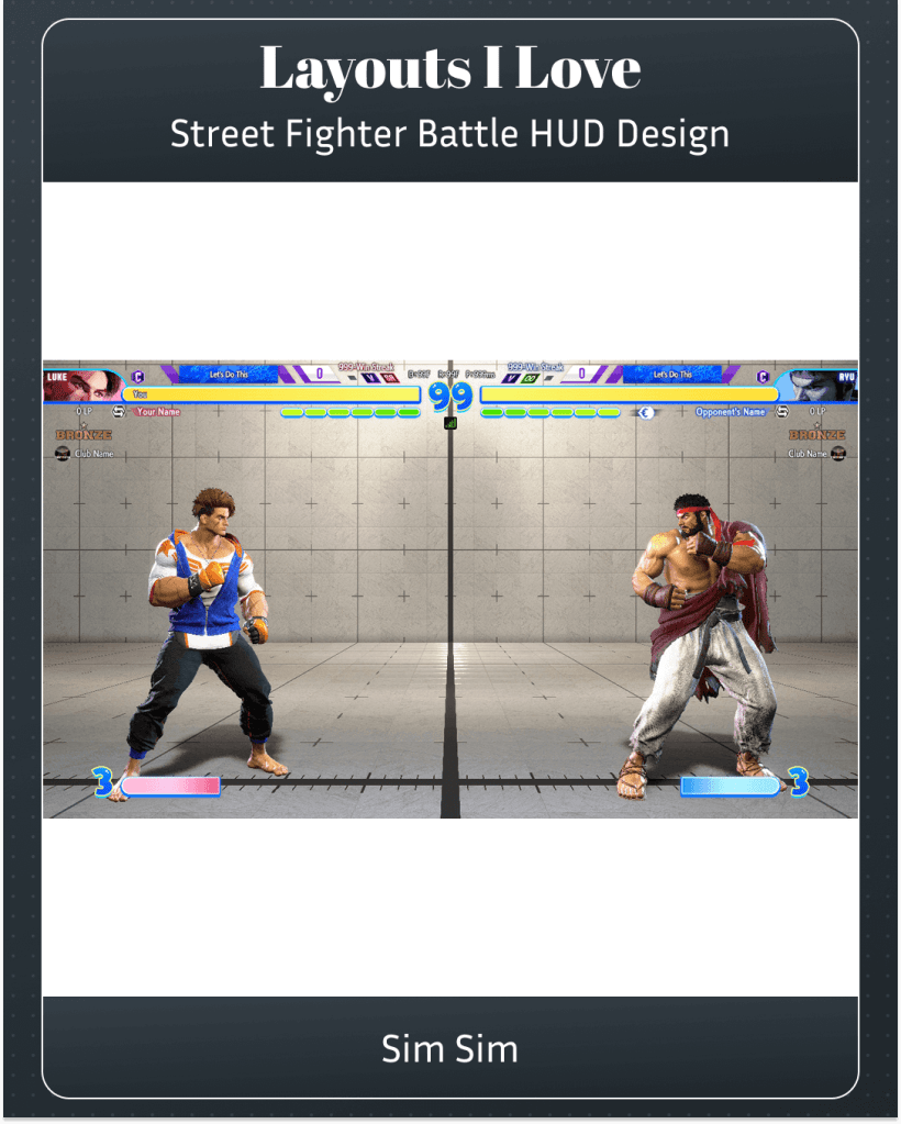
The free Sim Sim design is cute, very bubbly. It would have felt right at home on Dreamcast.
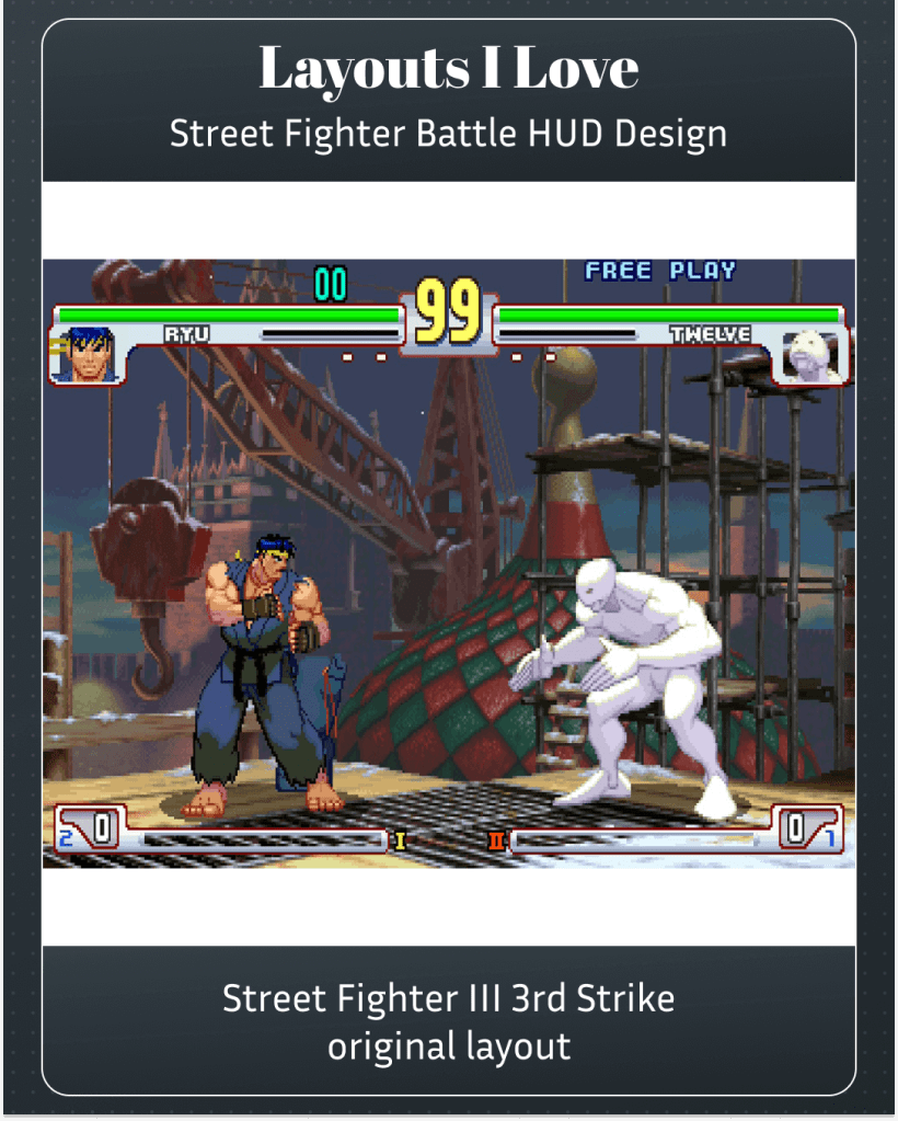
3rd Strike’s design is a benchmark for chromatic clarity. I think if you find the Street Fighter 6 aesthetic too noisy, switching to this might make things easier.
Alpha 3’s design gives you this power meter at the bottom that goes all the way across. The green and yellow choices make sure you won’t ever mix up what is what. But it’s the layout I like the least.
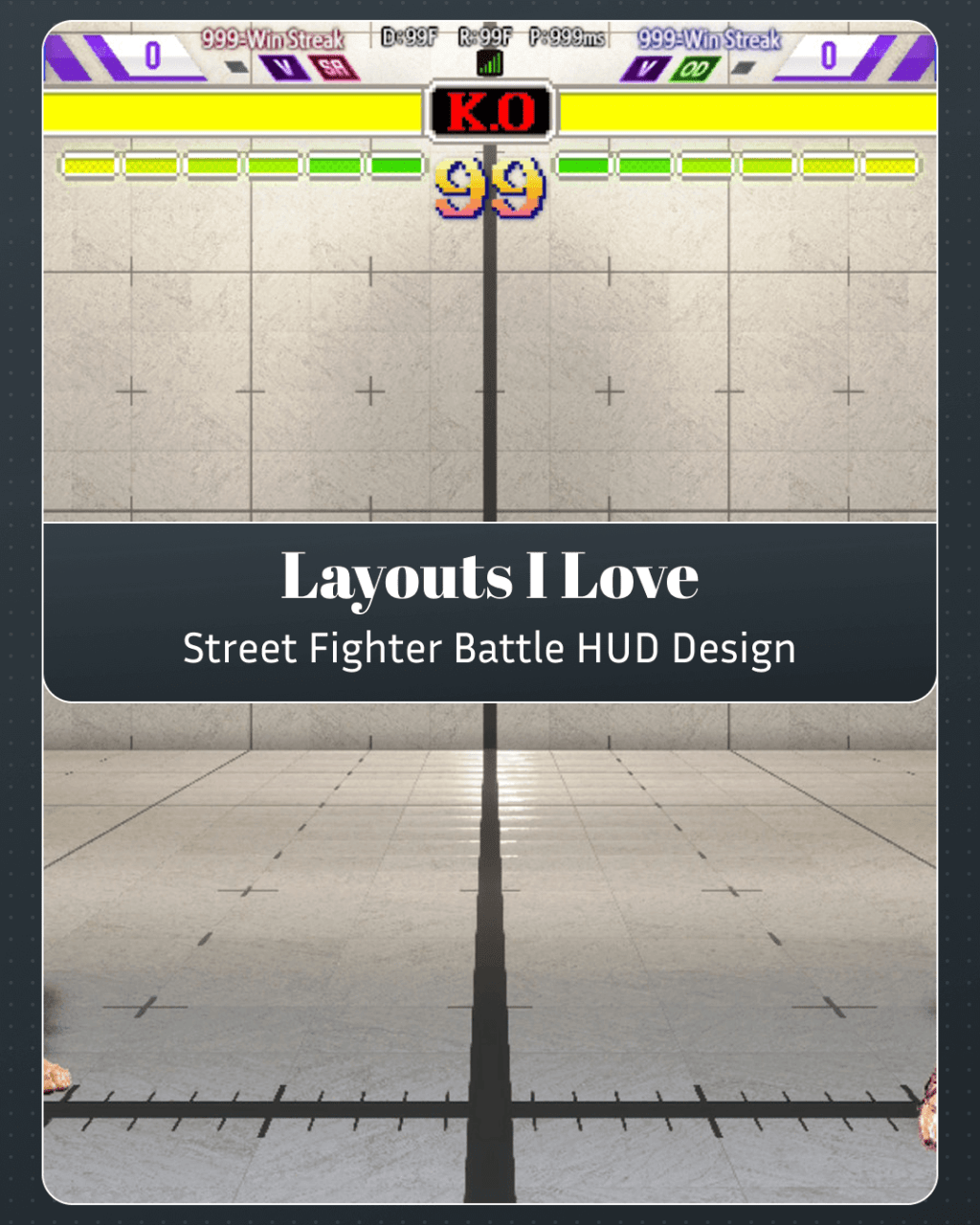
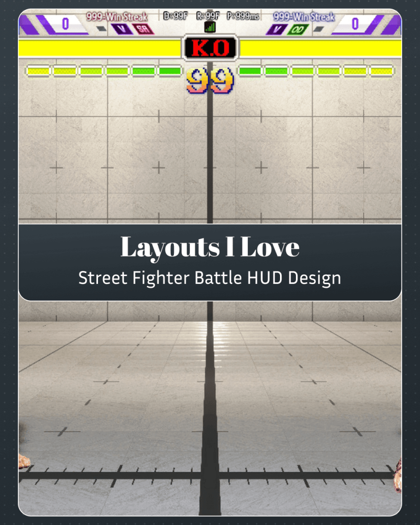
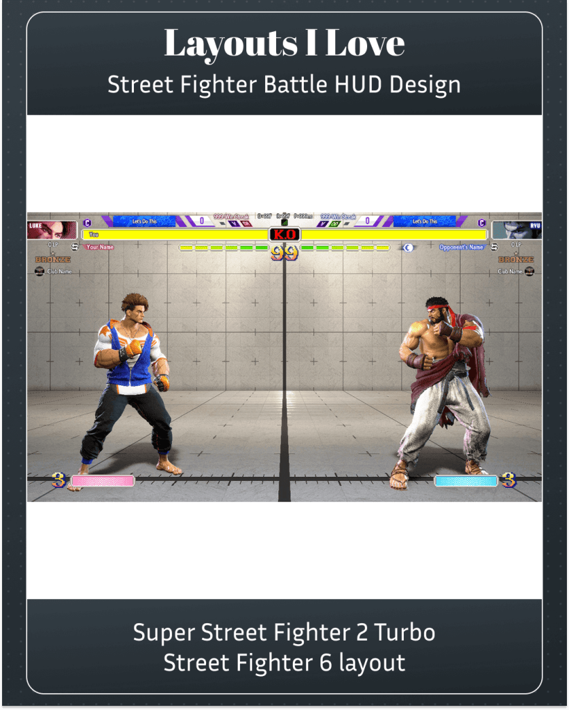
The Super Street Fighter 2 Turbo design is the best one. Is that because it’s the most nostalgic choice? Yeah. Is it because the yellow energy bar and small power meter feels correct in my brain in regards to Street Fighter? Yes. Do I like the halftone for the depleted part of the meter? I do. The red KO in the middle just looks correct to me. But my favourite part is the use of the yellow-to-red gradient in the numbers on screen. That’s the good stuff.

Leave a comment