

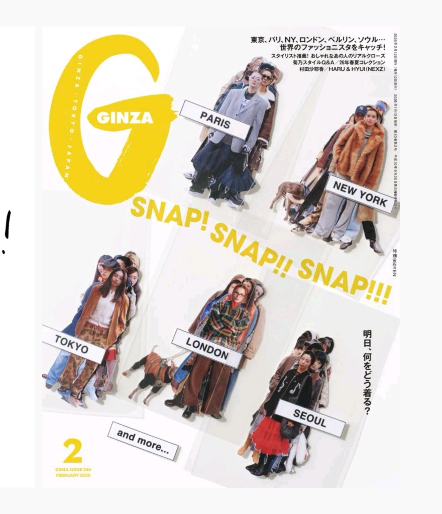
If you want to understand visual energy, look at Ginza’s February issue. The cover is really cheeky, like an in-process set of cutout stickers that you might order too many of online.
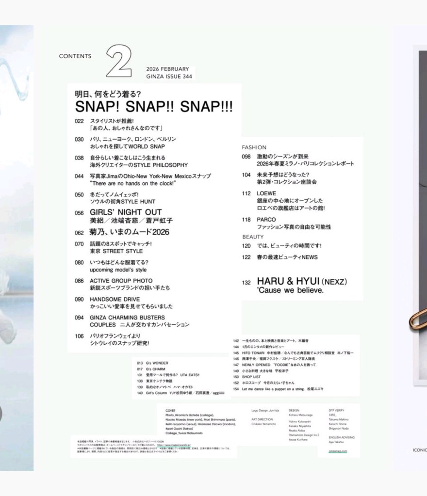
Look at the Table of Contents. You have a massive “2” anchoring the top left, balanced by a dense list of features with a mix of English and Japanese and a mix of font sizes, and it creates a nice typographic texture.
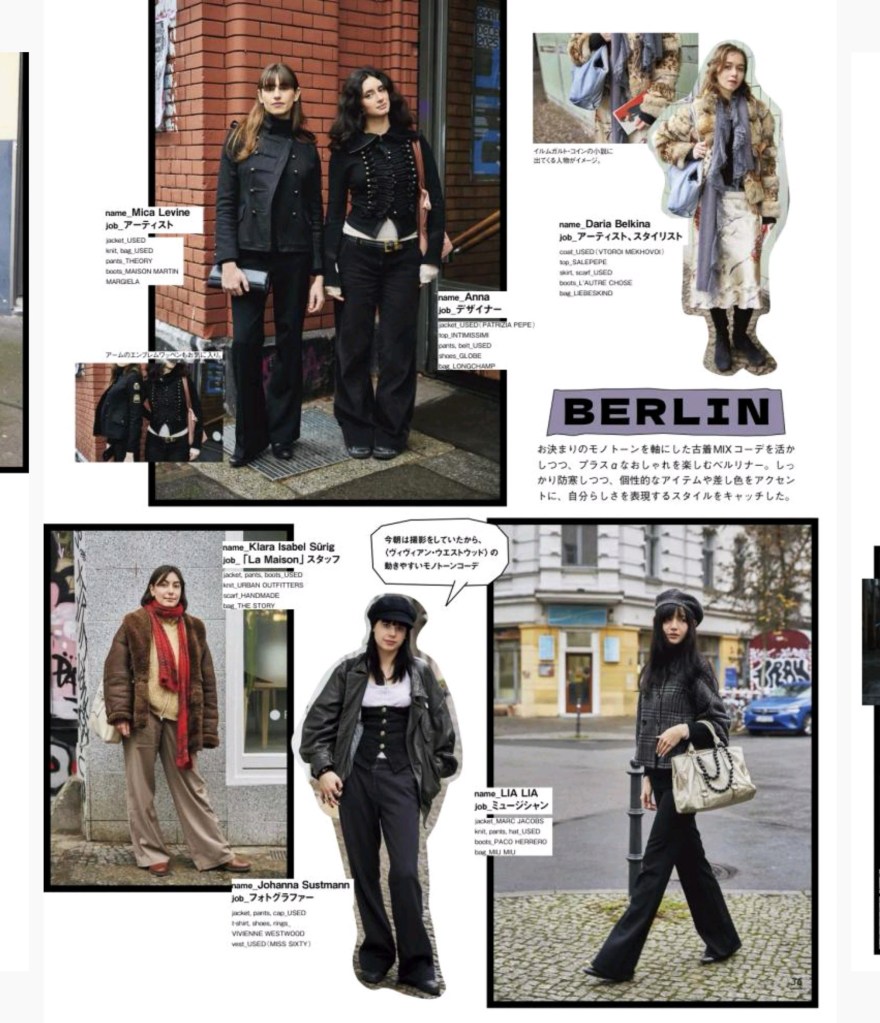
The “Berlin” and street-style spreads take the “cut-out” aesthetic even further. It rewards the reader for looking closer at the details. Further on, the text literally wraps around the subject to keep things interesting.
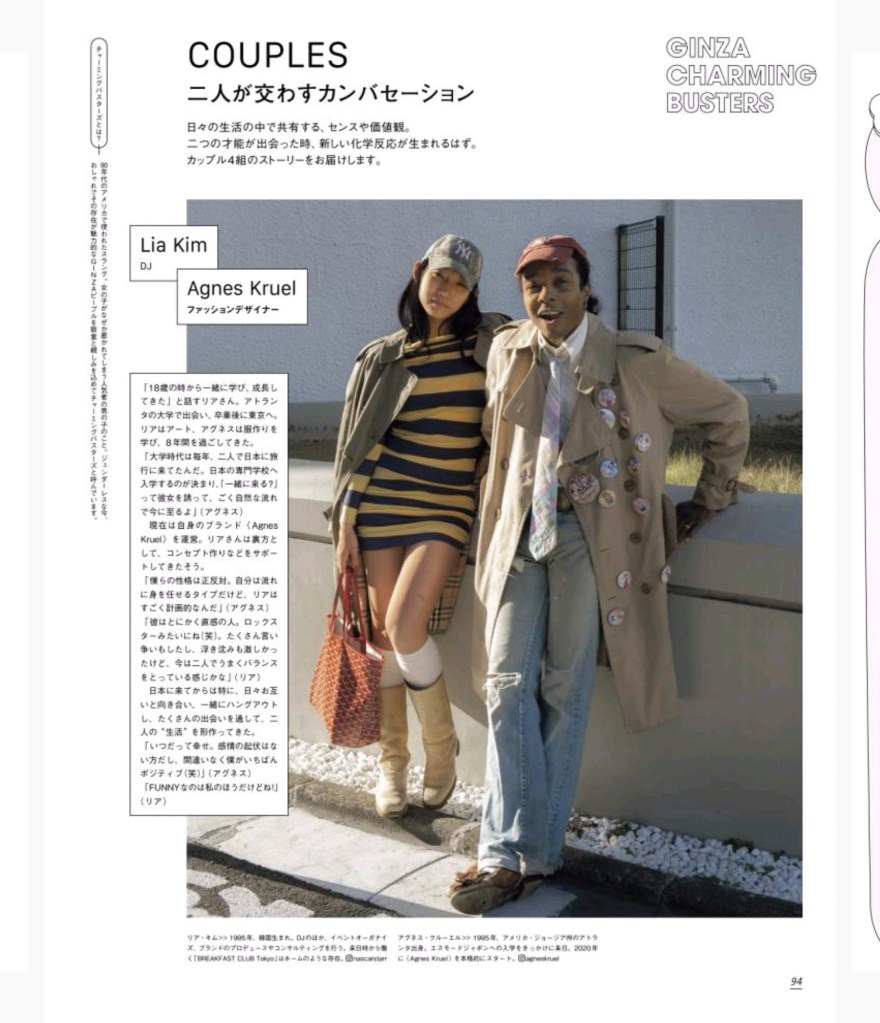
My favorite bit, though, is the “Couples” feature. It’s a moment of compositional calm. A singular, high-quality photograph, perfectly set type, and a clean header.

Leave a comment