

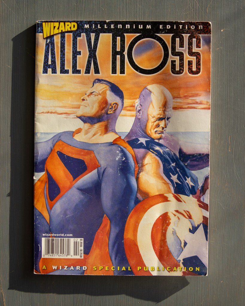
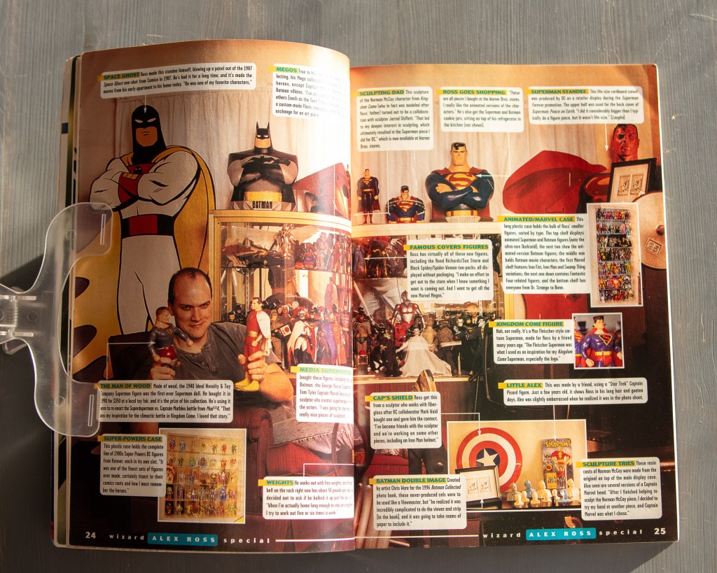
The layout designers at Wizard were masters of the “caption-heavy” grid. They managed to tuck 16 blurbs into a single spread.
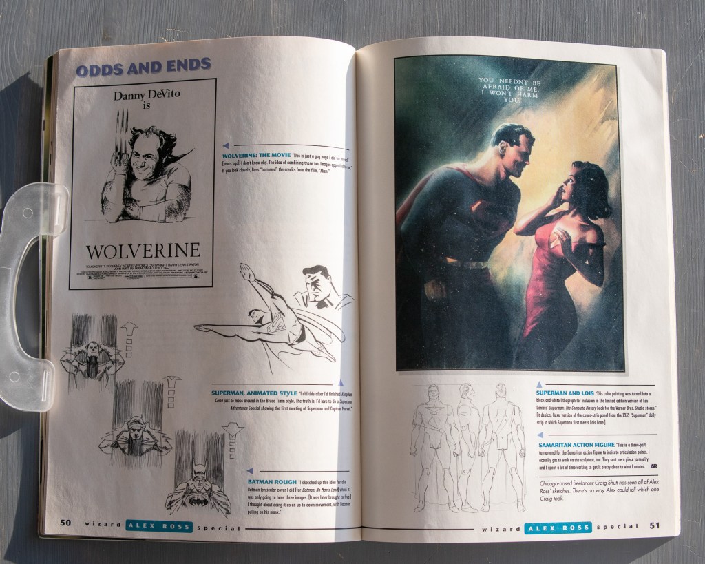
But my favorite part is the process pages. “Odds and Ends” gives a glimpse of the work’s skeletal structure: rough sketches, Batman head-turns, and even a “Danny DeVito as Wolverine” gag. You can still learn about visual weight and character silhouettes from these features.
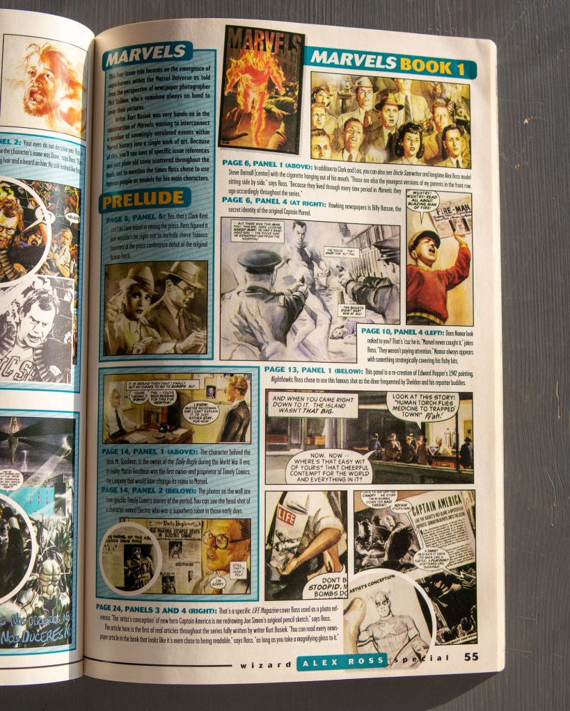
Then there’s the Marvels breakdown. It’s a lesson in references. Each panel is annotated with its real-world inspiration. It turns a comic book into a history lesson, laid out in that classic, high-saturation QuarkXPress style.

Leave a comment