
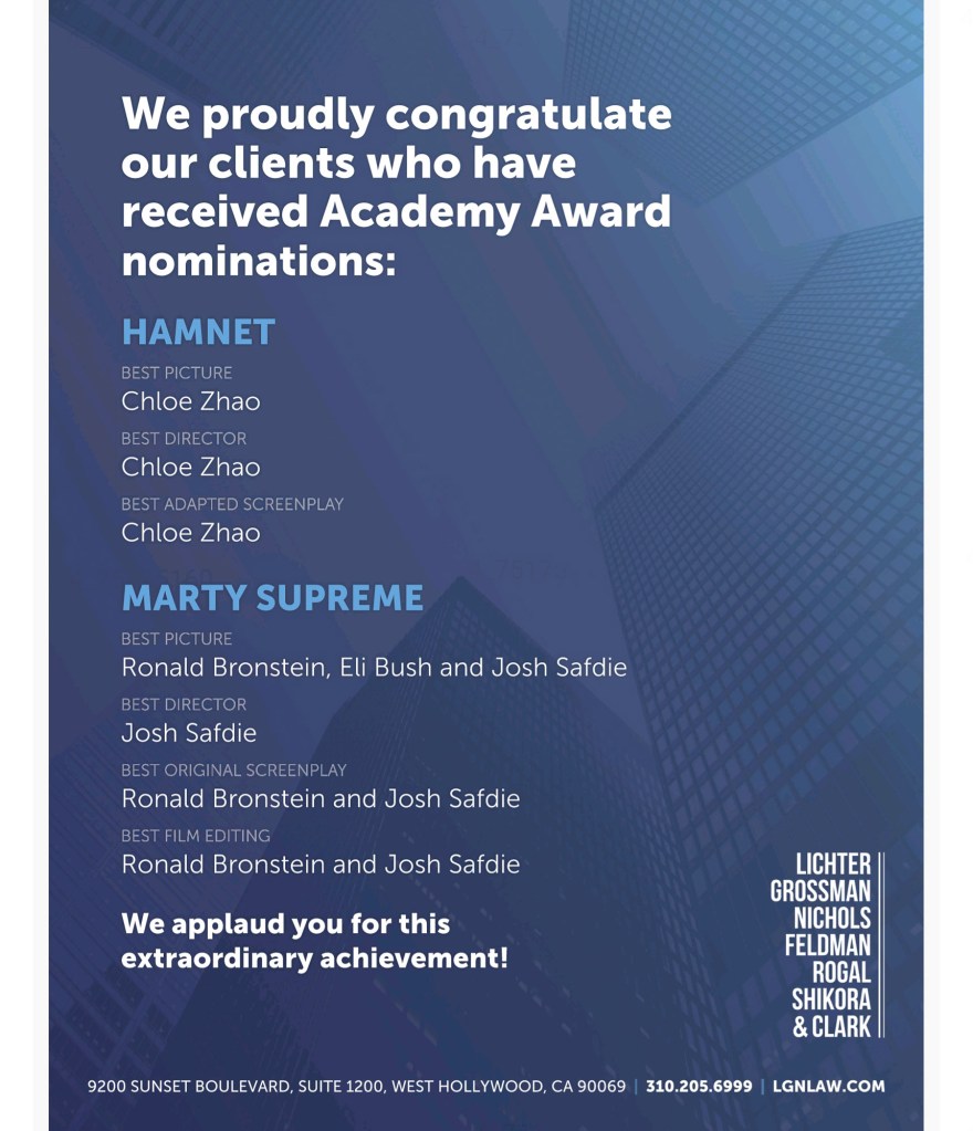
I thought it might be interesting to show off how, in layout, various agencies congratulated their talent in the Oscar issue of Variety Magazine.
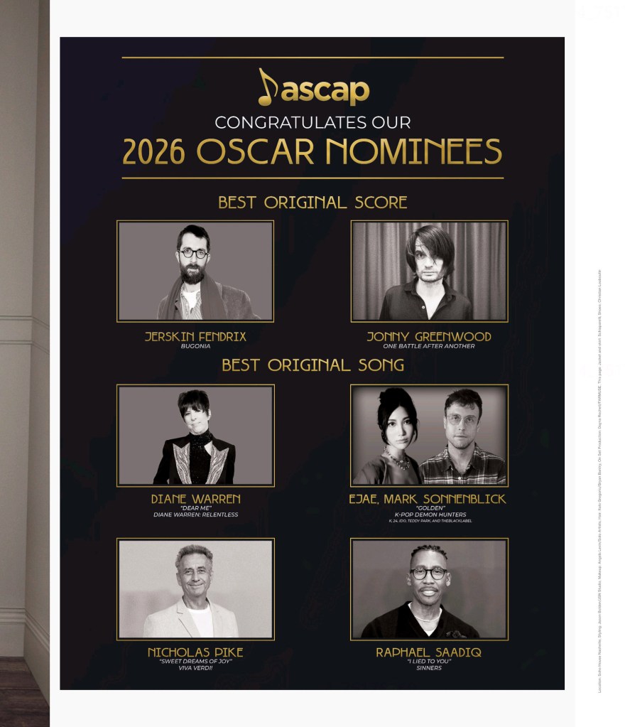
Ascap went with large photos and categories.
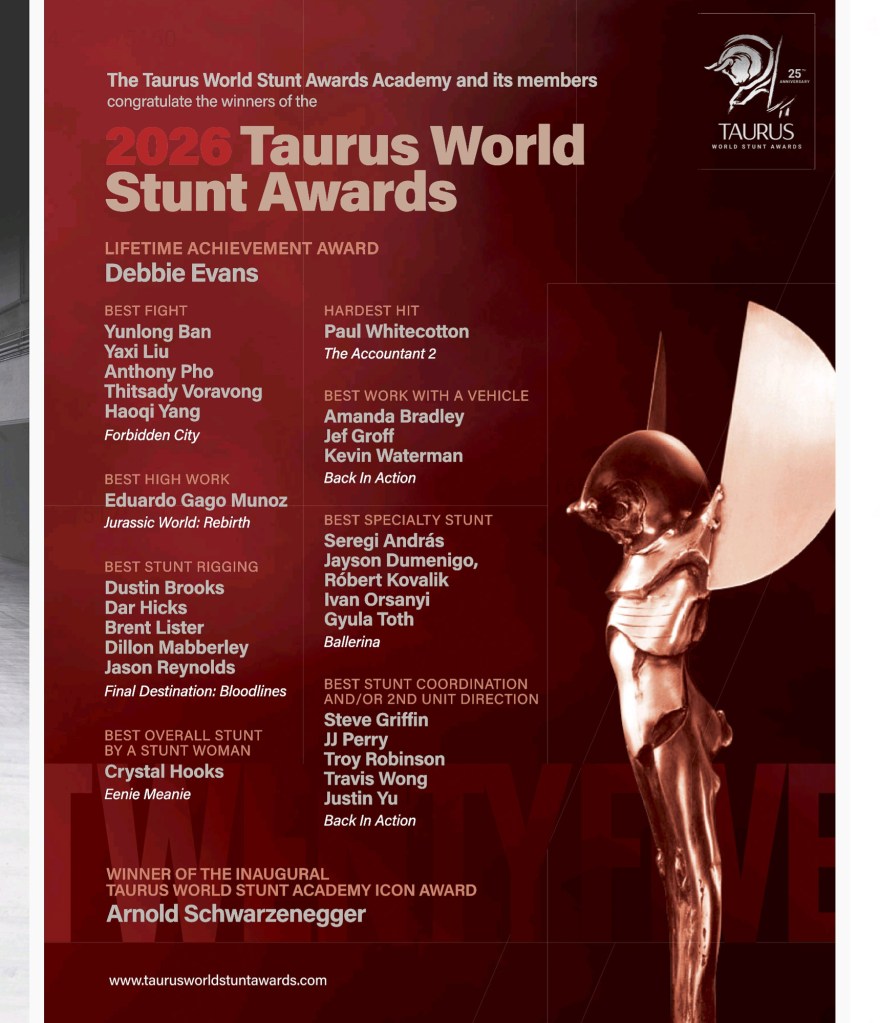
The Taurus World Stunt Awards went with two columns sandwiched with headline names above and below.
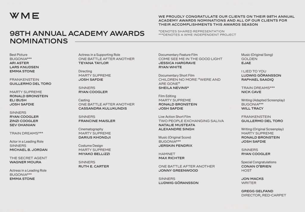
WME went with a two-page spread in grey and black, all text.
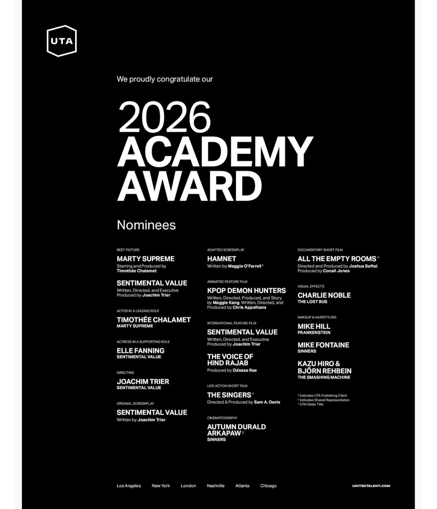
UTA went with three columns, with certain names or movies in a larger heading style.
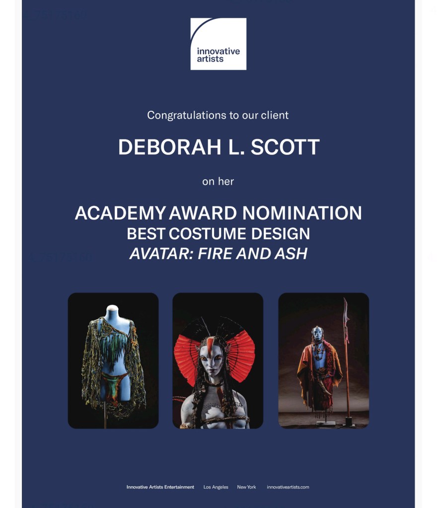
Innovative Artists focused on one person, showcasing their work.
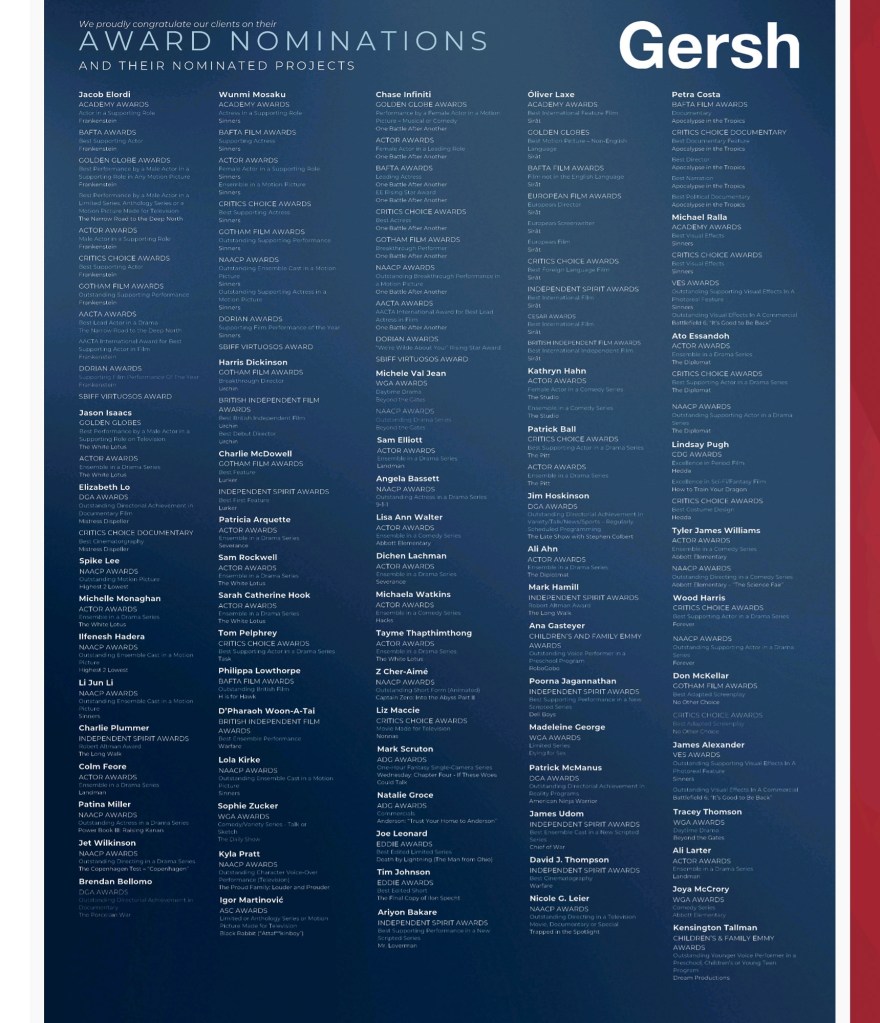
Gersh packed in the names with five columns on one page.
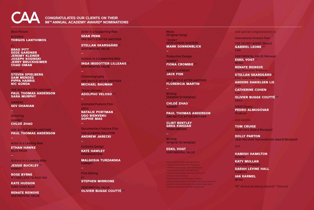
CAA used a two-page spread with white and black text against red with four columns with lots of breathing room.
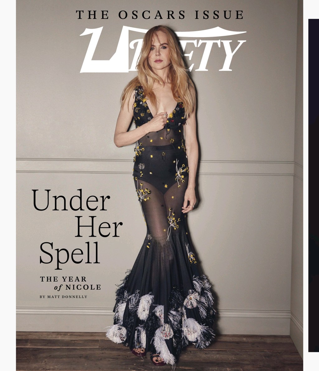
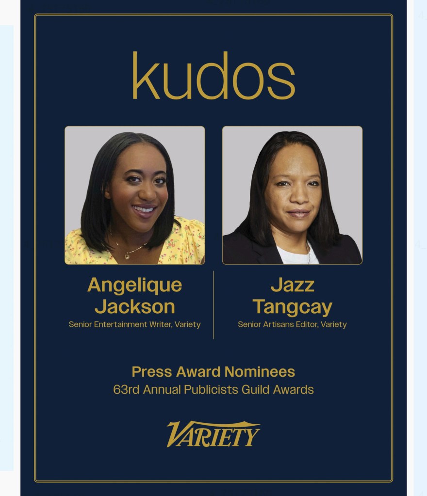
Finally, Variety themselves thanked two of their team with photos and nice big text.
I think this is a cool exercise. No two pages are the same, and everyone made unique typographic choices.


Leave a comment