
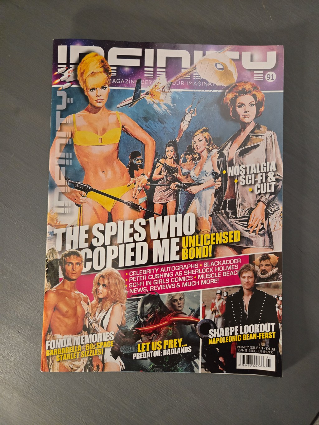
In my retro posts about EGM and Wizard, I talked about how most modern magazines skew accessible and clean, with over printing and noisy layouts left to the past. With Infinity Magazine, I stand corrected. Some layout artists are proudly keeping the high-saturation tradition alive.
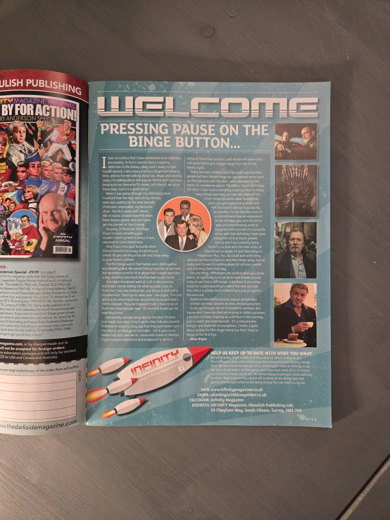
The Editors letter is set in white text on an alternating green background, framed by a darker green box.
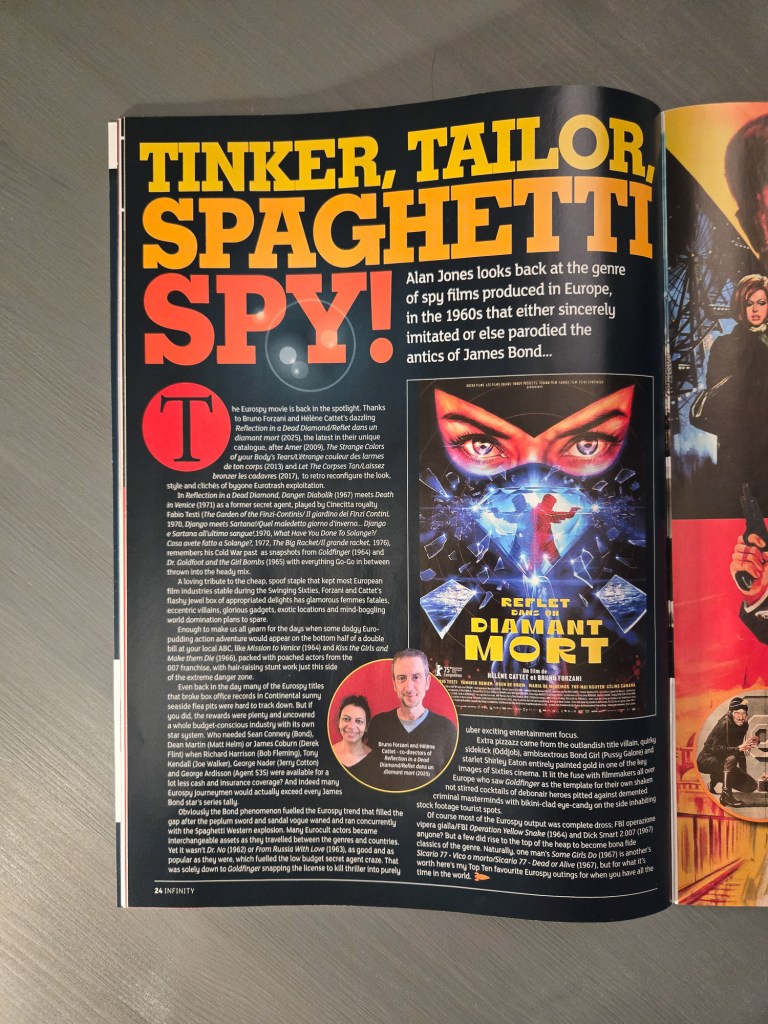
Further in, the layout doubles down on retro-digital flourishes. We’re seeing full-color fills and… is that a lens flare? In this economy? It’s a brilliant bit of stylistic commitment—this magazine covers fun, vintage genre fiction, and the layout does its best to match that energy.
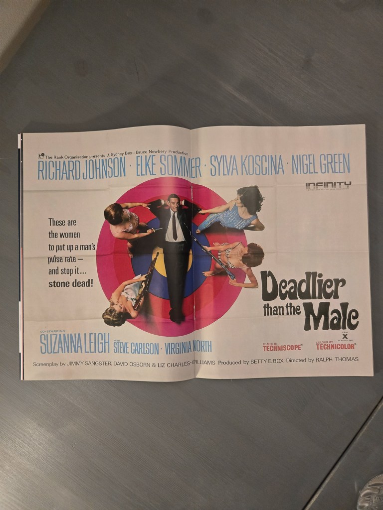
The centerpiece is a literal gift to the reader: a removable two-page spread. It’s a double-sided poster featuring Deadlier Than the Male and Barbarella. Tactile utility in a modern mag. That’s for you. Put it up in your room.


Leave a comment