

How do you set poetry? Filling Station, an independent Canadian magazine, has you well-covered.
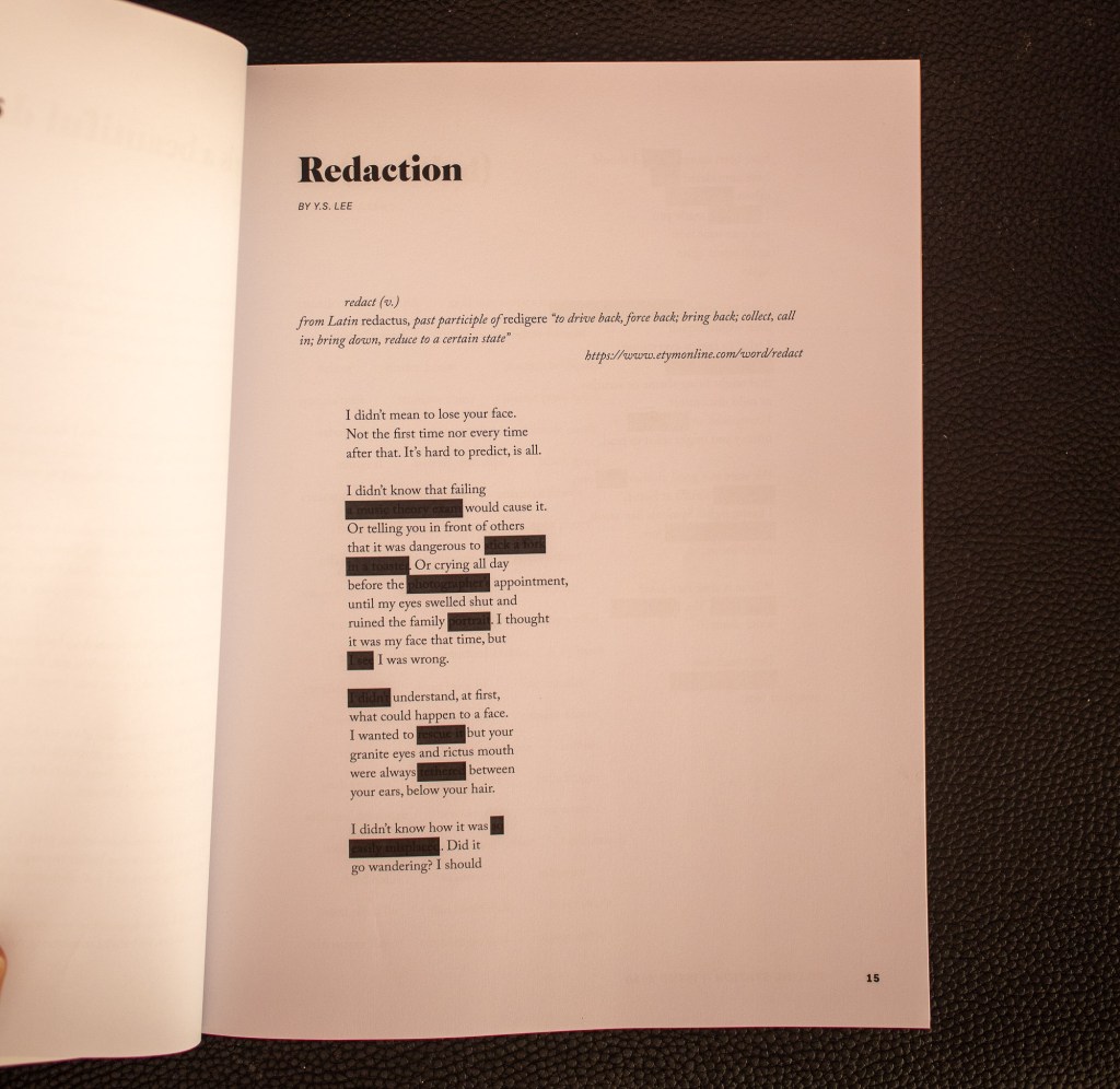
Big margins. Lots of white space. Take your time. Blackout some type, but make it visible if you look closer. Good use of overprint.
At first glance, some of this type appears like its bleeding through from another page. But no. This is pretty thick stock. Everything here is on purpose.
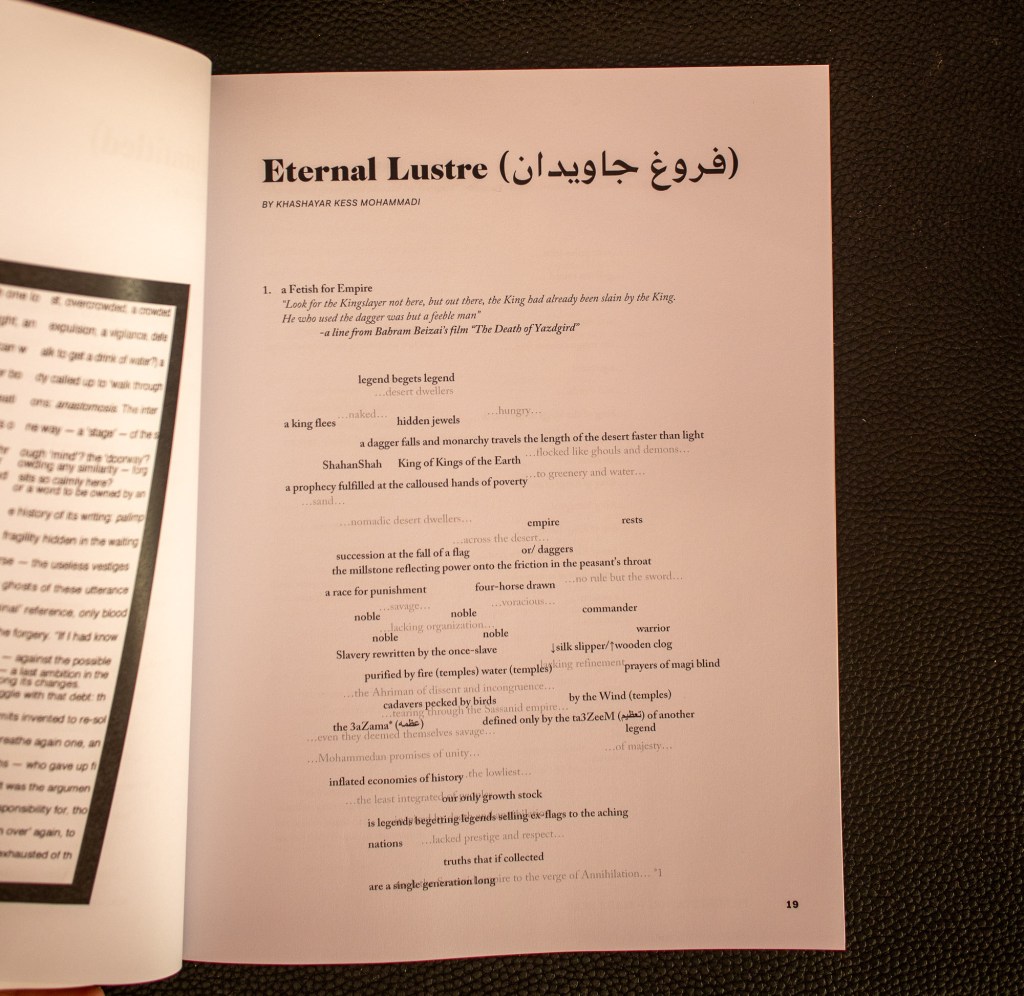
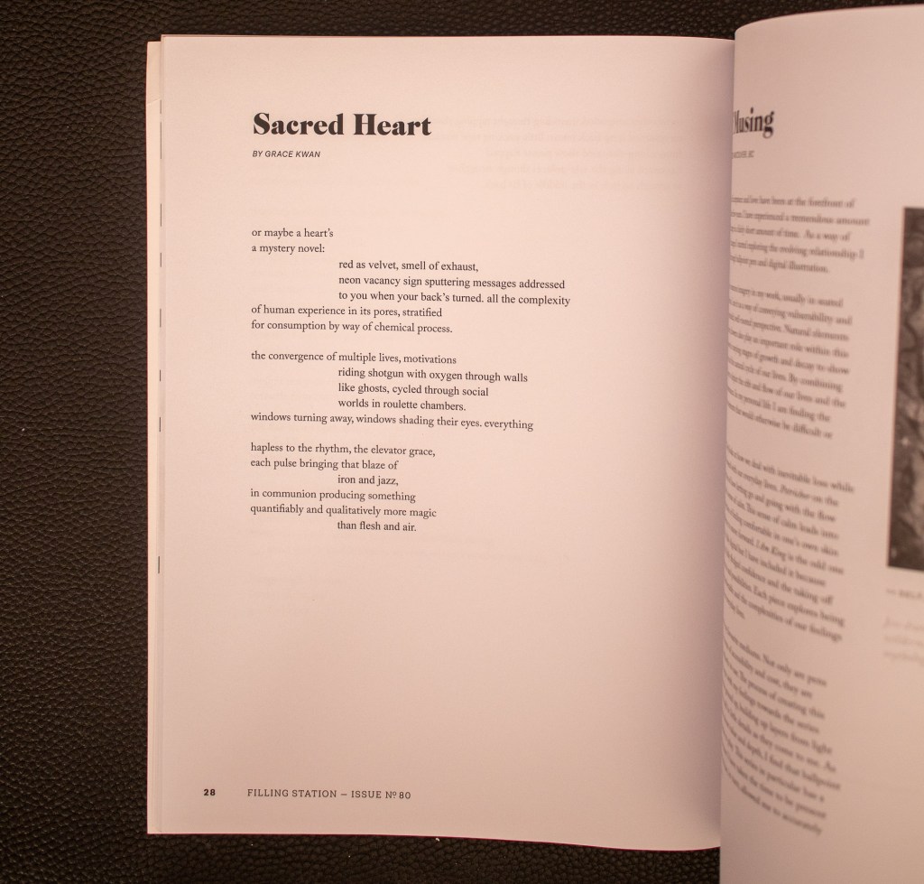
Laid out poetry gets to play with indents and orientation in a way most set type doesn’t. So don’t waste the opportunity.

Leave a comment