

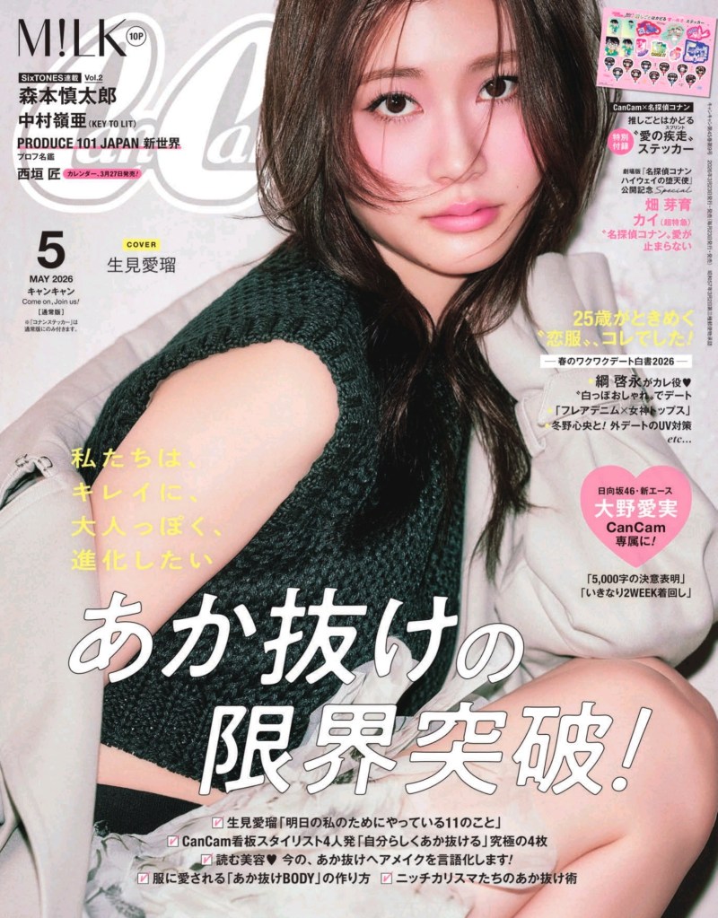
CanCam Magazine is commercial maximalism. It’s dense and colourful but so fun to look at. For this post, I wanted to highlight their spread layouts.
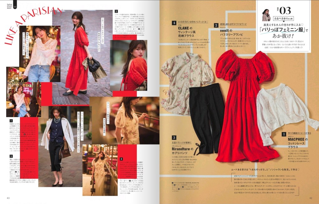
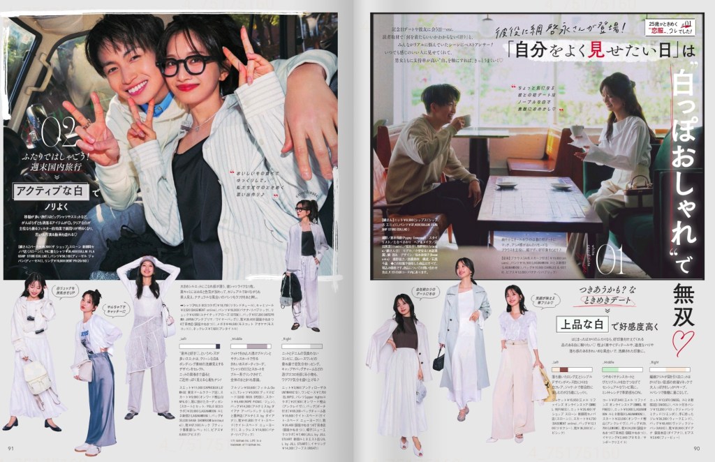
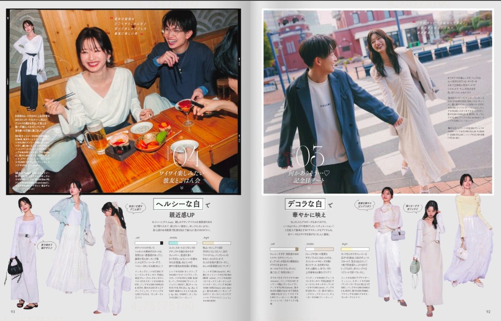
The “Travel Wardrobe” spreads are all held together by a strict color story. See how the soft pastels in the outfits contrast with the vibrant red, while both are mirrored by background elements.
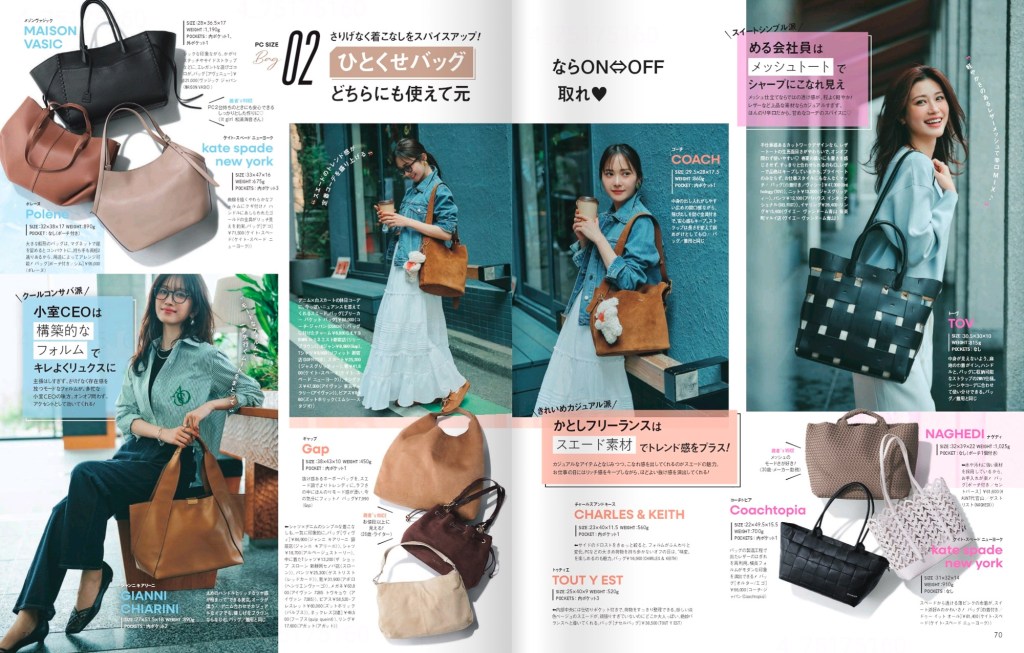
Look at the way the display type playfully overlaps over each image. The designer uses different fonts and bits of handwritten type to add texture to the collage.
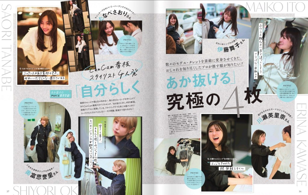
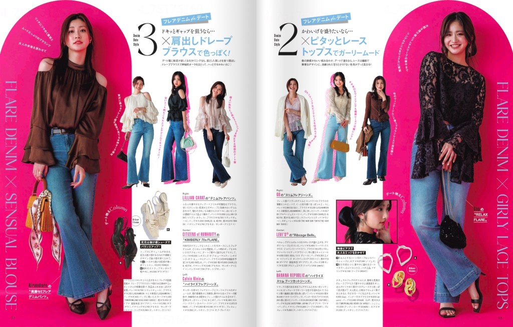
Each spread in this issue tells its own story, and uses strong layout to guide the eye, while also making sure each item has its own orbit of information: price, brand, and a tiny blurb, all aligned to a secondary grid.
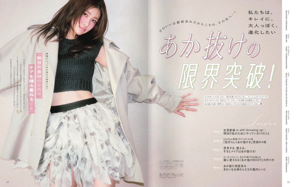
My favourite spread is this one, with two large framing blocks surrounding the model on each edge, with a smaller selection of modeled outfits interconnecting them. It’s so eye-catching.

Leave a comment