
-
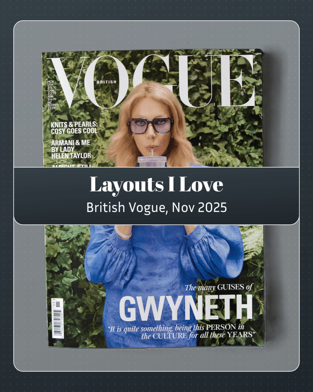
When I told my friend @friggy.pop about this series, he asked, “So, what are you going to read? British Vogue?” Later that day, I saw it on a rack. It’s likely been there my entire life, but I’m not sure I ever noticed it. Why not British Vogue? Whatever lingering bias I had against mainstream…
-

Anan is a weekly magazine every bit as full as most monthlies: 112 pages of interviews, shopping, and themes. This issue’s monograph? Chocolate, just in time to get everyone excited for Valentine’s Day. Musician Ryosuke Yamada’s photoshoot is… Sorry, where was I? I should order an espresso martini… 🍸 These layouts of chocolate are really…
-
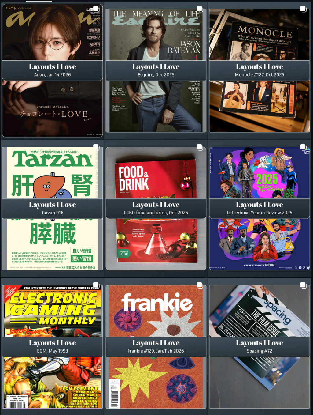
On January 1, 2026, I launched a social media project called “Layouts I Love” to regain confidence in my online presence. Inspired by others, I embraced video content despite initial hesitations. I’ve learned the importance of planning and adjusting designs for better engagement, while navigating the evolving social media landscape.
-
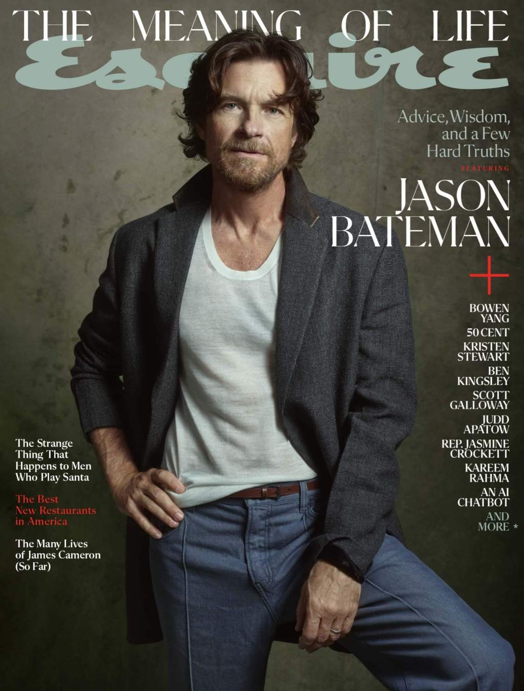
Esquire’s layout game is professional and clean, but there’s delightful details to keep the eye engaged. The masthead for December isn’t just a colophon, but an added layer of context centered around the issues’ theme. Five columns, four items. How do you make this interesting? Cascading. Draw the eye down and through. I thought it…
-

The articles explore various themes: the challenges and potential of open-source layout tools for print, the saturation and diminishing impact of social media, and the paradox of employer control over productivity in the workplace. They also examine Japan’s vibrant small business culture, the attention economy’s contradictions, and the profound emotional engagement with literature compared to…
-
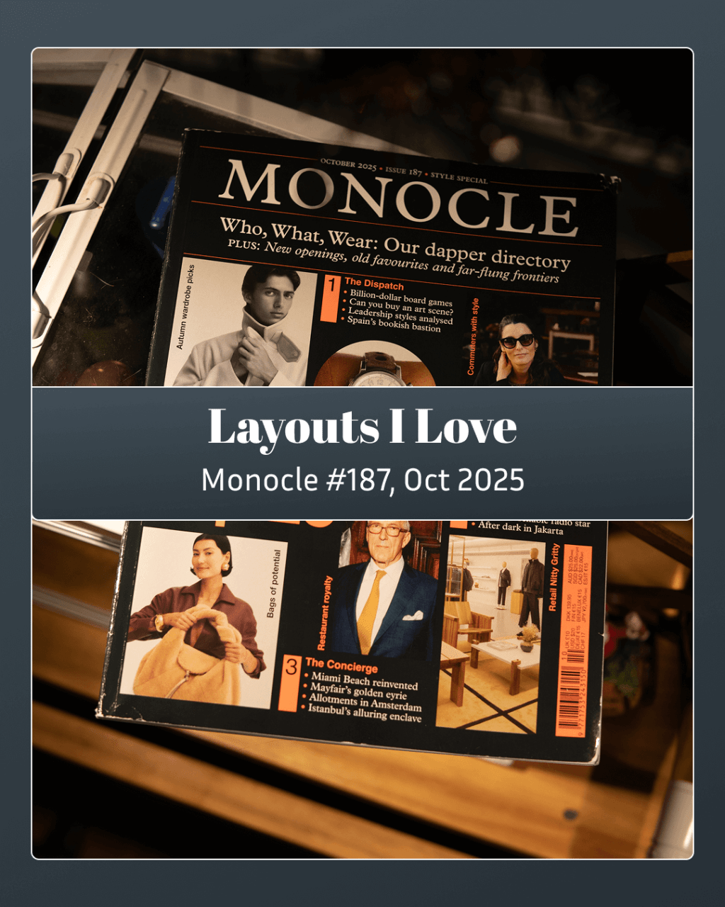
Monocle is a good enough magazine to be worthy of criticism. I think I’ll still just fawn for now. The spread showing the reclamation of a former labor building in Hamburg into a public garden caught the attention of my cat. It’s a wonderful use of a full spread. Monocle’s typography is sharp and precise;…
-
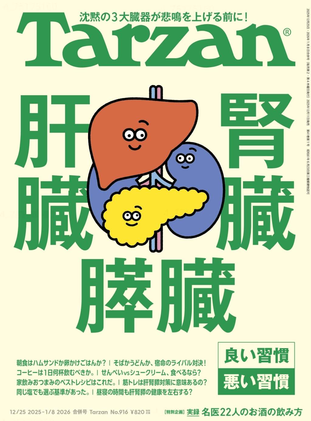
Tarzan is a Japanese magazine focused on health and activity. What sets it apart is a focus on fundamentals, excellent art, and energizing layouts that prioritize clear information. These mid-century-style illustrations are so inviting—they make you want to cut them out and turn them into stickers. Tarzan mixes art styles throughout. While they occasionally clash,…
-
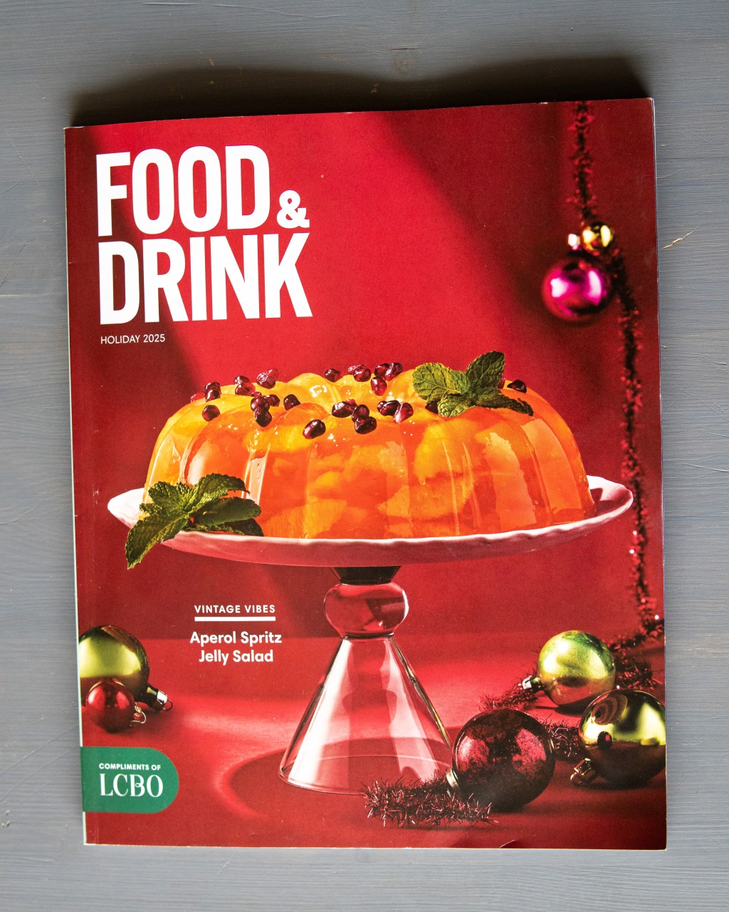
This is a good spot to mention that I don’t necessarily endorse every product or brand in this series. I’m focused on arrangement, typography, and design. Having said that, Food & Drink (distributed for free by the LCBO) is one of the Ontario government’s most interesting publications. I can only imagine the sheer number of…
-
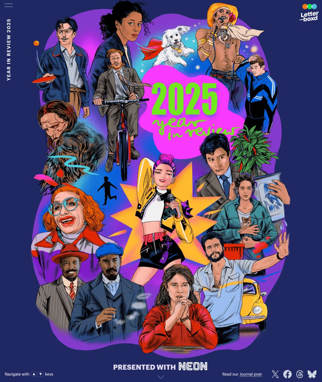
Letterboxd’s Year in Review impressively combines aesthetics and functionality, prompting changes in posting schedules. The website features a user-friendly design, great hyperlink integration, and well-curated ads. Highlights include a month breakdown of films and an emphasis on underappreciated video content, all while showcasing appealing film posters.
-
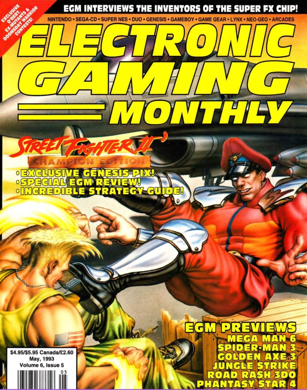
This was the first video game magazine I ever bought. At ten years old and obsessed with gaming, I was the target demographic. I read every single one of these 183 pages until they fell apart. This is a pure nostalgia play. Crisp designs and readable white space? Not here. 90s game magazines were built…
Blog Posts
- art (1)
- Blogging (14)
- Designs (17)
- Scripts (2)
- Favourites Logs (30)
- Hyperlinks Logs (13)
- Layouts I Love (78)
- links (1)
- Photos (11)
- Podcasts (38)
- Tech Blog (58)
- Uncategorized (4)
- Writing (3)
3DS (5) anime (5) Anime North (4) apple (4) apple music (4) Apple Watch (3) bookmarks (4) Canon M50 (4) Comic Books (3) delta (7) design (5) fashion (3) figma (5) game log (6) indesign (4) ipad (3) iphone (13) itunes (3) Japan (20) links (4) magazines (47) monocle (5) movie log (5) movies (6) music (17) nintendo (4) nintendo-switch (6) photoshop (4) print (11) ratings (3) retro magazines (5) spotify (4) Steam (4) technology (7) Toronto (10) tv (3) TV Log (5) typography (6) video games (25) wallpaper (3) Websites (5) windows phone (3) you chose poorly (39) youtube (4) zines (11)
