
-

This content highlights notable publications and opinions on the state of print versus digital media. It discusses the impact of AI on writing and reflects on the responsibilities of content creators in journalism. Additionally, it pays tribute to Paul Brainerd, the pioneer of desktop publishing, emphasizing his legacy in both technology and environmental conservation.
-
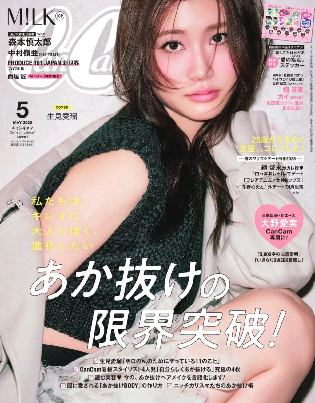
CanCam Magazine is commercial maximalism. It’s dense and colourful but so fun to look at. For this post, I wanted to highlight their spread layouts. The “Travel Wardrobe” spreads are all held together by a strict color story. See how the soft pastels in the outfits contrast with the vibrant red, while both are mirrored…
-
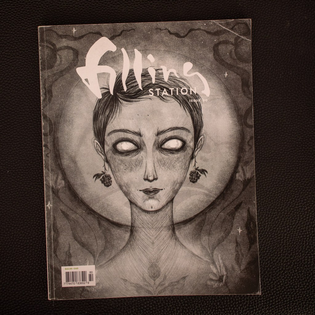
How do you set poetry? Filling Station, an independent Canadian magazine, has you well-covered. Big margins. Lots of white space. Take your time. Blackout some type, but make it visible if you look closer. Good use of overprint. At first glance, some of this type appears like its bleeding through from another page. But no.…
-
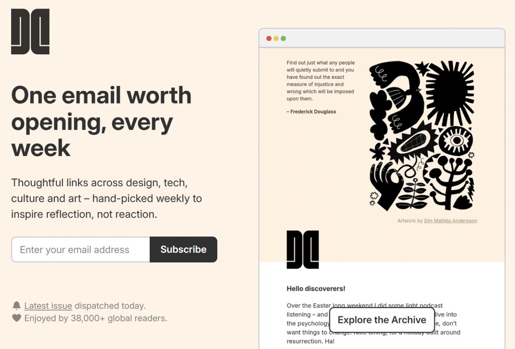
Most newsletters look identical. Substack normalized the look and feel of a modern newsletter to the point of visual boredom. But nothing looks like Dense Discovery, A tightly-packed newsletter I read just about every week. Since 2018, Kai Brach has been consistently publishing this fun recommendation engine of fun software, inspiring quotes, and useful classifieds.…
-
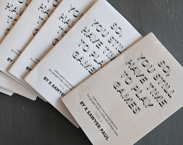
Inspired by physical media, I created my first 8-page zine. I rewrote six of my video game reviews to bring them together as a recommendation zine. The twist is that the recommendation is less about which game to play and more about how to enjoy it. Think of it as a pairing menu. This project…
-
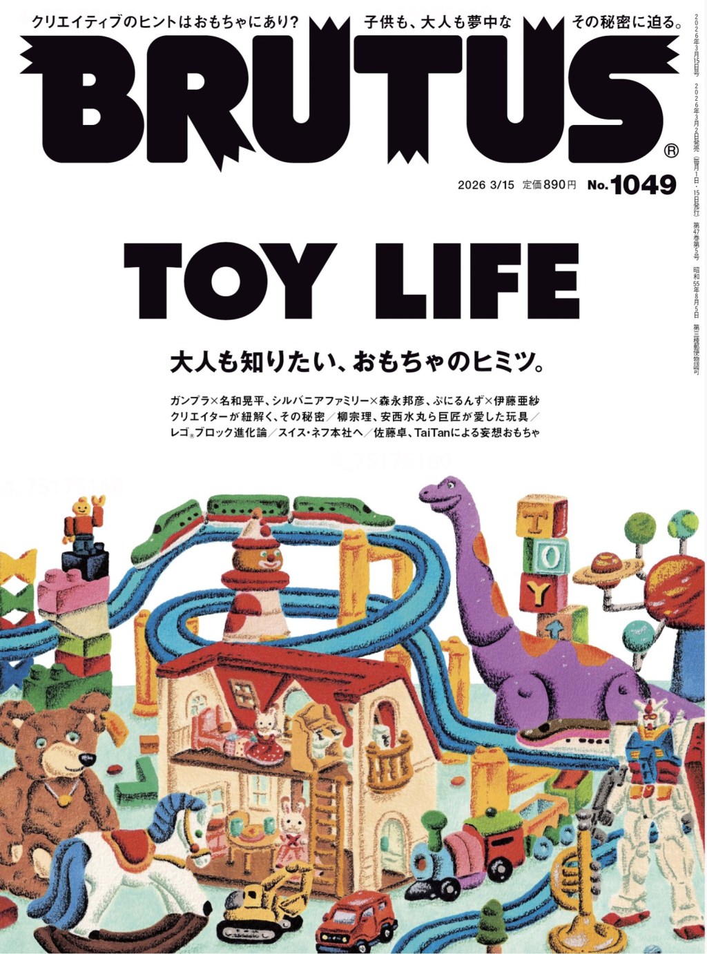
Brutus picks a theme every issue and commits to the bit, which challenges the layout designers to thread the theme throughout. Issue 1049 is about toys. How to make a grid post more toy-like? Ever made a model kit? You’ll recognize these connecting lines. It’s skeuomorphic, sure, but it really belongs. How to keep a…
-
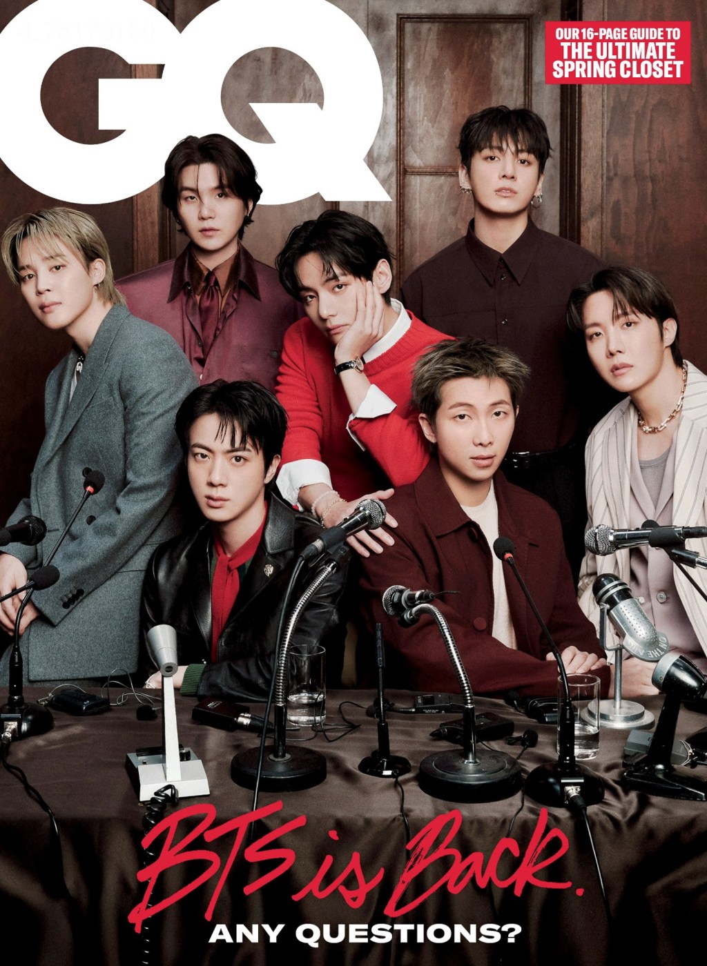
As of the March 2026 issue, GQ is going from 8 issues per year to 6, which makes it a much easier magazine to keep up with when you read a lot of magazines. It also might just give the whole team more time to make each issue more unique and memorable. The shift is…
-
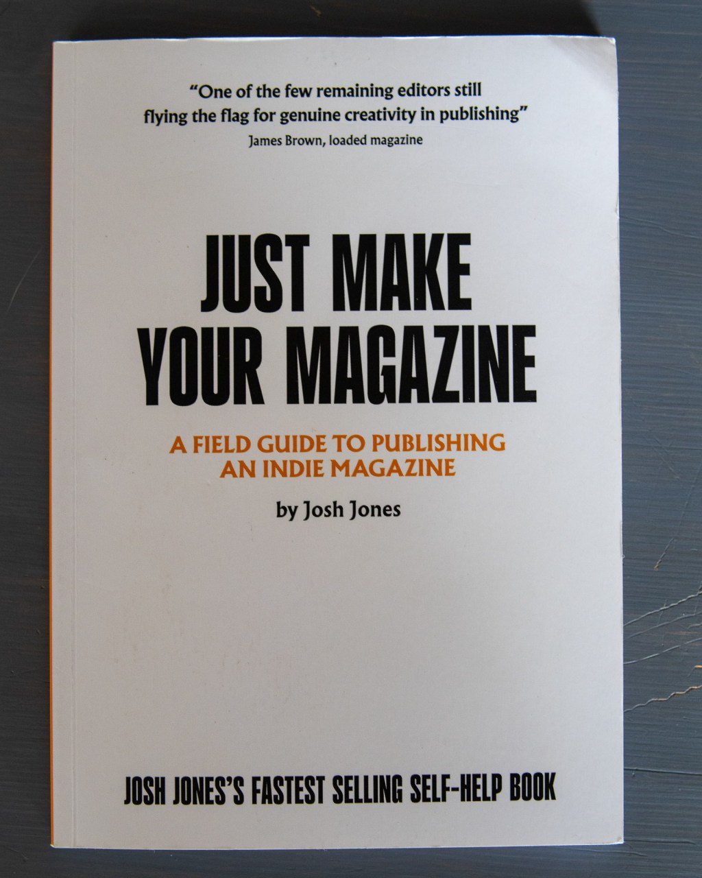
Designed by James Lee Duffy Sometimes you need some simple advice about a big topic like a publication you run yourself. This one has been helpful to me. Just seeing a page like this is inspirational. It’s so stark and cute. Like, yes, please, come help me design this. I need you. Jones highlights magazines…
-
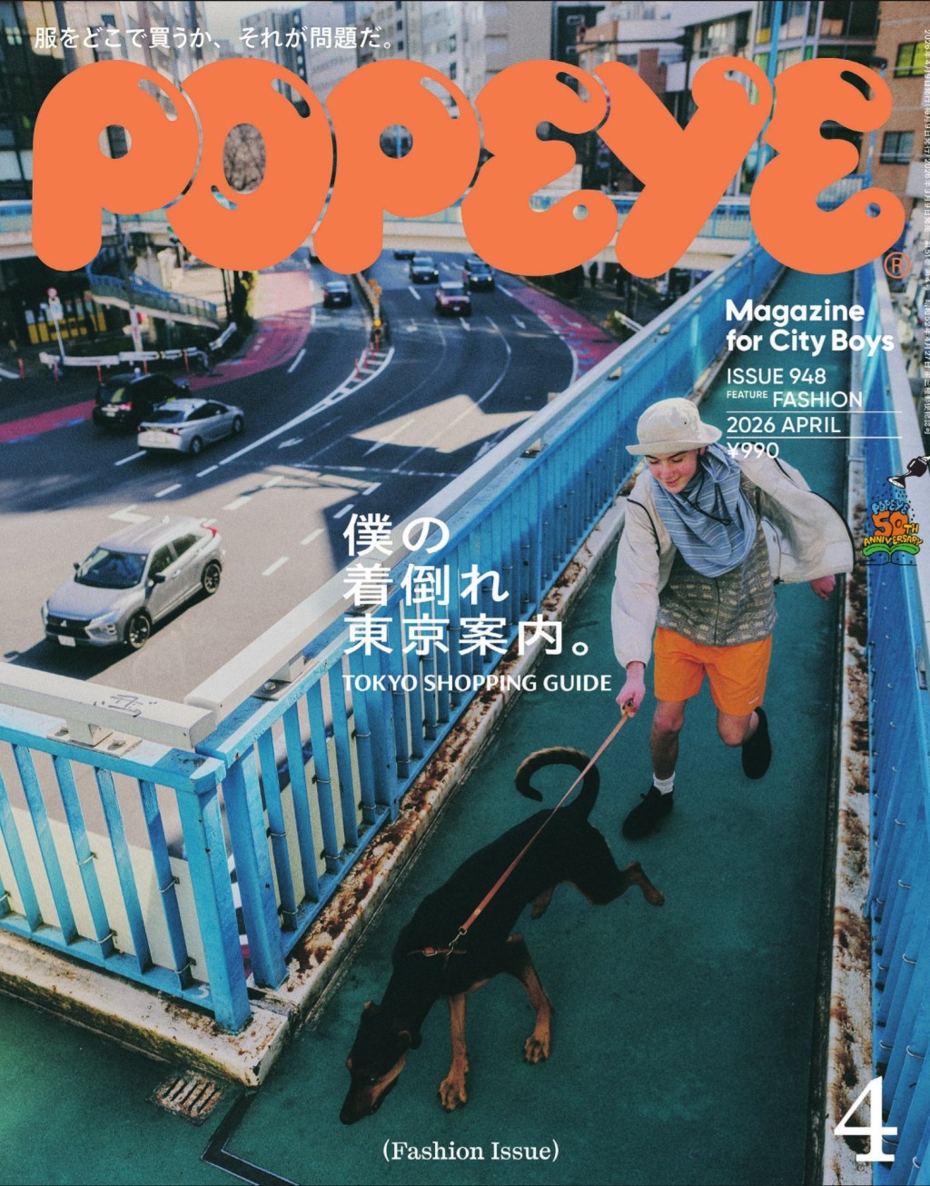
Popeye March 2026 is full of cool layouts, colour choices, and handdrawn sketches. The pink highlight around the headers here are really cute. It draws the eye well. I also love how grounded the photos are in relation to the clothes advertised. In this article for Japanese designers, they use a mix of purple and…
-
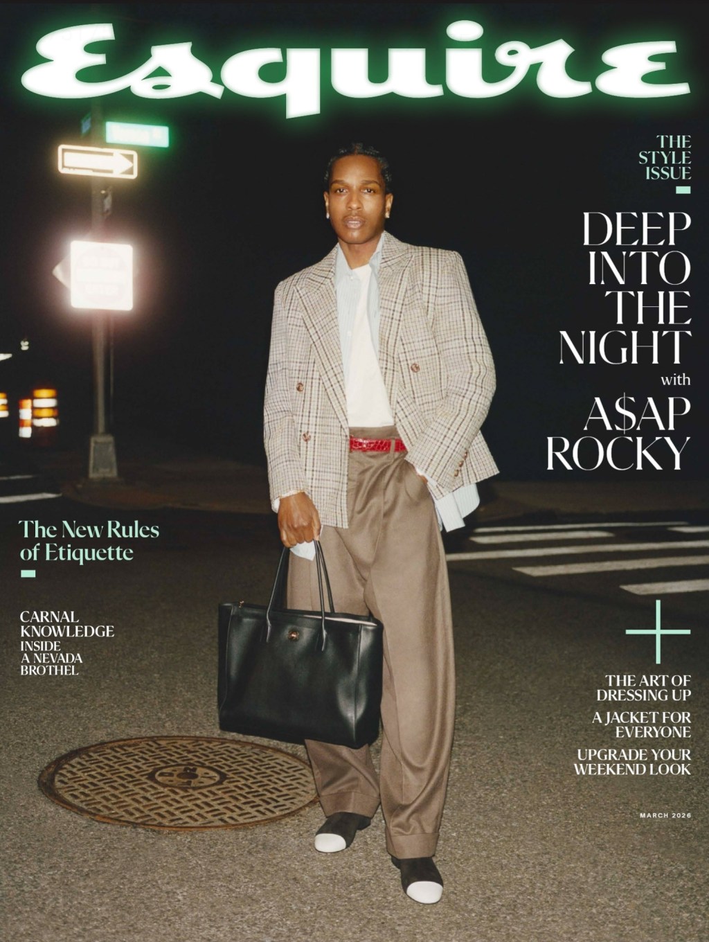
The March 2026 issue of Esquire contains a long running feature that has to stay visually fresh every year. The New Rules of Engagement is about social norms, and this layout adheres to the aesthetic of productivity. The intro page looks like a cared-for Notion. Running with the theme, the layout adheres to a five-column…
Blog Posts
- art (1)
- Blogging (15)
- Designs (17)
- Scripts (2)
- Favourites Logs (29)
- Hyperlinks Logs (12)
- Layouts I Love (66)
- links (1)
- Photos (11)
- Podcasts (39)
- Tech Blog (59)
- Uncategorized (3)
- Writing (3)
3DS (5) Anime North (4) apple (4) apple music (4) Apple Watch (3) bookmarks (4) Canon M50 (4) delta (7) design (5) figma (5) game log (6) indesign (4) ipad (3) iphone (13) italy (2) itunes (3) Japan (16) links (4) magazines (43) monocle (4) movie log (5) movies (6) music (16) nintendo (4) nintendo-switch (6) photoshop (4) playdate (2) ratings (3) Readwise (2) retro magazines (3) spotify (4) Steam (4) technology (7) Toronto (8) tv (3) TV Log (5) typography (5) video games (24) wallpaper (3) Websites (5) windows (2) windows phone (3) you chose poorly (39) youtube (4) zines (7)
