
-
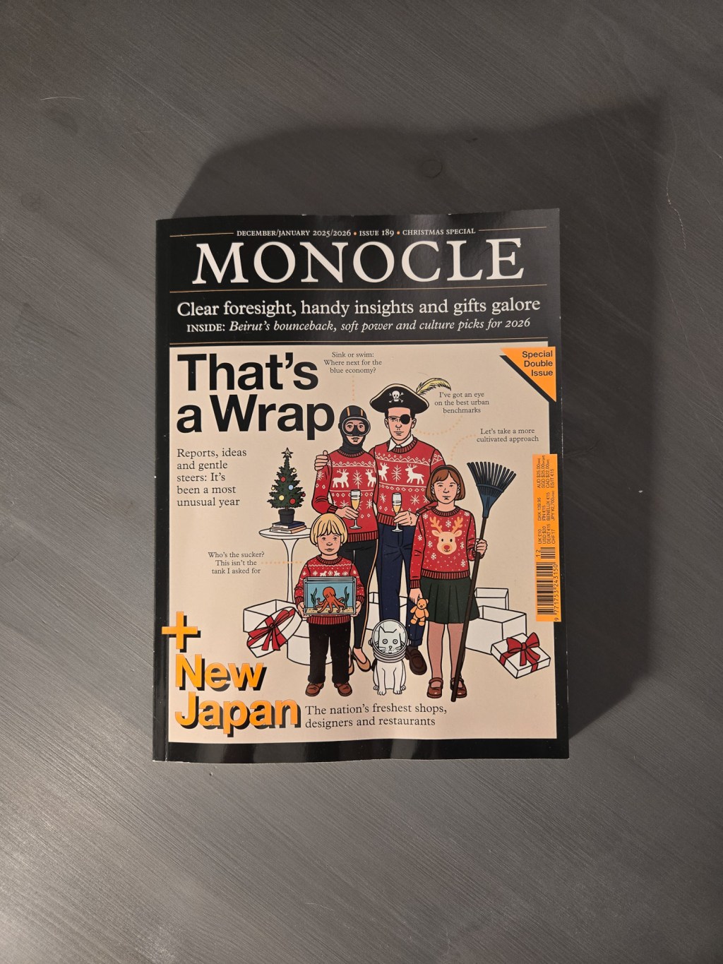
Monocle 189 rounds the new year with one of my favourite covers in years. Look at that fam. There’s a real sense of play in these layouts. Snug justified paragraphs allow for lots of white space here. These pops of red to push out the titles here are nice and pretty. And the photos tell…
-

This content highlights notable publications and opinions on the state of print versus digital media. It discusses the impact of AI on writing and reflects on the responsibilities of content creators in journalism. Additionally, it pays tribute to Paul Brainerd, the pioneer of desktop publishing, emphasizing his legacy in both technology and environmental conservation.
-
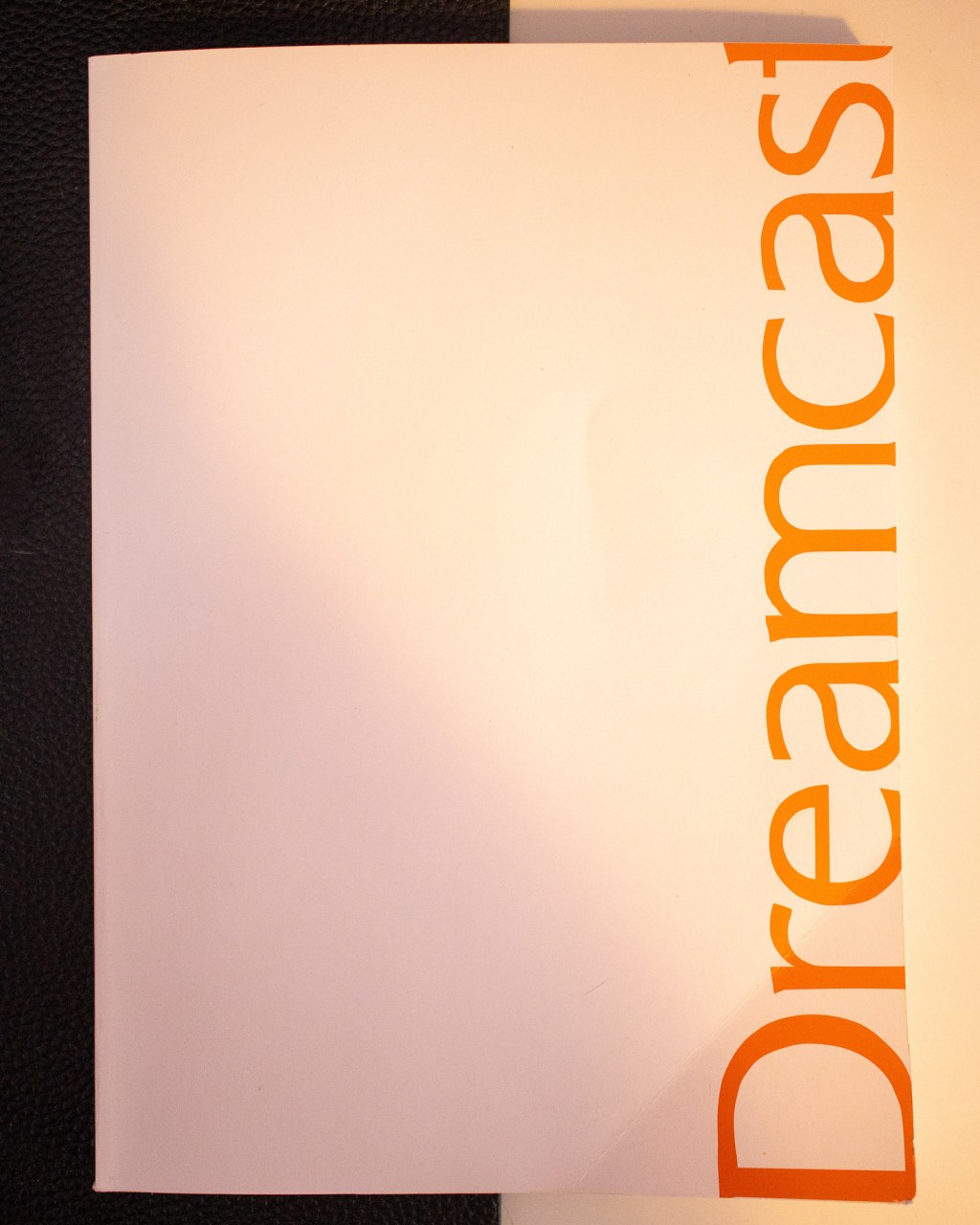
I picked up this catalogue while in Tokyo in a basement retro game store. I wanted a collective that wasn’t too heavy, but contained useful information. Perfect Catalogue is a series of books that tell an informative story of a console and all its games. This includes alternate console designs, Controller styles, and Strange accessories.…
-
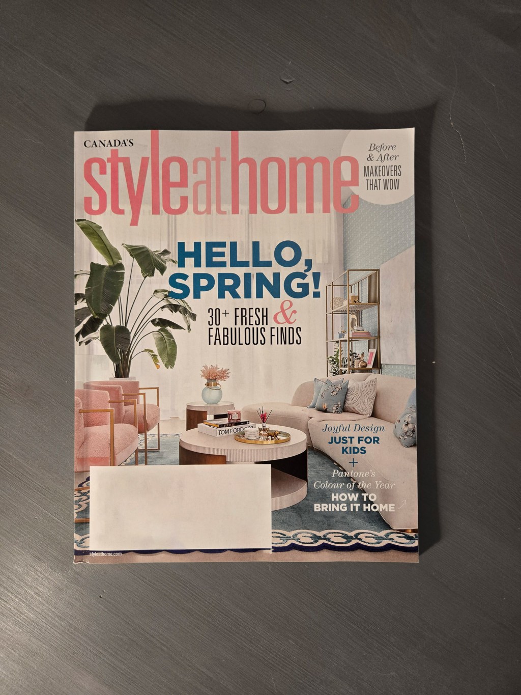
Style At Home is a long-running Canadian interior design mag. You have seen it everywhere. I’ve seen this on personal websites, but this is a first in a magazine masthead for me: an instruction for contacting via email without printing the email. You’re an adult. You can figure it out. The high price vs low…
-
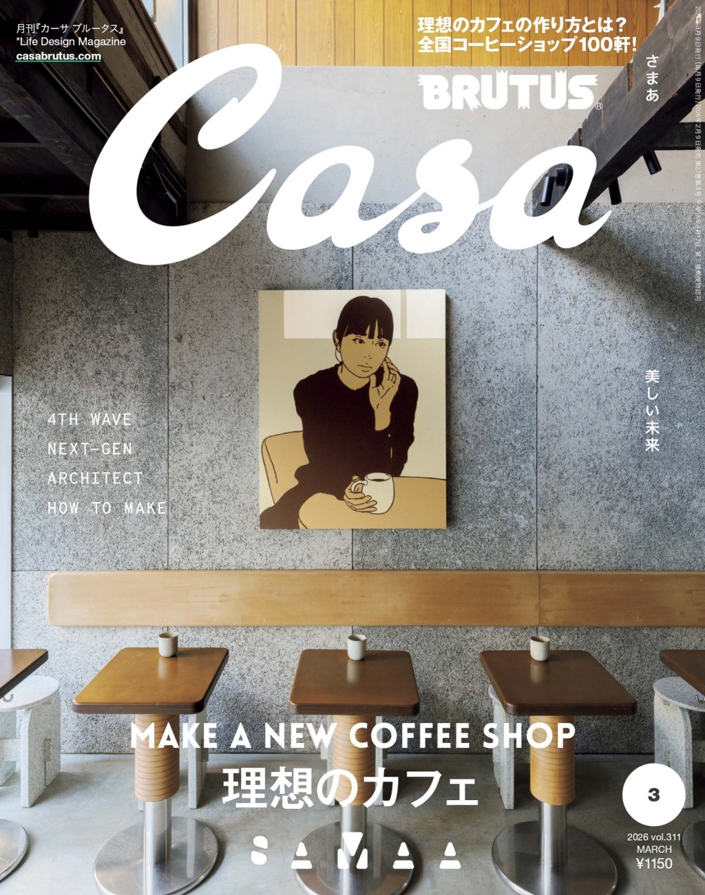
The March 2026 issue of Casa Brutus is all about making a new coffee shop. So how do they make that layout interesting? Because Brutus values clarity, they deliver an index up front that tells you exactly where to find every coffee shop mentioned in the issue. And they use a nice clear pixel map.…
-
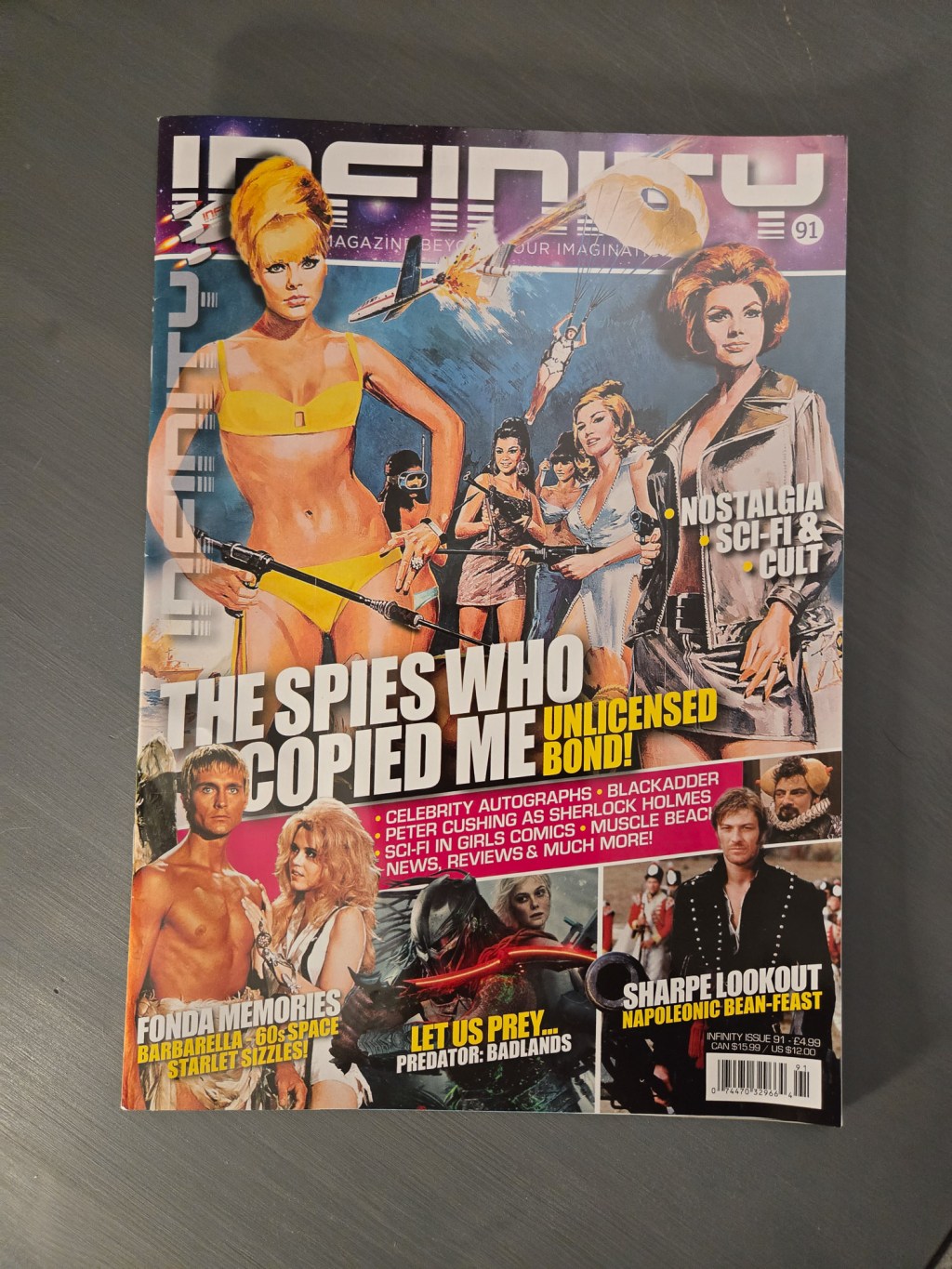
In my retro posts about EGM and Wizard, I talked about how most modern magazines skew accessible and clean, with over printing and noisy layouts left to the past. With Infinity Magazine, I stand corrected. Some layout artists are proudly keeping the high-saturation tradition alive. The Editors letter is set in white text on an…
-
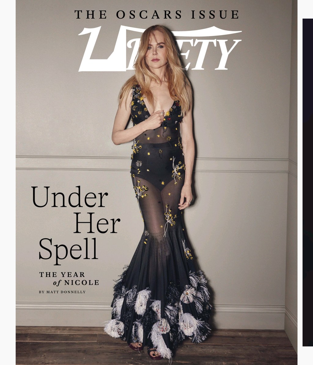
I thought it might be interesting to show off how, in layout, various agencies congratulated their talent in the Oscar issue of Variety Magazine. Ascap went with large photos and categories. The Taurus World Stunt Awards went with two columns sandwiched with headline names above and below. WME went with a two-page spread in grey…
-
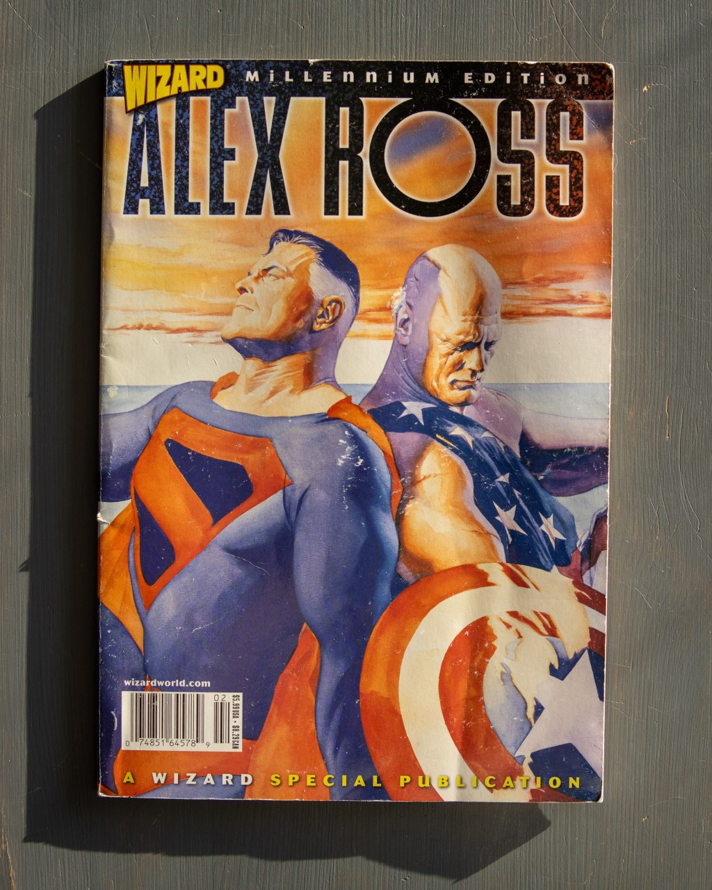
The layout designers at Wizard were masters of the “caption-heavy” grid. They managed to tuck 16 blurbs into a single spread. But my favorite part is the process pages. “Odds and Ends” gives a glimpse of the work’s skeletal structure: rough sketches, Batman head-turns, and even a “Danny DeVito as Wolverine” gag. You can still…
-
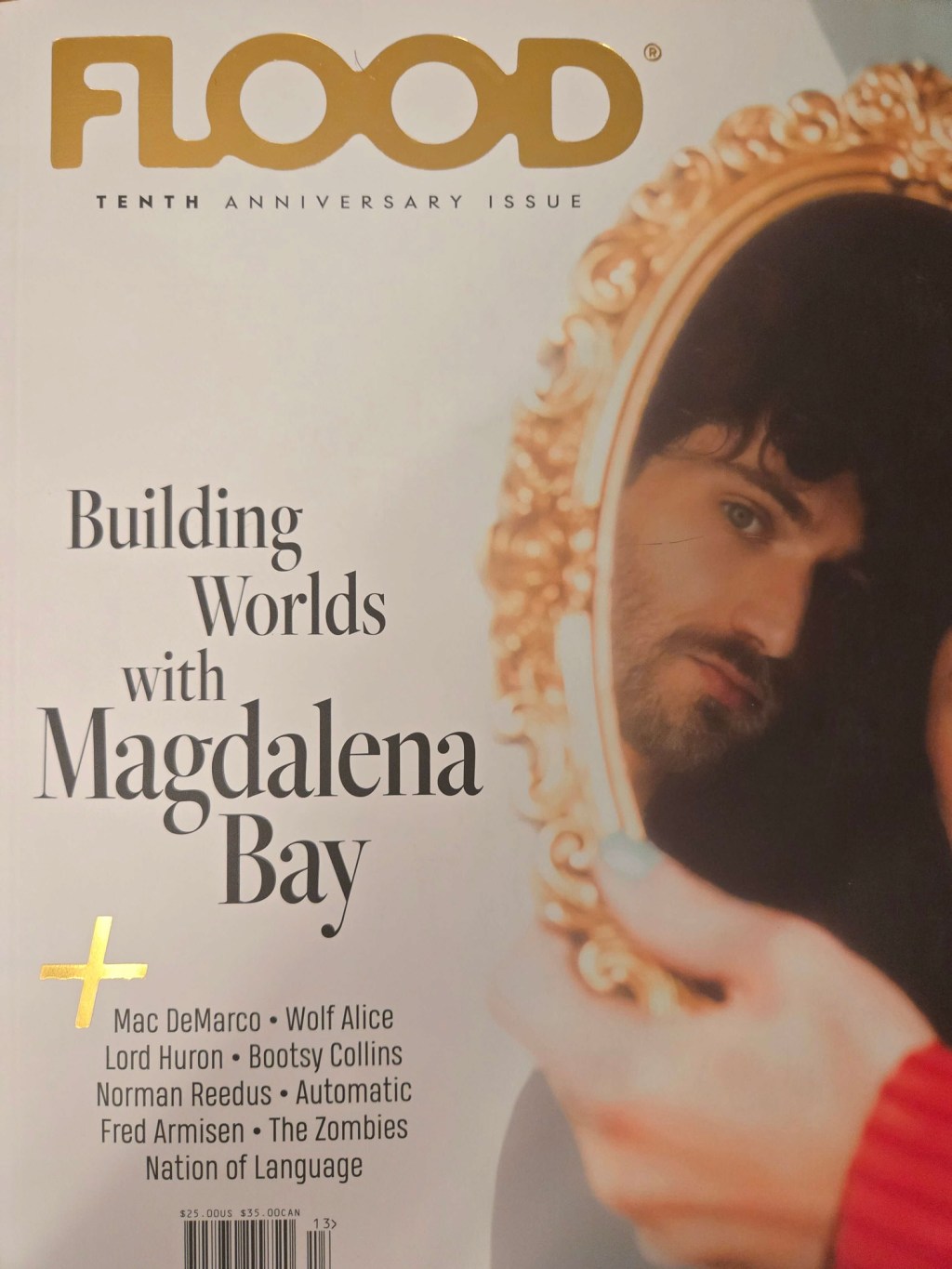
I’ve split this post about Flood 13 into two parts because the issue is kind of two magazines. But if we’re being honest, it feels like four. While the first half focused on the editors’ top picks, this side pivots to artist-led curation. Remember, this is a music magazine. You can put paragraphs anywhere you…
-
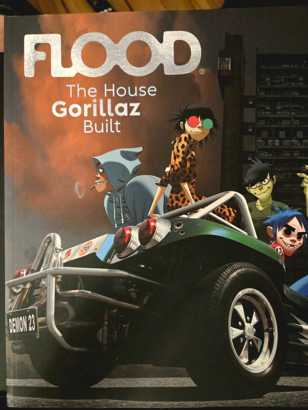
Flood 13 may be the heaviest magazine I’ve ever held. It’s over a kilogram and a half. This is exercise equipment. Music magazines are recommendation engines. The layout artists at Flood understand spatial respect. Here, they give their albums of the years half a page each, lots of breathing room for art and background elements,…
Blog Posts
- art (1)
- Blogging (15)
- Designs (17)
- Scripts (2)
- Favourites Logs (29)
- Hyperlinks Logs (12)
- Layouts I Love (66)
- links (1)
- Photos (11)
- Podcasts (39)
- Tech Blog (59)
- Uncategorized (3)
- Writing (3)
3DS (5) Anime North (4) apple (4) apple music (4) Apple Watch (3) bookmarks (4) Canon M50 (4) delta (7) design (5) figma (5) game log (6) indesign (4) ipad (3) iphone (13) italy (2) itunes (3) Japan (16) links (4) magazines (43) monocle (4) movie log (5) movies (6) music (16) nintendo (4) nintendo-switch (6) photoshop (4) playdate (2) ratings (3) Readwise (2) retro magazines (3) spotify (4) Steam (4) technology (7) Toronto (8) tv (3) TV Log (5) typography (5) video games (24) wallpaper (3) Websites (5) windows (2) windows phone (3) you chose poorly (39) youtube (4) zines (7)
