
-
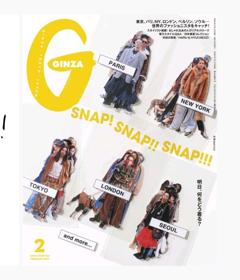
If you want to understand visual energy, look at Ginza’s February issue. The cover is really cheeky, like an in-process set of cutout stickers that you might order too many of online. Look at the Table of Contents. You have a massive “2” anchoring the top left, balanced by a dense list of features with…
-
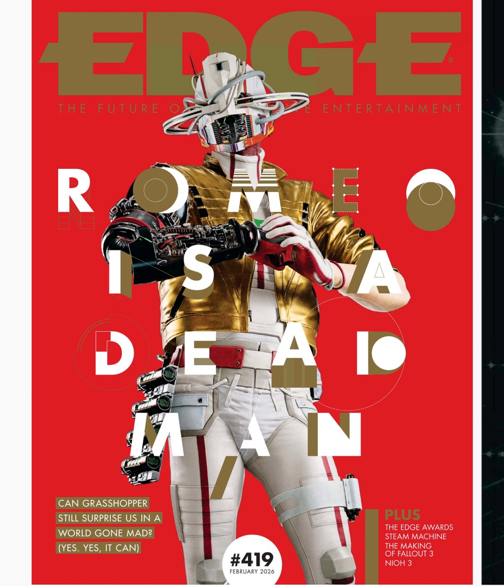
As fun as retro video game magazines are, did you know they still make fresh ones, and talented layout designers work on them? I feel that every time I flip through Edge. Every issue has its own feel, so you can expect them in my regular rotation. Game magazines are great places to see art…
-
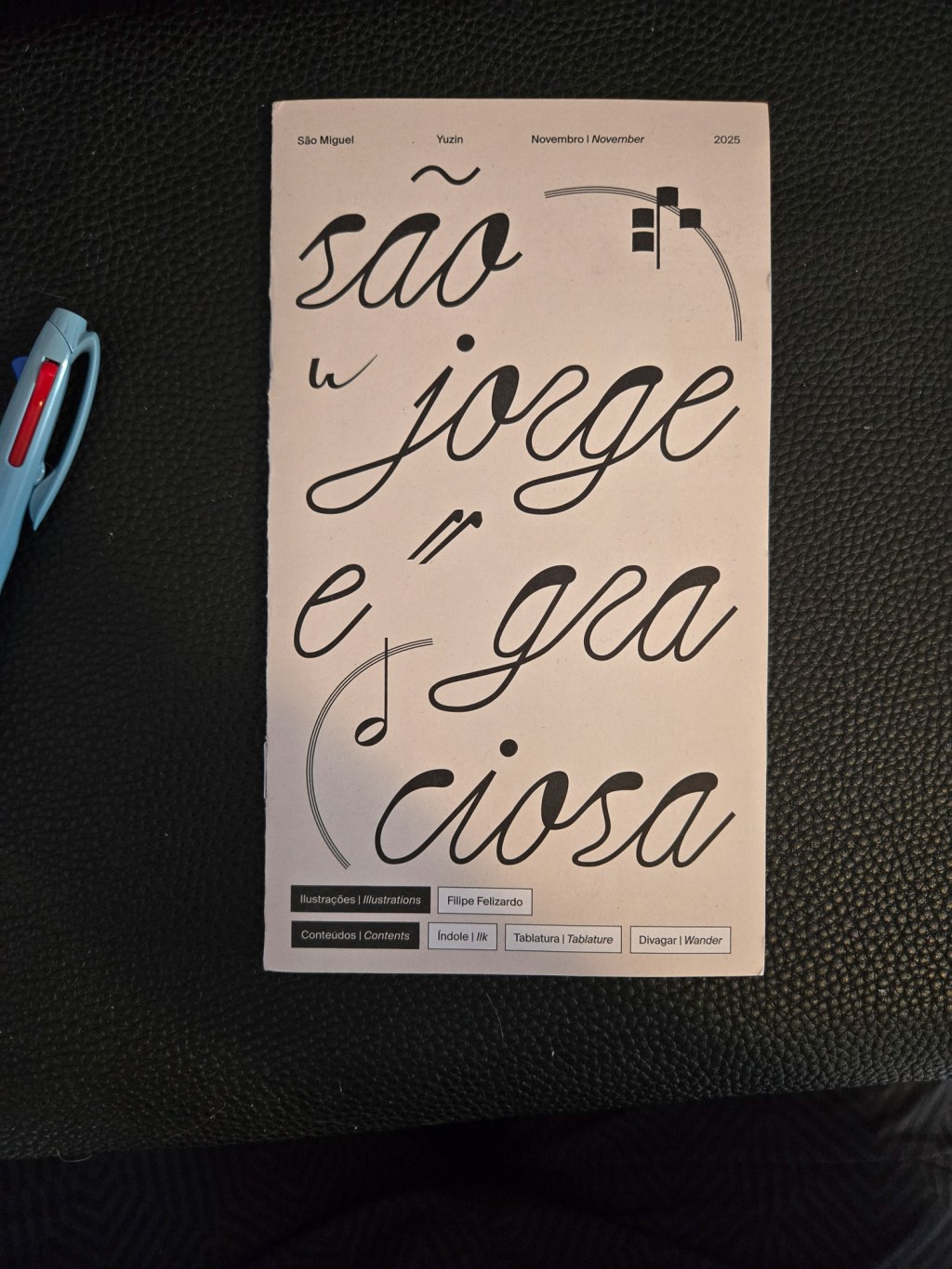
My friend Liane recently went on a trip to Sao Miguel and brought me back this lovely tourist booklet. This is one of my favourite kinds of souvenir so thank you 🤗 Yuzin Cultural Journal is a pretty lovely excuse to tell people about the fun historical stuff on an island. It’s printed like a…
-
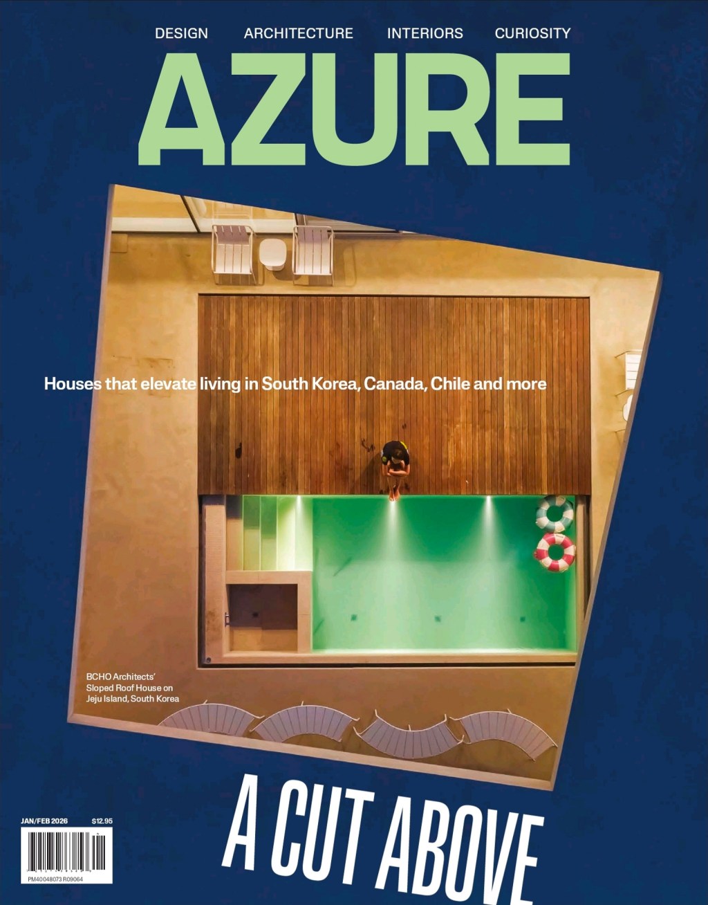
Azure’s Jan-Feb issue is a nice exercise in colour blocking. The cover uses a pretty simple trick to make the image feel dynamic. You ever do this trick in your designs? Why not? The “small wonders” lighting spread is pretty. It breaks its own grid by floating images on top. It’s a nice composition. I’m…
-
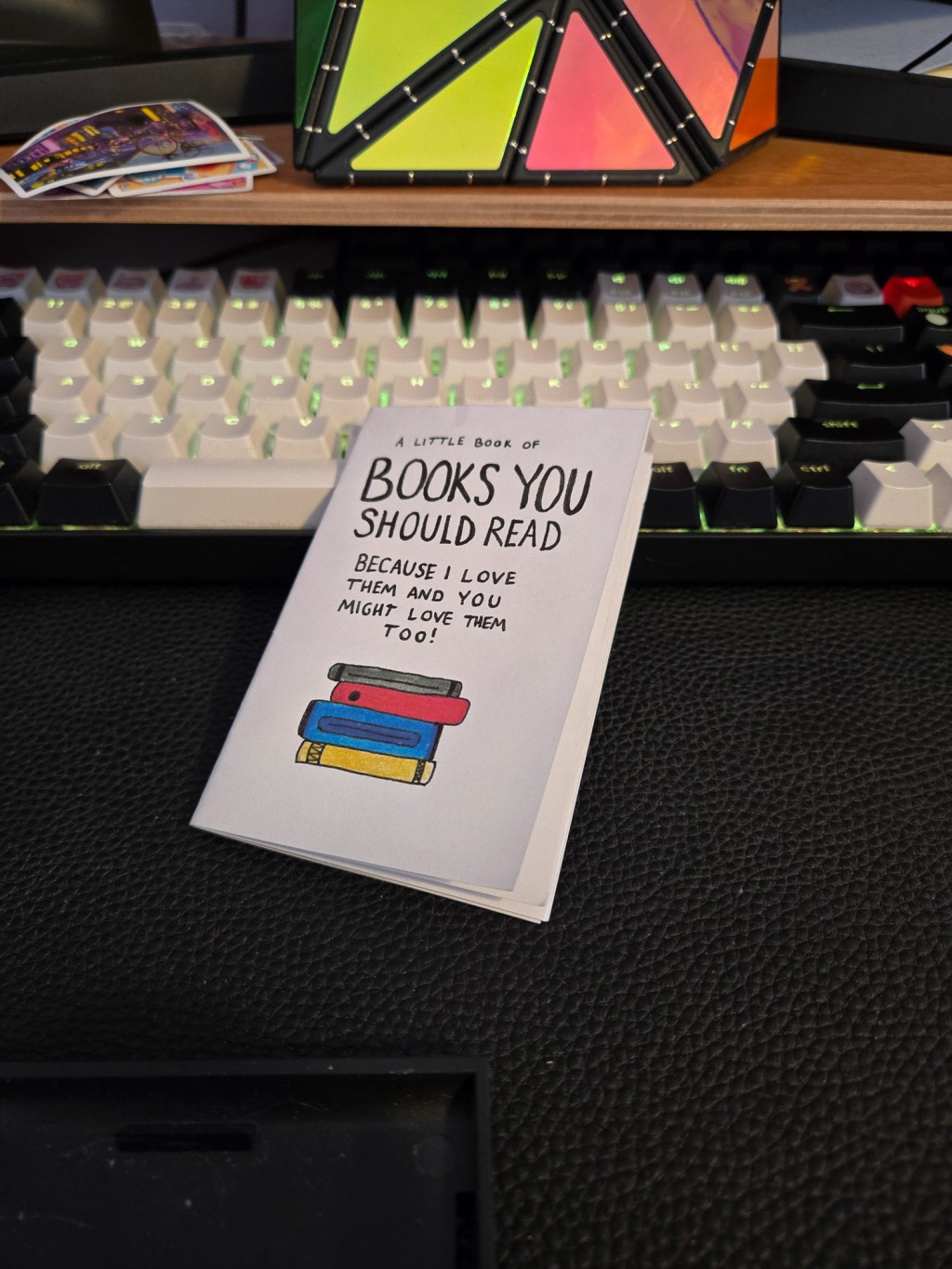
credit: @clementinek.art I’ve been mostly talking about big magazines so far, but great layouts are everywhere you look. And believe, I’m going to showcase tons of zines. I’m in Toronto. People make lots of zines here. I saw this one at Secret Planet: Books you Should Read Because I Love Them and you Might Love…
-
In the “One Month of Layouts I Love” post, the author shares their transition from personal social media to a focused project on layouts and video content. They discuss challenges with various platforms, successful video production strategies, and view counts on Instagram, YouTube, and TikTok, emphasizing Tiktok’s higher engagement. The author aims to refine their…
-
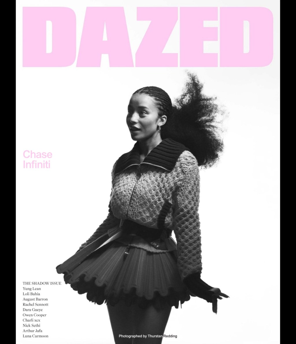
Let’s say you want to set a two column page. How should the paragraphs work to make it interesting? The winter 2025 issue of Dazed offers some ideas. First off, bold the questions, then indent the answers. Then, indent both speakers, but place a bolded initial for each, like a bullet. Then, fine, add a…
-
The articles explore various themes: the challenges and potential of open-source layout tools for print, the saturation and diminishing impact of social media, and the paradox of employer control over productivity in the workplace. They also examine Japan’s vibrant small business culture, the attention economy’s contradictions, and the profound emotional engagement with literature compared to…
-
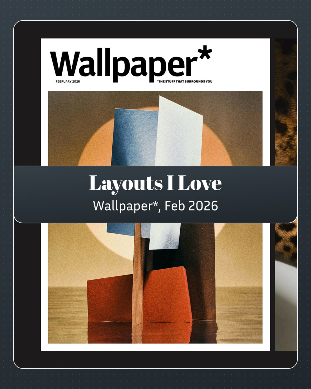
I like Wallpaper* a lot. I’ll have more to say about the magazine in future issues. For this one, I want to just focus on Header hierarchy. Designer of the year is in gray, Willo Perron in black. Subhead, space, three unjustified columns, a clean start. Next one: best in black. Retail therapy in grey.…
-
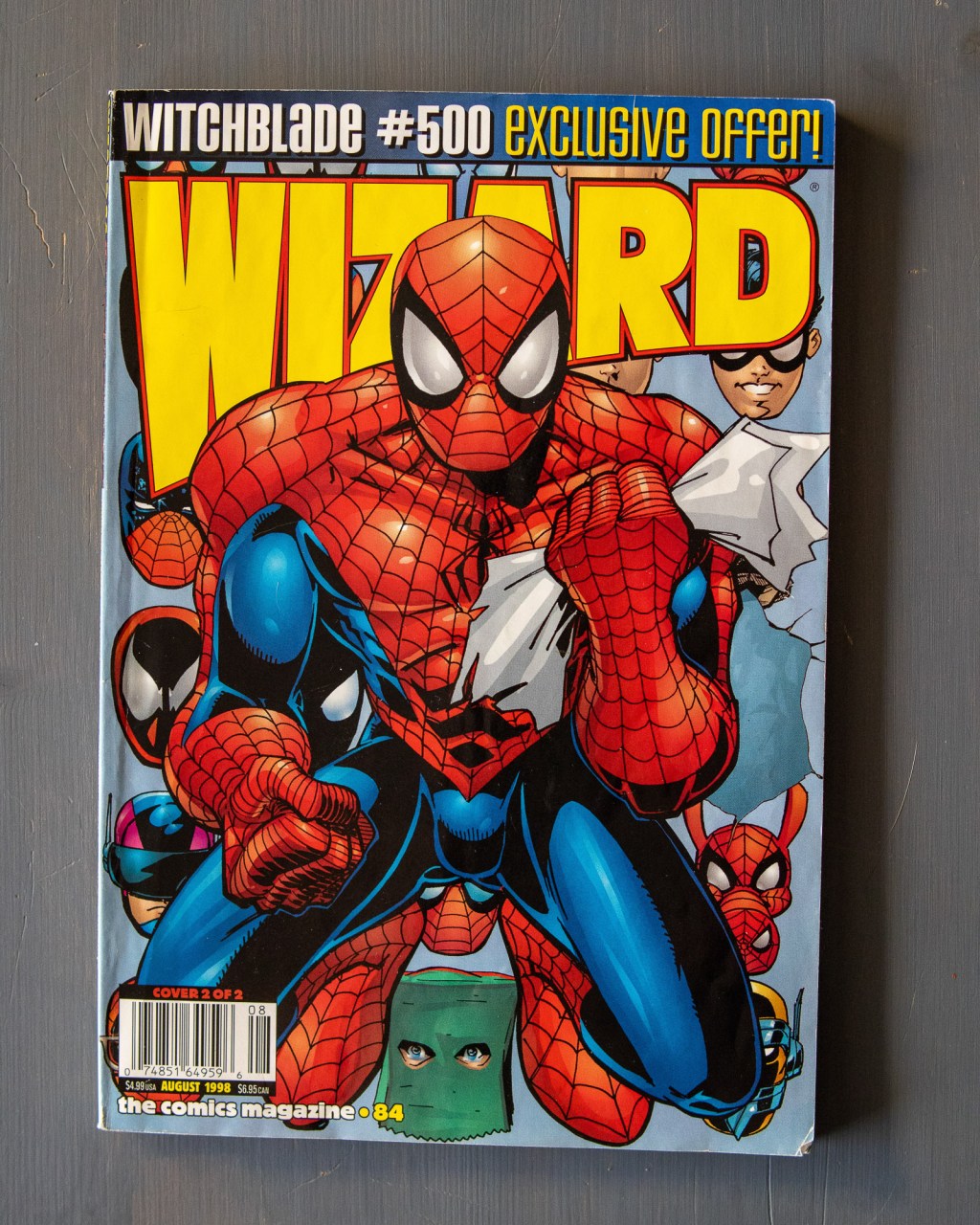
My friend Chris offered me up some Wizard magazines for this project. This project is making me a believer in manifestation, at least to the degree that my friends are handing me magazines. Keep them coming! I don’t know too much about Wizard. What I like here are the pages about process. Rough drafts, sketches.…
Blog Posts
- art (1)
- Blogging (15)
- Designs (17)
- Scripts (2)
- Favourites Logs (29)
- Hyperlinks Logs (12)
- Layouts I Love (66)
- links (1)
- Photos (11)
- Podcasts (39)
- Tech Blog (59)
- Uncategorized (3)
- Writing (3)
3DS (5) Anime North (4) apple (4) apple music (4) Apple Watch (3) bookmarks (4) Canon M50 (4) delta (7) design (5) figma (5) game log (6) indesign (4) ipad (3) iphone (13) italy (2) itunes (3) Japan (16) links (4) magazines (43) monocle (4) movie log (5) movies (6) music (16) nintendo (4) nintendo-switch (6) photoshop (4) playdate (2) ratings (3) Readwise (2) retro magazines (3) spotify (4) Steam (4) technology (7) Toronto (8) tv (3) TV Log (5) typography (5) video games (24) wallpaper (3) Websites (5) windows (2) windows phone (3) you chose poorly (39) youtube (4) zines (7)
