
-
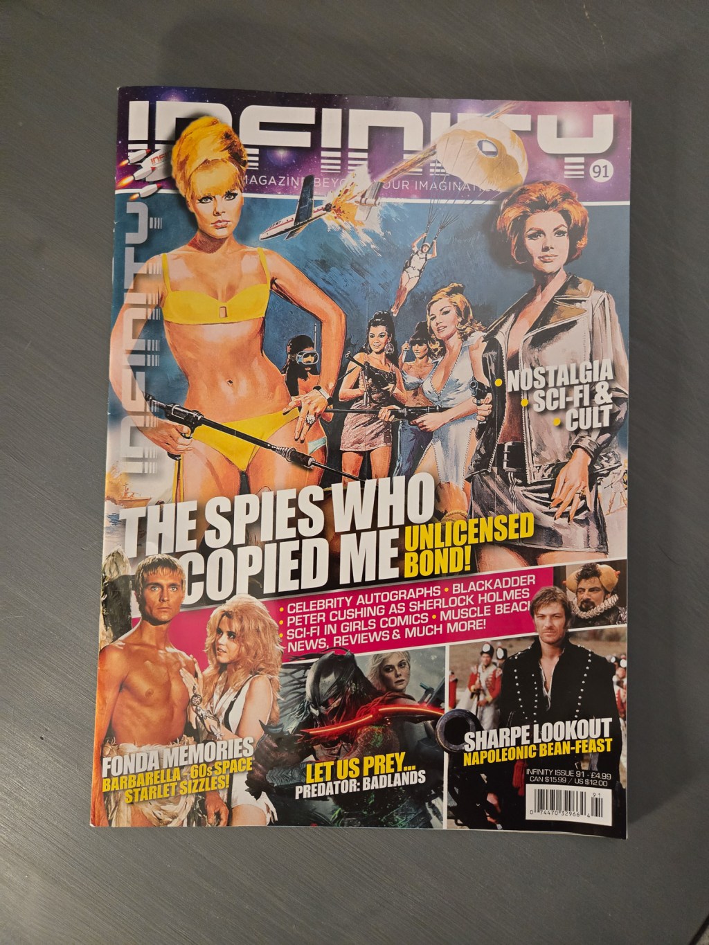
In my retro posts about EGM and Wizard, I talked about how most modern magazines skew accessible and clean, with over printing and noisy layouts left to the past. With Infinity Magazine, I stand corrected. Some layout artists are proudly keeping the high-saturation tradition alive. The Editors letter is set in white text on an…
-
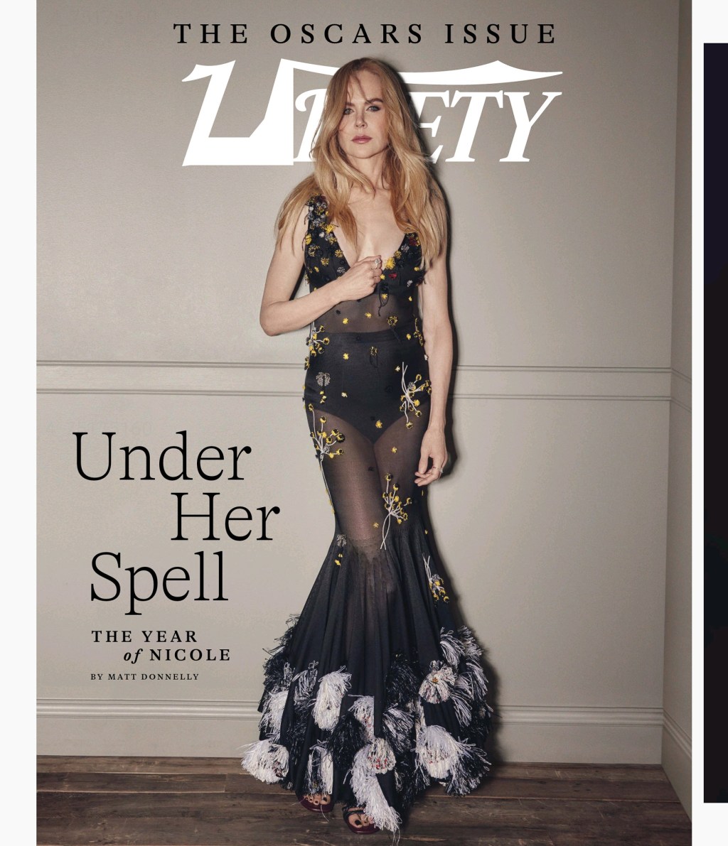
I thought it might be interesting to show off how, in layout, various agencies congratulated their talent in the Oscar issue of Variety Magazine. Ascap went with large photos and categories. The Taurus World Stunt Awards went with two columns sandwiched with headline names above and below. WME went with a two-page spread in grey…
-
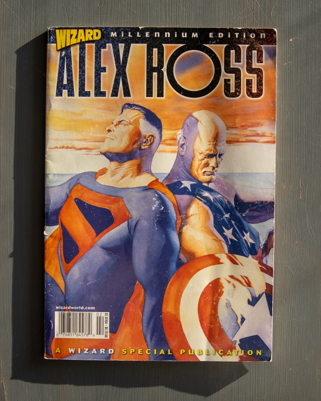
The layout designers at Wizard were masters of the “caption-heavy” grid. They managed to tuck 16 blurbs into a single spread. But my favorite part is the process pages. “Odds and Ends” gives a glimpse of the work’s skeletal structure: rough sketches, Batman head-turns, and even a “Danny DeVito as Wolverine” gag. You can still…
-
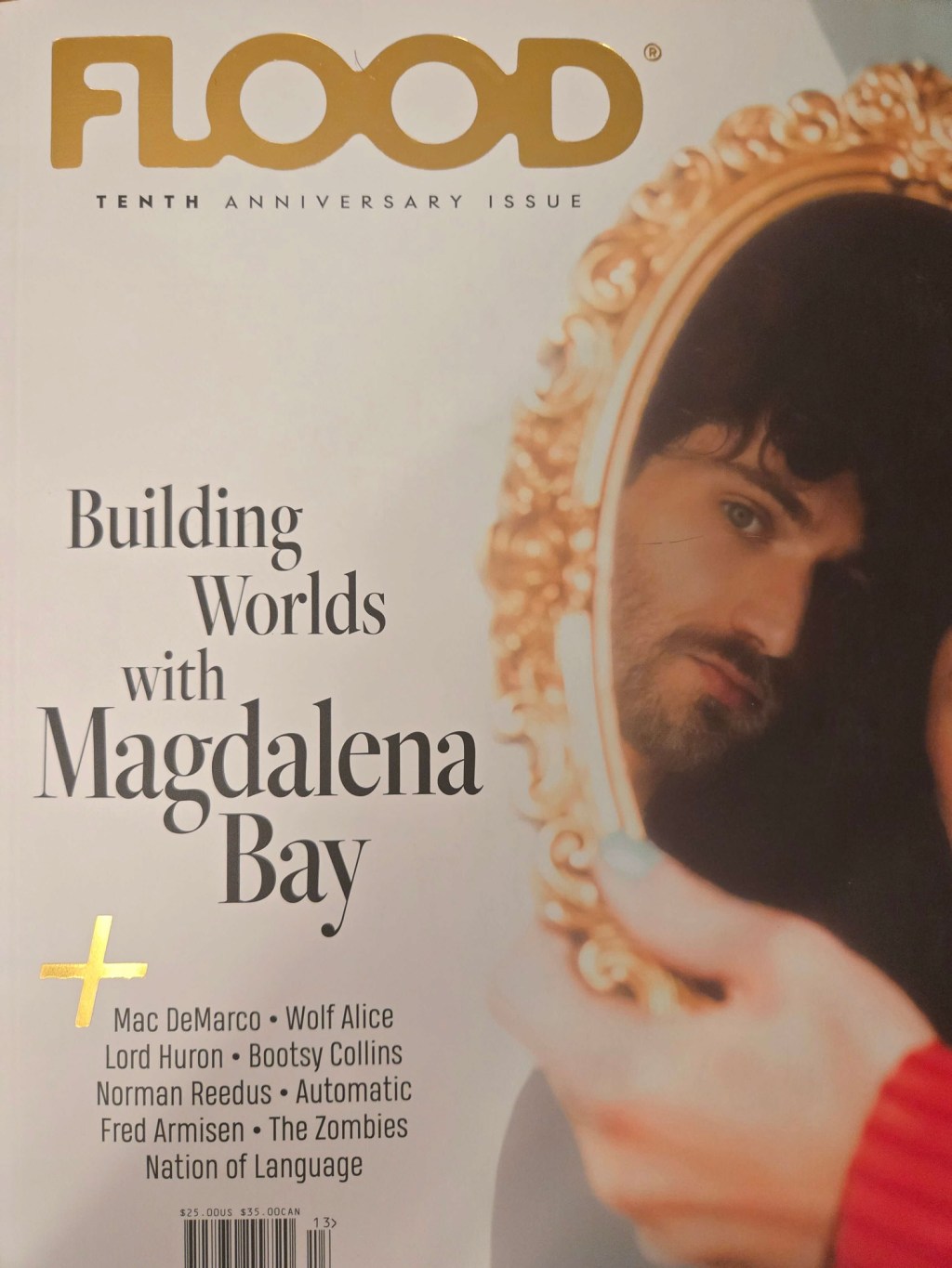
I’ve split this post about Flood 13 into two parts because the issue is kind of two magazines. But if we’re being honest, it feels like four. While the first half focused on the editors’ top picks, this side pivots to artist-led curation. Remember, this is a music magazine. You can put paragraphs anywhere you…
-
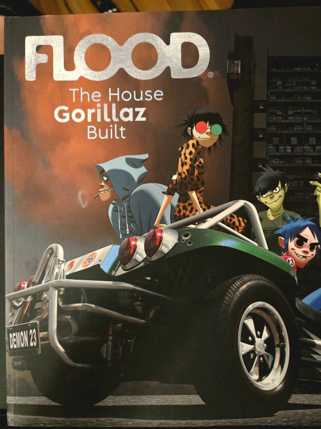
Flood 13 may be the heaviest magazine I’ve ever held. It’s over a kilogram and a half. This is exercise equipment. Music magazines are recommendation engines. The layout artists at Flood understand spatial respect. Here, they give their albums of the years half a page each, lots of breathing room for art and background elements,…
-
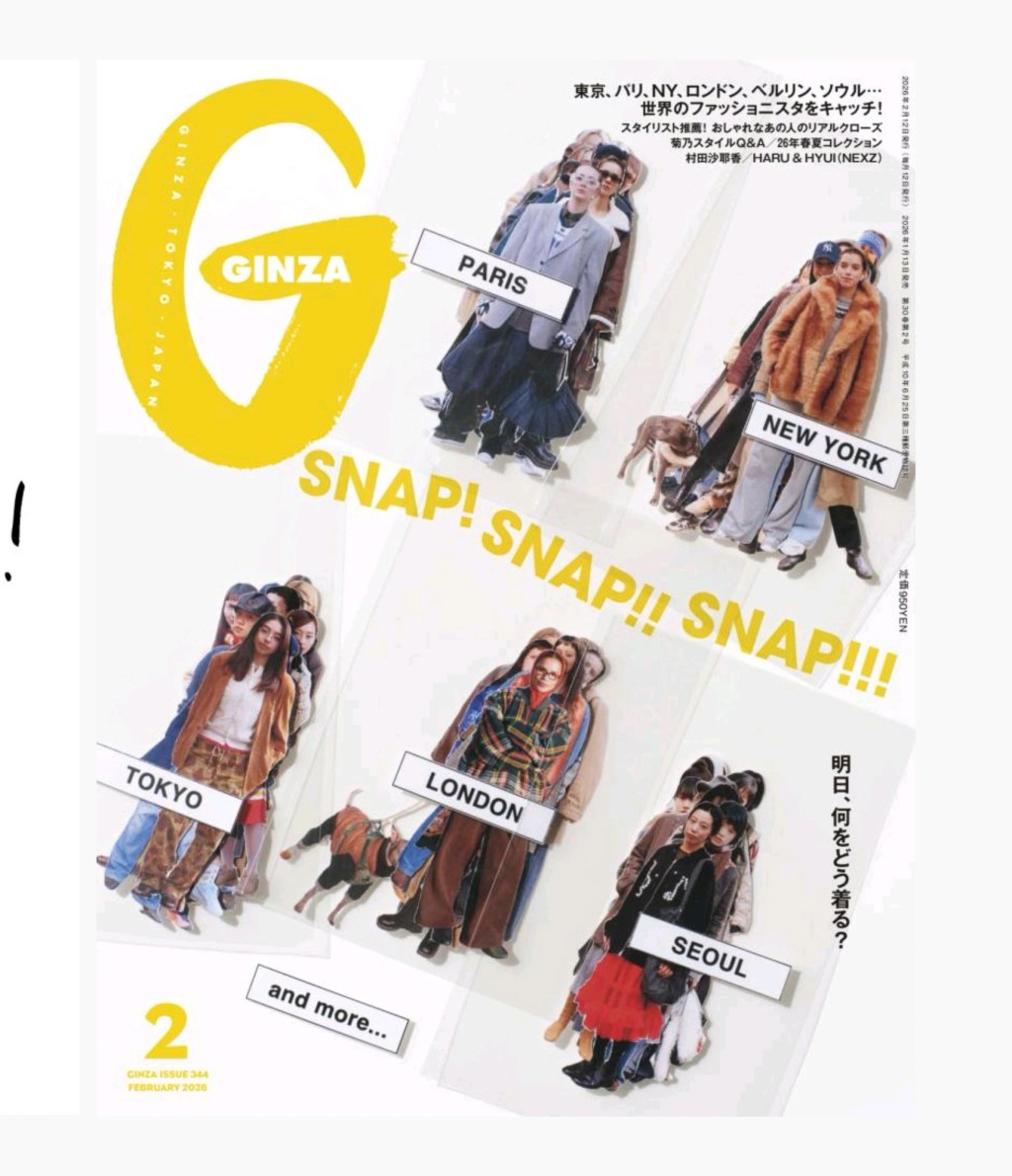
If you want to understand visual energy, look at Ginza’s February issue. The cover is really cheeky, like an in-process set of cutout stickers that you might order too many of online. Look at the Table of Contents. You have a massive “2” anchoring the top left, balanced by a dense list of features with…
-
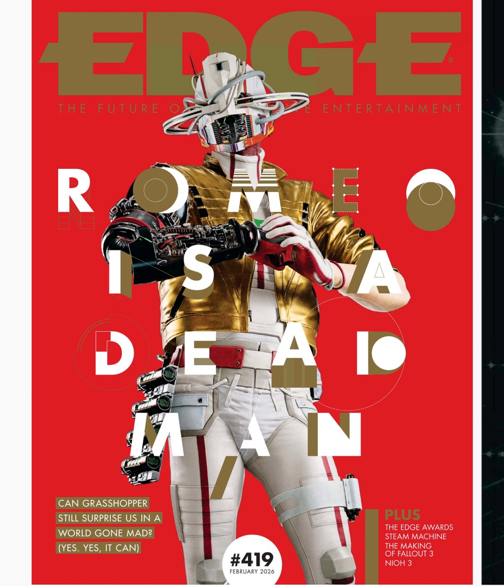
As fun as retro video game magazines are, did you know they still make fresh ones, and talented layout designers work on them? I feel that every time I flip through Edge. Every issue has its own feel, so you can expect them in my regular rotation. Game magazines are great places to see art…
-
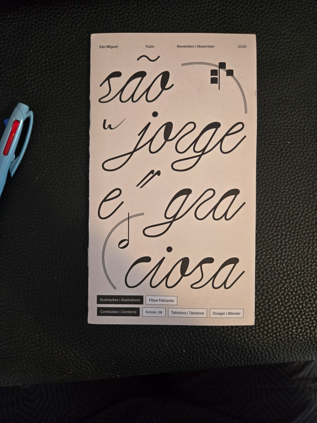
My friend Liane recently went on a trip to Sao Miguel and brought me back this lovely tourist booklet. This is one of my favourite kinds of souvenir so thank you 🤗 Yuzin Cultural Journal is a pretty lovely excuse to tell people about the fun historical stuff on an island. It’s printed like a…
-
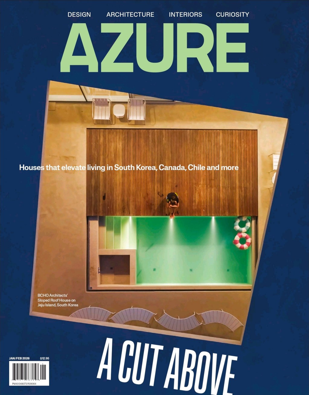
Azure’s Jan-Feb issue is a nice exercise in colour blocking. The cover uses a pretty simple trick to make the image feel dynamic. You ever do this trick in your designs? Why not? The “small wonders” lighting spread is pretty. It breaks its own grid by floating images on top. It’s a nice composition. I’m…
-
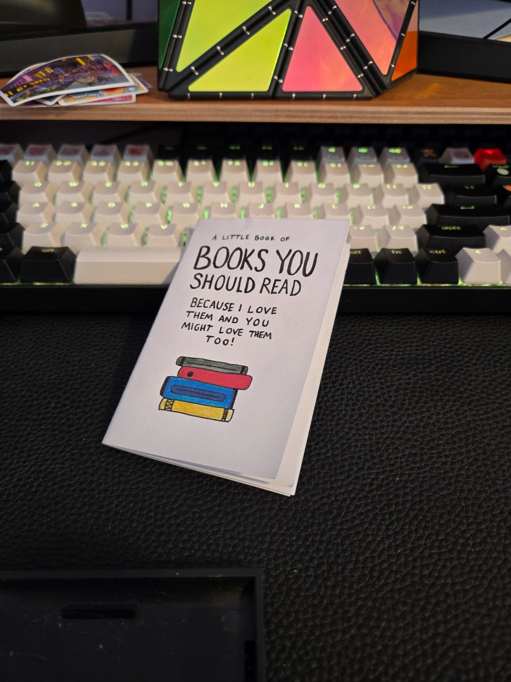
credit: @clementinek.art I’ve been mostly talking about big magazines so far, but great layouts are everywhere you look. And believe, I’m going to showcase tons of zines. I’m in Toronto. People make lots of zines here. I saw this one at Secret Planet: Books you Should Read Because I Love Them and you Might Love…
Blog Posts
- art (1)
- Blogging (14)
- Designs (17)
- Scripts (2)
- Favourites Logs (30)
- Hyperlinks Logs (13)
- Layouts I Love (78)
- links (1)
- Photos (11)
- Podcasts (38)
- Tech Blog (58)
- Uncategorized (4)
- Writing (3)
3DS (5) anime (5) Anime North (4) apple (4) apple music (4) Apple Watch (3) bookmarks (4) Canon M50 (4) Comic Books (3) delta (7) design (5) fashion (3) figma (5) game log (6) indesign (4) ipad (3) iphone (13) itunes (3) Japan (20) links (4) magazines (47) monocle (5) movie log (5) movies (6) music (17) nintendo (4) nintendo-switch (6) photoshop (4) print (11) ratings (3) retro magazines (5) spotify (4) Steam (4) technology (7) Toronto (10) tv (3) TV Log (5) typography (6) video games (25) wallpaper (3) Websites (5) windows phone (3) you chose poorly (39) youtube (4) zines (11)
